12 Super Simple Strategies to Ensure your Forms Convert
12 Super Simple Strategies to Ensure your Forms Convert
When building out lead generation landing pages it’s all too easy to get caught up in how the page looks and how it’s optimised without giving any consideration to the one element on the page where you really want people to be taking action …
When building out lead generation landing pages it’s all too easy to get caught up in how the page looks and how it’s optimised without giving any consideration to the one element on the page where you really want people to be taking action …
The Form!
Instead, you lead your visitor through a journey, pull on those heart strings, hit them with your proposition and get them ready to tap in those coveted details, yet they drop off into thin air!
What happened!?
Here are 12 simple things you can do to ensure your forms are on point and your visitor has the best user experience of their life.
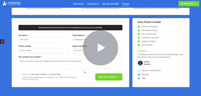
I’m starting with the seemingly obvious I know, but it’s super important that you tell the user what they’re getting, and give them an excellent reason to want to do it.
Make your form title clear and utilise a subheading to iterate what you need you need them to do.
For example: if you’re collecting leads for life insurance comparison, you may want to iterate to your users to ‘Fill out the form below for your free quote, it only takes 30 seconds’
Your visitor has landed on that form to take one action, so don’t give them any reason to fail on doing so.
Distracting surroundings, terms and privacy agreements that lead away or anything that distracts from the core action needs to go.
If you need to display terms and disclaimers have them open in a lightbox overlay that keeps the user on the page.
Placing any disclaimers or legal prompts in overlays allows you to keep the user on the page
Any hurdle that can potentially cause confusion for your visitor is another reason for them to drop off.
If you’ve got forms that require above and beyond your basic contact information, tooltips can be a saviour for ensuring your visitor does their thang.
Take for example that life insurance form we discussed earlier, which may ask which ‘type of cover’ you need between ‘life insurance only’ or ‘life insurance and critical illness’ — tell your visitor what the difference is and give them no reason to navigate away to a search engine (where your competitors ads are sitting) to do their own research.
Sometimes you can’t avoid having to ask for a life story, but whenever this is the case, be sure to make it less daunting for your visitor.
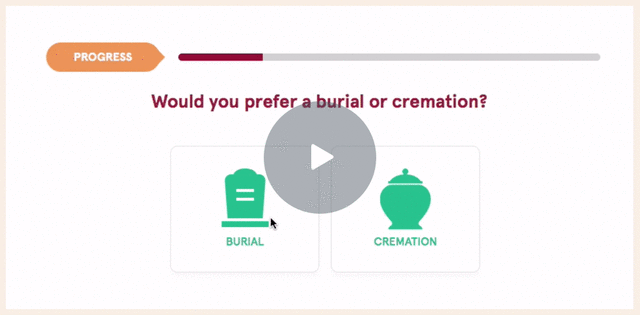
Breaking your forms into multiple steps is an excellent way to ease the process for your target, providing digestible chunks that minimise on distraction.
Pair this with people’s need for congruence, and you’ll often find that with the right questions put first people will continue to fill out a form right until the end having already said ‘yes’ or agreed to questions in the previous steps.
NOTE: If using multistep, tell people where they are!
If you’re doing the above, make sure you let the user know where they are within the journey – step 1 of 3. If they get too far through and can’t see their progress or the end in sight, they’re going to get frustrated and leave.
Show the user their progress to avoid any confusion
If you’re collecting a lot of mundane information, it can potentially be a little daunting to go through the standard process of filling out blank white fields with text, but do not fear…
Quiz style and interactive forms are an incredible way to engage your user and keep them stuck to your form through until the end. These forms utilise images, buttons, colours, smooth transitions and lots of fun trinkets to make the experience engaging for the user.
When utilised correctly you can really tap into some psychological triggers to create confidence and congruence with your visitor.
There are some excellent services out there such as Leadformly or Typeform that make creating such forms a breeze.
No matter what information you’re asking for, make sure you’re giving the user the feedback they need to enter it correctly.
I’m sure you’ve encountered this before, but let’s look at an example.
You’ve taken the time to fill out a form, checked through all the details and hover that cursor over the submit button, click.
Error – you’ve entered an incorrect phone number.
Okay sure, maybe I need to put dashes in it? or spaces? or a + at the beginning? Who knows?
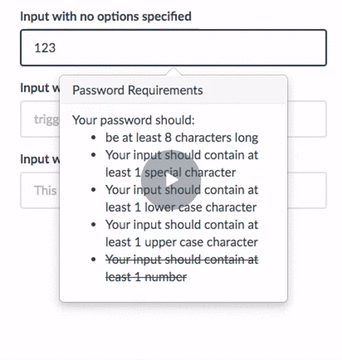
Make sure your form validation happens as the user is filling out the form, and make sure it’s descriptive.
If you’re asking for a password that requires an uppercase letter, lowercase letter, number and symbol then state it and confirm to the user in real-time once each is achieved.
Telling the user exactly what you require in realtime provides clarity and avoids drop off
Any tactic you can do to minimise input and friction is a must, which is where pre-population can really shine.
If you’re asking a user for their full address, consider adding a postcode lookup to minimise typing so that they only have to enter one field.
If you need them to enter their utility company, provide them with a dropdown of active providers within their area based on their postcode.
If they’re arriving from another service where they’ve already entered details such as their name, pre-populate it so that they don’t have to retype it (and even report it back to them in a conversational tone for added brownie points – ‘Hello Andy, please finalise the details below’).
Remove and friction or unnecessary steps and watch conversions rise.
By now you’ve already taken the steps to ensure you’re validating the user data in real time, ensuring each visitor knows exactly what they should be entering and how. Now it’s time to take it to the next level with live verification services.
What are live verification services?
Put simply, these little beauties will register a user’s input such as their phone number, post/zipcode or email address and check that it’s a real or live entry which can have a massive impact on your lead quality.
Just don’t do it.
If you don’t ring your prospects, don’t ask for their phone number. Especially don’t ask for their day, evening, home, mobile, office and great uncles number.
Anything you can do to reiterate and cement the trust of your offering to the end user should be done. A great way to do this when capturing leads is to emphasise any ‘trust elements’ in or around your form. These could be accreditations, security seals, the benefits of your service and social scores such as TrustPilot ratings.
With a massive increase in mobile browser usage in the recent years, the onus has never been more important on providing users with fast, efficient and frictionless opportunities to get what they need and take action.
A seemingly small but super effective way of increasing your form fills on mobile is to ensure you’re using the correct field types.
What do I mean by this?
When coding a form, each field is defined by a type such as ‘name’, ‘email’, ‘tel’ and so on. These types are responsible for working a little bit of magic that changes the keyboard on the visitor’s device to match the relevant scenario.
For example: utilising the ‘tel’ field type on a phone field will bring up the numeric dial pad allowing for quick number entry.
The ‘email’ field type will bring up an optimised keyboard that presents relevant email symbols such as @, .com and so forth.
So, the user has made it this far. They’ve entered their coveted details, been guided and reassured throughout and are now ready to push that final button!
The Formidable Form Toolbox
Luckily for you, there are some excellent resources out there to add to your arsenal and ensure you create forms with attitude. Such as:
The services above are tried and tested, plug and play libraries that allow you to get moving quickly on implementing as many as the tips possible to ensure you’re making the most of your traffic.
The Hall of Fame
There are many poor examples of forms out there, but we’re here to chat about the great, and how you can make yours the king of all.
With that in mind, let’s look at some examples of awesome forms that are really nailing it and making the input process quick, easy and fun.
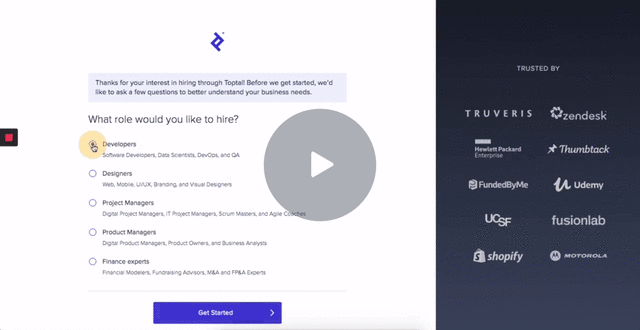
TopTal
TopTal utilise a multistep process that provides a quick and seamless sign up
TopTal are a market leader in hiring top talent from a nature of different fields for your business. The potential complexity of such a broad offering means that they need to provide a clean sign up process for anyone that may not understand exactly what they’re looking for. They’re doing many things to help with this including:
A multistep, single question flow which avoids distraction and provides congruence through a series of relevant questions
Realtime form validation to communicate valid inputs
Highlighting of their clients which include many large and noteworthy brands to provide trust in their offering
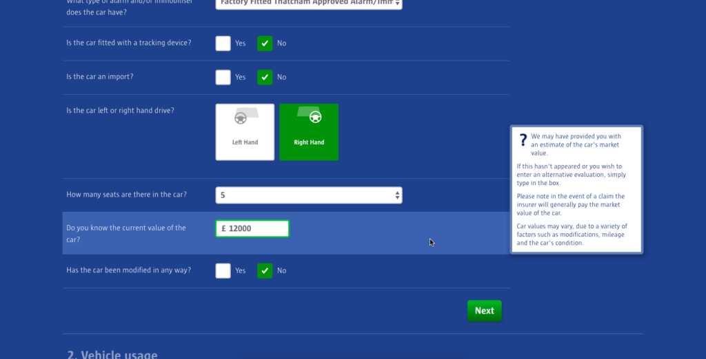
Compare the Market
Compare the Market not only pre-populate information, but also provide realtime validation and useful tooltips
Compare the Market are certainly up there when it comes to providing a flawless usability experience with their forms. Everyone knows how painful it can be to enter the troves of information required to get insurance quotes, however through a use of different tactics and principles they make the process a breeze. They’ve implemented features such as:
Data pre-population based on a specific input, which in their instance includes pre-filling vehicle information based on the entry of a single registration, as well as full address population based on the entry of a single postcode.
Realtime field validation to report whether an entry is correct or not
Informative tool tips that are presented on hover of a field area (as a whole) so that you can make an informed decision on your entry without having to navigate away to find the answers
Multiple interactive field types such as text, dropdown, multiple select and image select buttons for an enhanced experience
Multiple steps which are clearly labeled so that a user knows where they are in the process and what’s required next
All of these points add up to a pretty powerful and user friendly form.
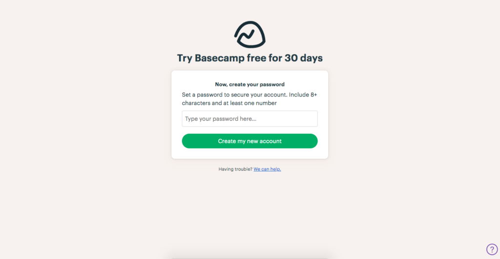
Basecamp
Basecamp keep things simple, and tell you exactly what they need upfront to minimise any friction or frustration
Most likely the simplest form on this list, however worth mentioning due to it’s pure simplicity. The form Basecamp are providing is for a 30 day free trial that involves no commitment and no credit card details to proceed. With that in mind, they’ve broken the form down into two very simple steps, one of which asks for your name and company name, an the other that asks for your password. Why’s this so great?
They don’t ask for any unnecessary information that may cause friction, they simply collect everything they need to setup an account
They tell you in a clear and simple manner what is required to constitute a valid password, no fluff, no guessing
Simple is better. If you don’t have to overcomplicate the process then don’t. If you’re running a service such as a software, you will have plenty of time once the client is onboard to collect the extra information you require.
These 12 super simple tips will ensure your forms convert!
If you’ve enjoyed watching this video and you don’t want to miss out on any tips like this in the future join our newsletter: https://landingpageguys.com/newsletter
We don’t spam! We only send out one email every month with all the information you need to make your website/landing page successful.