This guide will teach you everything you need to know about conversion design, from the basics of designing effective above-fold elements and calls to action to implementing AIDA principles, psychological triggers, and more. By the end of this guide, you’ll be able to design pages that are optimized
This guide will teach you everything you need to know about conversion design, from the basics of designing effective above-fold elements and calls to action to implementing AIDA principles, psychological triggers, and more. By the end of this guide, you’ll be able to design pages that are optimized for conversions without investing in expensive optimization software or hiring a conversion rate expert. Whether you’re working on a landing page, an eCommerce site, or anything else, this guide will give you the tools you need to design pages that convert.
Conversion design has become one of the most important aspects of online marketing, as it can make the difference between a successful website or landing page and one that fails to convert visitors into customers or subscribers.
Conversion design is the process of designing a website or landing page with scientific precision, tried and tested psychological triggers, persuasion principles that guide the user’s eye, and a focus on maximizing the number of conversions (sales, sign-ups, etc.). It aims to help businesses convert visitors from the day the landing page gets live, and you have your first visitor.
After a visitor clicks on your social media ad or any other type of online marketing you have employed to bring them to your landing page, the design of this page will determine whether they stay and convert or leave without taking any action.
Conversion design works to find what is called the offer-to-visitor match. Following are some of the main factors that influence a conversion:
AIDA principles, i.e., Attention, Interest, Desire, and Action
Persuasion principles, i.e., social proof, authority, scarcity
Above-the-fold element design calls to action, layout, colors, images, copywriting, usability
User experience, i.e., navigation, design, flow
Copywriting, i.e., headlines, calls to action, body copy
We will talk about all these conversion design elements in detail later in this guide.
People often misunderstand conversion design as simply “designing apretty website.” However, there is much more to it than that. A pretty website may get visitors, but if it’s not designed with conversion in mind, those visitors are likely to leave without taking any action.
What’s the difference between a website that’s been designed for conversion and one that hasn’t? The answer lies in the details.
Apretty landing page may get visitors, but if it’s not designed with conversion in mind because:
It has no clear purpose or value proposition
There’s no compelling call to action
The design is cluttered and overwhelming
The user experience is poor
The above-the-fold content isn’t effective
The page takes too long to load (page speed is important for conversion)
A landing page that’s been designed for conversion:
Has a clear purpose or value proposition
Has a compelling call to action – above the fold
The design is clean and uncluttered
The user experience is good – easy to navigate
The above-the-fold content is effective – clear and concise
The page loads quickly – important for conversion
Conversion design is different from traditional CRO (conversion rate optimization) in that it’s a holistic approach to designing and building websites and landing pages with the sole purpose of maximizing conversions, even without testing.
On the other hand, CRO is a data-driven approach that uses A/B testing and experimentation to find what works best for a particular website or landing page. We have covered in detail the difference between conversion design and CRO in this guide. Meanwhile, let’s move on and find out how you does conversion design work.
Conversion design is all about understanding what works to convert visitors into customers or subscribers and then designing your website or landing page accordingly. It starts with understanding your target audience and what their needs are. Once you know this, you can then create an offer that speaks to their needs and desires.
Let’s see how this works. The purpose of conversion design revolves around 3 things:
Persuade the customer to buy your product service or subscribe to your newsletter
Hook them to want your offer now
Want them to buy only from you
How can we achieve this? How do we persuade the customer? How do we make them want our offer now and not later? And how do we make sure they buy only from us?
There are a few considerations that come into play when answering these questions:
AIDA principles
Persuasion principles
How do we utilize these principles on a landing page, website, or even an email? The answer lies in the above-the-fold section, user experience, copywriting, and many other design elements that we will discuss in detail below.
There are certain elements of design that work together to achieve these goals.
They are:
Above-the-fold design
Calls to action
Layout
Colors and Images
Copywriting
Mobile-friendliness
Social proof
Authority
Scarcity
User experience
Let’s take a closer look at each of these in turn and how they can be used to improve conversion rates.
Above-the-fold design
Conversion design focuses on above-the-fold elements as the main hook to persuade visitors to stay on the page and take action. There are certain elements that should be included in an effective above-the-fold design:
What do visitors search for when they land on your website? Do you offer what they’re looking for?
Your value proposition: what are your product’s or service’s main benefits? Are others buying from you?
Start with the unique selling point – the pain points your product or service solves.
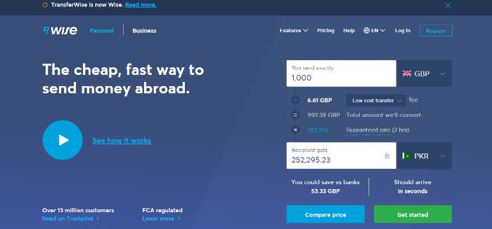
Check this screenshot from Wise:
ROI Calculator from ConverionWise
They are highlighting what they are popular for. The cheap and fast way to send money abroad. Since they have placed the conversion calculator on the home page, visitors can be sure of no hidden charges and the amount they need to pay.
The next conversion design tip is to use social proof to show that others are using your product or service and are happy with it. You can use customer testimonials, reviews, and customer logos to achieve this. You can also use 5-star ratings to show the quality of your product or service. This is a great way to show social proof and encourage visitors to buy from you. In fact, you can use the authority logos of businesses who you have worked to show that you are a credible source.
Social proof on the Homepage
The third main element that conversion design focuses on is the call to action or CTA. The CTA should be prominently placed on the page and must be clear and concise. It should tell visitors what you want them to do – buy your product, subscribe to your newsletter, etc.
Color psychology equally plays an important role in conversion design. The color of your CTA button should be in contrast to the background color and must be large enough to be easily seen.
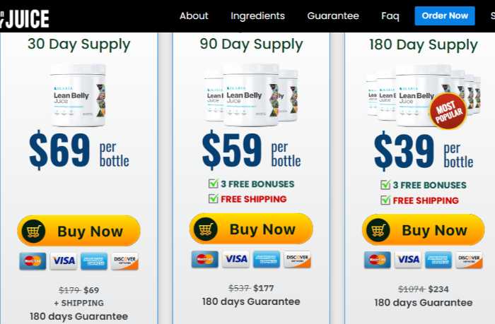
Check this screenshot:
Bundle offers
Do you see the color variation? The CTA button is in yellow, which is in contrast to the white background. The 3 free bonuses button has green, whereas free shipping has red. This makes it easier for visitors to take notice of these elements.
Mobile-friendliness
With more and more people using mobile devices to browse the web, it’s important to make sure your website is mobile-friendly. This means that your website should be designed to be easily viewed on smaller screens.
Your website should have a responsive design that automatically adjusts to the device’s screen size. You should also use large font sizes and buttons so visitors can easily tap on them.
User experience
Last but not least, conversion design also focuses on improving your website’s user experience or UX. This means ensuring visitors can easily find what they’re looking for on your website and have a smooth and enjoyable experience while browsing.
You can achieve this by using easy-to-navigate menus, proper labeling, and eliminating clutter. You should also make sure that all your pages load quickly.
This is how we utilize the conversion design elements, persuasion principles, and user experience to create an effective website design that does not depend on traditional CROeat and is easy to follow, right?
Now that we’ve looked at the main elements of conversion design, let’s take a more detailed look at the BIG why behind the conversion design process.
Conversion design is important because it helps businesses increase their conversion rate – the number of visitors who take the desired action on their website.
Following are the main reasons why conversion design is so important when it comes to overall website design:
It helps you focus on the right things.
The main aim of conversion design is to increase conversions. This means that it helps you focus on the right things – those elements of your website that have the biggest impact on conversion rates.
Trust, trust, trust: Businesses never focus on building trust with their potential customers. This is one of the most important aspects when it comes to increasing conversion rates. If visitors don’t trust you, they’re not going to buy from you.
When we have strong value propositional elements above the fold and use trust-building elements, we are more likely to see an increase in conversion rates. These two factors work together to create a powerful combination that can help you increase conversions.
When a visitor lands on your website or page, you are inviting them to invest their time and attention into what you have to say. If visitors don’t trust you, they’re not going to invest their time and attention into your website.
That’s why it’s so important to build trust with your potential customers. In fact, you can further strengthen the trust element with FAQs schema markup.
It helps improve the overall user experience.
Another important reason for conversion design is that it helps improve your website’s overall user experience or UX.
When you focus on increasing conversions, you’re also automatically focusing on improving the UX of your website. This is because the two go hand-in-hand.
You can implement scarcity and urgency tactics to increase conversion rates, but if your website has a poor UX, visitors are still going to leave.
Scarcity, for instance, can be implemented with emotive sayings or sentences that arouse the psychological FOMO effect in people, encouraging them to take action.
For instance, if you’re selling men’s shoes, scarcity can be achieved by saying, “only 4 pairs left in stock” or “act now before it’s too late.”
Urgency, on the other hand, can be created by using countdown timers. This encourages visitors to take action before it’s too late.
Both of these tactics can be effective in increasing conversion rates, but they will only work if your website has a good UX.
Conversion designs connect each element on your site
The second last of the list, conversion design connects each element on your site. Most businesses don’t think about how the different elements on their website are connected. It connects each element on your website. Visitors should be able to find what they’re looking for on your website easily.
When you implement AIDA principles and persuasion hacks, you know where to place the images on site, what element to use in the above-the-fold section, where to place the CTA button, and so on. All these factors play an important role in increasing conversion rates.
Suppose you want to learn more about conversion design and how it can help you increase conversions. In that case, you can join thousands of businesses in Conversion Rate Academy, where we kill it with conversion strategies on a daily basis.
You get to improve ROI without increasing your marketing spend
Finally, one of the best things about conversion design is that it helps you improve ROI without increasing your marketing spend. You can achieve this by optimizing your website for conversion. This means that you focus on those elements of your website that have the biggest impact on conversion rates.
Let’s say, for example, you are getting a 2% conversion rate. If you can increase it to 3%, that’s a 50% increase in conversion rate. But if you can increase it to 4%, that’s a 100% increase.
You can see how even a small increase in conversion rate can have a big impact on ROI. And conversion design is all about increasing conversion rates.
You can use this ROI calculator by ConverionWise to calculate the impact of conversion rate changes on your ROI.
ROI Calculator from ConverionWise
Do you see? With only a 3.5% increase in conversion rate, you get a 50.00% increase in ROI. How do you get this additional 3.5% in conversion rate? You guessed it – by focusing on conversion design!
If you’re not already doing so, I encourage you to start focusing on conversion design. It has benefits beyond just increasing conversion rates.
Let’s move to the benefits of conversion design for e-commerce stores.
If you have an eCommerce store, running a successful business is all about making more sales. And conversion design can help you do just that.
Here are some of the benefits of conversion design for e-commerce stores:
1) Saves time and money!
The first benefit of conversion design is that it saves you time and money. Traditional marketing methods require you to constantly create new content, focus on a/b testing, and make changes to your website. Conversion design, on the other hand, is a set-it-and-for-get-it method. Once you have your conversion-optimized website, you can focus on other aspects of your business. Your chances of converting visitors when they land on your site are higher than ever before. Because you have used every element of your website strategically based on conversion psychology. So you free up your valuable time and money, which you can now use to grow other areas of your business.
2) Increased conversion rates
The second benefit is increased conversion rates. As I’ve said before, the whole point of conversion design is to increase conversion rates. Since everything on the site is at 100% conversion potential, you are bound to see an increase in conversions. What do customers see on a site designed based on AIDA principles, persuasion hacks, and other conversion strategies? They see an offer they can’t refuse, a CTA that is too good to resist, and an overall design that is optimized for conversion. All these factors play a vital role in increasing conversion rates.
3) Improved ROI
Though we talked about this before, it’s worth mentioning again – conversion design improves ROI. How? By increasing conversions without increasing your marketing spend. Remember, you can achieve this by optimizing your website for conversion. This means that you focus on those elements of your website that have the biggest impact on conversion rates.
4) Helps you stand out from the competition
Let’s face it. In today’s day and age, there is a lot of competition out there. And the only way to stand out from the rest is by offering a better user experience. This is where conversion design comes in. By following the best practices of conversion design, you can make your website more user-friendly and offer a better experience than your competitors. As a result, you’ll be able to acquire and retain more customers.
Nothing beats a website that is designed for conversion. If you’re not already using conversion design on your website, I encourage you to start today. It’s the best way to increase sales and grow your business.
Now that you know all about conversion design and the benefits it offers, you might be wondering how you can get started.
Keep the excitement in because it’s easier than you think. In this section, we’ll take a look at some of the things you need to do to get started with conversion design.
But first thing first. We are talking about strategies that will increase your website’s conversion rate of your website but what about the factors that kill it? Before we start with the how-to’s of conversion design, let’s look at some common mistakes that can kill your conversion rate.
Your pages are confusing.
Fact: People are lazy. They don’t want to put in the effort to figure out what your pages are all about. Yoast, a popular SEO plugin, studied how their users interact with their website. They found that people spend an average of 5 seconds on a page before clicking the back button. This means you have 5 seconds to make an impression and communicate what your page is about. If you don’t, they’re gone.
Do you see? How confusing this page is. Readers are bombarded with too much information all at once. They can’t decide which card would be the right choice. Confusion leads to frustration which in turn kills conversions.
Your pages aren’t credible.
Fact: In order for people to trust you, your pages need to look credible. This means that they should have a professional design, well-written copy, and testimonials from happy customers.
If your pages don’t look credible, you will have difficulty converting visitors into customers.
For instance, take a look at this landing page:
Homepage of Quebec
Do you see how much information is present here? How do you expect people to read all of this and still take action? Remember, there are thousands of options available online. If you want people to choose you, you must make it easy. A cluttered page is not going to do the trick.
Your offer sounds meh.
Fact: If your offer is not good enough, people are not going to convert. It’s as simple as that.
If you have a good offer, it doesn’t guarantee that you’ll get conversions. There are a lot of other factors that come into play. For instance, how do you present it? Is it in the form of a banner or a pop-up?
The way you present your offer is just as important as the offer itself. If you’re unsure how to do it, look at this guide.
Check out this screenshot:
Poor landing page example
What’s wrong with it? Is it a landing page or a legal note? It is so cluttered that readers have no idea what’s going on. As a result, they’re not going to convert.
The offer could be better if they presented the information in a more organized way. For instance, they could use bullet points or highlight the most important information.
Now let’s see how we can get started with conversion design.
The first step is to assess your current website. Does it have all the elements necessary for a conversion-optimized website? If not, you’ll need to make some changes.
1) What’s your goal?
The first step in any conversion design project is to identify your goal. What do you want your landing page to achieve, and is your current page up to the task?
When you know your goal, you can start to think about how you will achieve it. What elements will you need on your page, and what copy will you use?
Determine what aspects of your business should be highlighted – what makes you stand out from the competition?
Think about what offer you’re going to make to your visitors. What will entice them to take action and convert?
And finally, consider what call-to-action you’re going to use. What will urge visitors to take the next step?
Check this screenshot from Wag:
Wag Homepage
Now, do you see how simple yet effective this page is? Everything on the page has a purpose and is there to help the visitor take the next step.
It builds trust by showing that 351k caregivers are already community members and has a clear form that helps visitors understand what they need to do. The form is very simple – just your name and email.
The copy is short and to the point, yet it tells the visitor everything they need to know. The page’s goal is clear – to get visitors to sign up for the newsletter.
And finally, the CTA is simple and effective. It’s not overwhelming, and it’s easy to understand.
Apply AIDA
The next step is to apply the AIDA model to your page. As we mentioned before, AIDA stands for Attention, Interest, Desire, and Action.
You need to ensure that your page grabs the attention of your visitors immediately. Use eye-catching headlines and images that will grab their attention.
Once you have their attention, you need to keep them interested. Use engaging copy and relevant images to keep them interested in what you have to say.
Then, you need to create a desire for your product or service. Use strong copy and images to show your visitors what they’re missing out on if they don’t take action.
Check this screenshot with all the elements of AIDA:
Homepage of TalkSpace
Do you see? The headline is attention-grabbing because it shows the therapist is licensed in accordance with the law. The image is also relevant; it shows a woman smiling, which builds trust.
The copy is interesting because it talks about how the therapist will help you with your problem. And finally, the CTA is well placed with green color that stands out, and it’s easy to understand what you need to do – click the button.
Apply Persuasion principles:
The third is to learn about persuasion. Persuasion is all about using the right techniques so that you know how to get started with conversion design; it’s time to learn about persuasion. Persuasion is all about using the right techniques so that you know how to get started with conversion design; it’s time to learn about persuasion.
Following are the’s time to learn about persuasion. Persuasion is all about using the right techniques to influence your visitors to take action.
Here are some persuasion principles that you can apply to your page:
More authority= more influence
Social proof
Scarcity
Pain-pleasure principles
Need for consistency
Solve all the objections
Visuals to support your points
Persuasion principles are important because they help you understand how to get people to take action.
And finally, don’t forget the basics:
The last thing to keep in mind is the basics. Make sure your page is well-designed, easy to navigate, and fast loading.
Conversion design is about making it easy for visitors to take action. If your page is hard to use, they will not stick around. Where to use what, how to combine all the elements, and how to get started with conversion design isn’t easy as each industry, each business, and even every niche differs from others.
How much white space should be left out?
Where exactly should you place the CTA button?
What’s the most effective font size to use?
How can you make sure your pages are mobile-friendly?
Should you add social proof above the fold or below it?
Does it vary according to your niche and industry?
You can’t learn conversion design strategies without having a good foundation in the basics of design.
Where Can I Learn More About Conversion Design?
The design of landing pages plays an important role in the success of your website. We know that. What it needs is good time learning, learning, and more learning.
ConversionWise has been in the market for over 10 years, creating the highest converting landing pages for our business and clients.
We have created 7-figure, 8-figure, and 9-figure landing pages. We know how to get results. Only carefully chosen design strategies, the right placement of elements, and powerful persuasion can help you achieve these results.
This is where we have been able to help our clients by providing a complete solution that not just looks amazing but also gets results.
That’s how Conversion Rate Academy was born, where we help people learn how to design, persuade, and get results with their pages.
Conversion Rate Academy is our flagship program that has helped thousands of businesses like yours get the results they need from their pages.
How does Conversion Rate Academy Work?
Conversion Rate Academy
At Conversion Rate Academy, we provide you with all the resources you need to get started with conversion design. A complete library of training materials, templates, and resources that you can use to create high-converting pages.
We also have a private community where you can ask questions, get feedback, and connect with other like-minded people who are on the same journey as you. Plus, we have regular live trainings and office hours where you can get all your questions answered.
If you’re serious about learning conversion design, then Conversion Rate Academy is the place for you.
So, that’s it from this ultimate guide to conversion design. Nothing is left out. We have covered everything you need about conversion design, from the basics to the advanced strategies. What helps you get started and achieve results with your pages? Now, it’s time for you to take action and apply what you’ve learned.
If you want to go to the next level of persuasion and learn more about getting people to take action, then we can help you get into the academy. Get started with the program today and see results in as little as 30 days.


