Conversion design is the future of organic conversions without going into traditional advertising. It’s a new way to think about marketing that emphasizes the user experience and how to turn browsers into buyers.
Conversion design is the systematic process of using AIDA principles, persuasion triggers, and psychological techniques to increase the percentage of visitors to a website who take the desired action, such as making a purchase, signing up for a newsletter, or filling out a contact form.
The key to successful conversion design is to understand what motivates your target audience and then craft a user experience that appeals to those needs.
If we are, to sum up, how conversion design works, it would look something like this:
- Make your ideal prospect desire your offer whatever it is.
- Make them want it immediately now.
- Make them want to get only from you.
- Take away any possible objections they might have.
So, how can you start using conversion design principles to increase your website’s conversion rate without investing in traditional advertising?
Develop Your Page for Mobile Users
Ecommerce starts from developing a landing page that is mobile-responsive. A majority of internet traffic now comes from mobile devices, so it’s important to make sure your Landing page is optimized for mobile users. This means using a responsive design that automatically adjusts to fit the screen size of the device someone is using.
It also means making sure your content is easy to read on a small screen and that your forms can be easily completed on a touchscreen.
Mobile users have different needs and expectations than desktop users, so it’s important to tailor the user experience to them.
After your web page is mobile responsive, the second step is to…
Make Sure Your Pages Load Quickly
The average mobile user has a very short attention span, so it’s important to make sure your pages load quickly.
In fact, research has shown that a one-second delay in page load time can result in a 7% decrease in conversion rate. There are a number of things you can do to improve your page speed, such as optimizing your images and using a content delivery network.
Google uses page speed as a ranking factor in its search algorithm, so it’s also important from an SEO perspective.
If you don’t know how fast your pages are loading, you can use Google’s PageSpeed Insights tool to find out or you can use Pingdom’s speed test tool to test the load time of individual pages. If your pages do not load in 3 seconds or less, you need to work on improving your page speed.
Follow these steps to improve your page speed:
- Reduce the size of your images. You can do this by using a tool like Photoshop or an online service like TinyPNG.
- Make sure you’re using a content delivery network (CDN). A CDN stores your website’s static content, such as images, in servers around the world and serves it to users from the server that’s closest to them. This can greatly reduce page load times.
- Use a caching plugin. This will create a static version of your pages and serve that to users instead of rebuilding the page every time someone visits it.
The third step is to…
Utilize Above the Fold Element of Your Page
When a user clicks on your ad and arrives on your landing page, the first thing they see is called “above the fold.” This is the portion of the page that’s visible without having to scroll.
You only have a few seconds to make a good impression on your visitors, so it’s important to use this space wisely.
Following are the persuasive and effective elements that should be placed above the fold on your landing page:
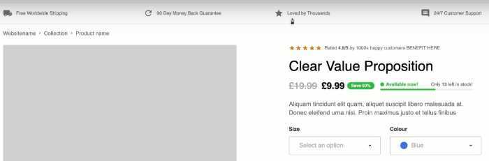
1) A clear value proposition
When someone arrives on your page, they should immediately understand what you’re offering and why it’s valuable to them. Benefit-driven headlines and subheadings are a great way to do this.
Make sure your value proposition is clear, concise, and easy to understand. An emotive language that speaks to the user’s needs and desires can also be effective. Let’s say you’re selling a weight loss product.
Instead of using the headline “Lose Weight Fast,” you might use something like “Shed Those Unwanted Pounds Quickly and Easily.”
This tells the user what they can expect from your product and how it will benefit them.
2) A compelling image or video
Conversion design focuses on using emotive visuals to get users to take action. The image or video you use on your landing page should be persuasive and visually appealing. When visitors see it, they should be able to immediately understand what your product or service is and how it can help them.
An emotive image is often more effective than a literal one. For example, if you’re selling a weight loss product, you might use an image of a person who looks happy and confident after losing weight, instead of just an image of the product itself.
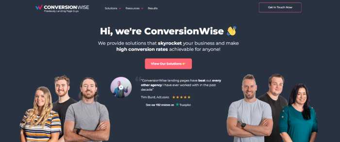
Check this screenshot:
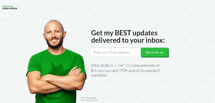
Look how simple yet effective the image is. It’s not just emotive but building trust as well. The copy is simple and they have used the white space well too.
The headline is short, sweet, and to the point. It tells you exactly what you can expect from the service and how it can benefit you. The subheading reinforces this by providing more information on what the service does and how it works.
4) Social Proof:
If you don’t add social proof on your landing pages, you’re missing out on a huge opportunity to boost conversions. Conversion design is all about persuasion, and social proof is one of the most persuasive elements you can use.
How can you use social proof on your landing pages?
There are a few different ways:
Testimonials: Customer testimonials are one of the most effective forms of social proof. They show potential customers that other people have used your product or service and been happy with it.
5-star ratings and reviews: If you have positive ratings and reviews from third-party sources, make sure to showcase them prominently on your page.
Media mentions: If you’ve been featured in any popular publications, make sure to mention it on your page. This will show potential customers that you’re a credible and trustworthy company.
When users click on your ad and arrive on your landing page, the first thing they see is called “above the fold.” This is the portion of the page that’s visible without having to scroll.
5) Call to action (CTA):
The next strategy that is used above the fold is to include a call to action (CTA). A CTA is a button or link that encourages users to take a specific action, such as “Sign up now” or “Buy now.”
Your CTA should be placed in a prominent location on your page, such as above the fold or in the middle of the page. It should be highly visible and easy to find. Color psychology plays a huge role in the CTA button too.
The color of your button should contrast with the color of your page so that it stands out and is easy to see. For example, if your page is mostly white, you might use a green or orange button.
Now after reading all this, if you’re thinking to yourself “this is a lot of work,” you’re not wrong. But the great thing about conversion design is that once you’ve created a high-converting landing page, you can use it over and over again for different campaigns and products.
After above the fold, the next thing users will see is the body copy. This is where you’ll include more information about your product or service and how it can benefit users.
Checklist for The Rest of the Page:
1) Cart and Checkout optimization
The shopping cart is often a point of friction for customers. They may add items to their cart only to abandon it later. This is why it’s important to optimize your shopping cart and checkout process.
There are a few different ways you can do this:
Make sure the checkout process is as short and simple as possible. The fewer steps there are, the better.
Include progress indicators so users know how many steps are left in the checkout process. Allow guest checkout so users don’t have to create an account to purchase from you.
Make sure your shopping cart is visible on all pages of your site so users can access it at any time.
Check this screenshot:
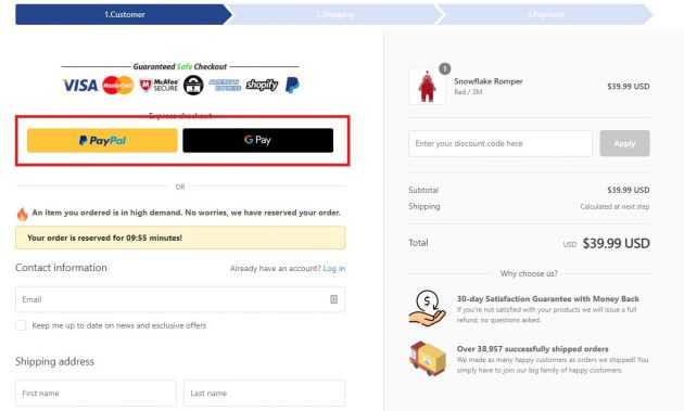
Look how easy and straightforward the checkout process is. There are only 3 steps, and each step is clearly indicated. The progress bar shows users how far along they are in the process. It converts because it’s easy to use and understand.
2) Upsells, cross-sells, and suggestion walls
You can also increase your conversion rate by using upsells, cross-sells, and suggestion walls. Conversion design experts use these strategies to increase average order value (AOV).
An upsell is when you offer a customer an upgraded version of the product they’re interested in. For example, if someone is looking at a basic smartphone, you might upsell them to a more expensive model with more features.
A cross-sell is when you offer a related product to the one the customer is interested in. For example, if someone is looking at a winter coat, you might cross-sell them a scarf or gloves.
A suggestion wall is when you offer a customer a selection of related products. For example, if someone is looking at a book on Amazon, they’ll see a suggestion wall of other books that are similar.
Check this screenshot:

3) Everything bundles
Bundles are another great way to increase your AOV. When you offer a bundle, you’re essentially selling multiple products for a discounted price. This is a great way to increase sales while also giving customers a good deal.
When you have products that complement each other, consider bundling them together. For example, if you sell wireless headphones, you might bundle them with a case and a charging cable.
Check this bundle option from thedentitox101:
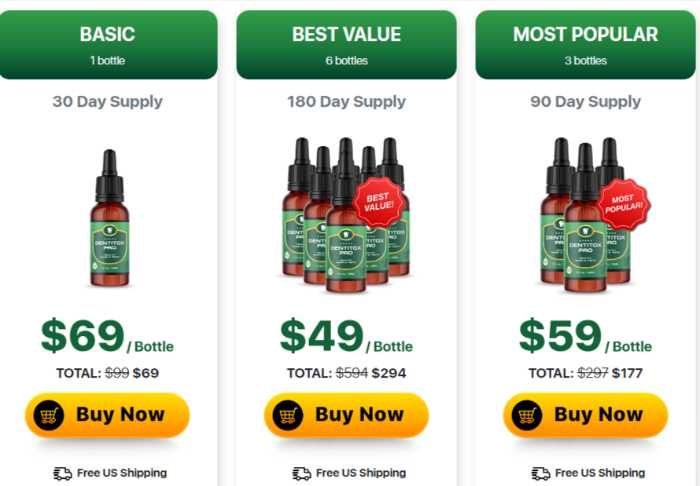
Do you see? The middle option is the one they want you to pick. They will have to pay more to get the other items but they will get a discount. One bottle costs $69 if you go for one only. But if you buy the bundle, you’ll get 6 bottles of detox, the price comes down to $49 per bottle. So it’s a win-win for both the customer and the business.
Now, let’s move to the last part of our conversion design guide:
Persuasion Principles
Last but not least, we have persuasion principles to get started with conversion design. Persuasion principles are psychological techniques that businesses use to influence customer behavior.
There are many different persuasion principles, but we’re going to focus on three of the most important ones: Authority, trust and scarcity.
Authority
The principle of authority is based on the idea that people are more likely to do something if they perceive the person telling them to do it as an authority figure.
For example, if a doctor tells you to take a certain medication, you’re more likely to do it than if a friend tells you to take it. This is because we perceive doctors as authority figures.
You can use the principle of authority to increase your conversion rate by using testimonials, reviews, and customer logos on your site.
Check this screenshot:

Shopify is simply sharing how millions of people use their platform every day. They are using the principle of authority to increase conversions.
Trust
We have talked about the trust elements before in this article so won’t talk in detail. The principle of trust is based on the idea that people are more likely to do business with companies they perceive as being trustworthy.
Trust can help you to increase your conversion rate in two ways. First, it can help you to get more visitors to your site. Second, it can help you to get more visitors to take action on your site.
Scarcity
The principle of scarcity is based on the idea that people want things that are rare or in limited supply.
For example, if you see a pair of shoes you like but there’s only one pair left in your size, you’re more likely to buy them than if there were 10 pairs left in your size. This is because the shoes are rare and you might not be able to get them again if you don’t buy them now.
Check this screenshot:

This is a classic example of scarcity. “Hurry Only 1 Left” creates a sense of urgency and encourages people to buy the product before it runs out.
The idea is to make people think they might miss out on something if they don’t take action now.
You can use scarcity to increase your conversion rate by using countdown timers, limited-time offers, and low-stock warnings on your site.
So, that’s it! These are three important persuasion principles you can use to get started with conversion design.
Wrapping Up
We have discussed all the elements you need to get started with conversion design. We have also looked at the responsive landing page development, above-the-fold content, psychological techniques, checklist for the rest of your page, and the three most important persuasion principles.
However, conversion design is not a one-time thing. It’s an ongoing process that you need to constantly work on if you want to keep your conversion rate high. At ConversionWise, thousands of businesses learn, test, learn again, and grow their conversion rate by an average of over 30%.
We have founded Conversion Rate Academy – the first online school for conversion rate optimization, where people can learn all about conversion rate optimization and how to increase their conversion rate. We are a community of conversion design experts who have helped 7-figure, 8-figure, and 9-figure businesses to increase their conversion rates.
Who is Conversion Rate Academy for?
Everyone who wants to learn about conversion rate optimization and how to increase their conversion rate.
The course is for:
- Ecommerce businesses
- Lead generation businesses
- SaaS businesses
- Startups
- Entrepreneurs
- Digital marketing agencies
Everyone who wants to learn about conversion rate optimization and how to increase their conversion rate. If you want to increase your conversion rate, join the academy today!
/