Welcome to another session of ConversionWise. In this post, I will talk about Mobile Hero Section: Key Elements for Conversion.
But before we move on, I would like to make an announcement. If you are reading this session as a blog post on our website, watch the video session of this blog on our channel on YouTube, “ConversionWise”.
You can also join our free Facebook group, where we teach about getting higher conversions for your business and offer free audit sessions.

In this group, you will learn tips and tricks on how to build your business, increase sales, and improve the ROI of your online course or program.
Now that we’ve got that out of the way, let’s start with our lesson!
In today’s session, we r going to audit four landing pages for a pest control company to identify the key elements for mobile hero sections that can improve conversions.
Nothing sells more than a comforting feeling! And that’s exactly what the hero section on mobile devices can do. With a clear and persuasive message, it can help to boost your conversions on mobile devices.
Some key factors that make a mobile hero section effective are the headline, copy, images and video, CTA buttons, and social proof. A well-designed mobile hero section can help to improve conversion by improving trust and engagement.
However, not all landing pages are optimized for mobile devices. Often, marketers don’t pay enough attention to it or run into design and technical issues while converting desktop pages to mobile.
That’s why, at Conversion Wise, we conduct regular landing page audits to help our Facebook community, our email list, and our clients improve their conversion rates.
We randomly select landing pages that members from our Facebook group have submitted and evaluate them for mobile hero sections. By identifying the gaps in these pages, we help marketers and businesses improve their landing page strategies and increase conversions.
So, without further ado, let’s begin our analysis of the pest control company landing pages.
In this session, we analyze 4 landing pages and give feedback on what’s working well and what needs improvement.
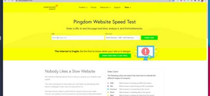
I’m going to use some tools to help me with my analysis. The first one is called “Tools.Pingdom”
With this tool, I can check the page speed and see if any issues need to be addressed.
The second tool I’m going to use is “Built With.” This tool will tell me what technology was used to build the landing page.
Now before I move on, I want to give you a quick overview of what we do at ConversionWise while conducting these audits.
We focus on conversion principles, and we also take a look at the technical aspects of the landing page.
The conversion principles we focus on are:
1) AIDA principles: Attention, Interest, Desire, Action
2) Page load time/speed
3) Trust Icon
4) Social proof
5) Call to action
There might be more, but these are the main principles.
Let’s start with the first one.
1) Garden Tech

Let’s start with the speed of the landing page. According to Pingdom, the average time it takes for this landing page to load is 2.56 seconds. It’s fine but it can be improved. There is room for improvement with respect to speed as it will help to improve user experience and, hopefully conversions.
Now, let’s find the top 5 elements on the hero section of this page.
- Imagery
- Headline
- CTA button
- Social proof
- Trust icons
Gladly, this page has pretty good imagery. They have headlines, social proof, and a trust icon.It’s good you have already used them, but I would not add this much text as I can see that it can be overwhelming for users.

I would remove this in-stock option and replace it with more scarcity or urgency. I would also add a subheading with more emotive words and increase the font size to grab attention.
I would also suggest you have a specific review section on your landing page. It can have a real nice picture with a 5-star icon and individual review snippets. This will also help to improve conversions and trust.
Lastly, you need to add FAQ section as it can clear any confusion and objections a user might have.
Overall, this landing page is okay. A few tweaks and you can increase your conversions.
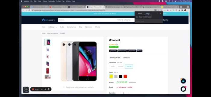
2) Cell Export
The landing page speed of this page is 3.88 s which is not really good. I would suggest using a faster hosting platform, as it can significantly improve the loading time and user experience.
Next, let’s take a look at the top 5 elements on the hero section of this page.
- Imagery
- Headline
- Trust icons/elements
- CTA button
- Social proof
Gladly, this page also has some good imagery. However, the headline is not very clear and needs to be changed. It has social proof plus trust icons so this is good.
But you can’t simply have Iphone as your headline. It should be more descriptive nd emotive. You can say, “The easiest way to transfer your photos, videos, and contacts across all iPhone devices.”
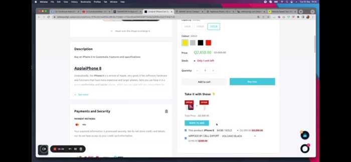
I love the fact you are giving 25% off, but I would also add a countdown timer to the offer. This will create more urgency and increase conversions.
I like you are providing all the details of I phone in a separate section. Whther it is supported or not, how to make an order and so on.
I don’t like the term pre-owned I phones as many people might not like it. I would rename this section to “Certified Pre-Owned.”
I like you have a FAQs section but I would suggest to have some images here as it can reduce confusion and increase clarity.
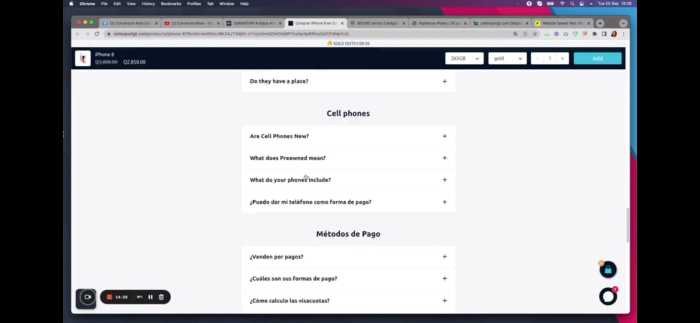
Overall, you have a good landing page here but you need to make a few changes to improve conversions.
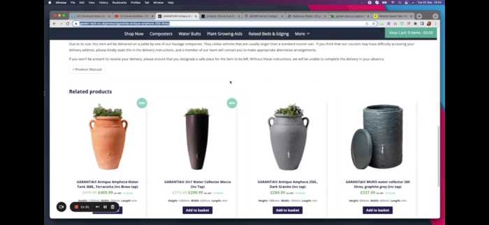
3) Sons Trading Co
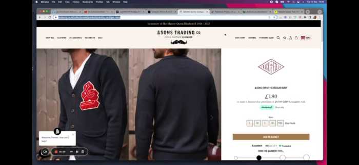
Let’s start with the speed of this landing page. According to Pingdom, the average time it takes for this landing page to load is 5.55, which is not good. We would suggest you use a faster hosting platform, as it can significantly improve the loading time and user experience.
At first glance, your page looks really fine with the trust icons, images, and CTA button.
But we don’t have any social proof or review on this page. I would suggest you add some trust elements and individual customer reviews to improve conversions.

I would ask to have a stronger color call to action as the current one might not be too noticeable. Also, have a 5-star review section to add credibility.
I like you have a good quality content but it’s too texty, try to make it more scannable. I would also suggest you use short sentences or bullet points and break the content into smaller paragraphs.
After this text, I would want a repeat call to action to make sure they are using it.
Lastly, you are missing the FAQs section on this landing page. You need to have general as well as technical questions that customers might have.
Overall, you have a good page but it needs a few tweaks here and there.
4) Righteous Plates

Let’s start with the speed of the page. The speed is 2.55 s which is good as compared to other pages we saw today. So, we would suggest you use a faster hosting platform to improve loading time.
At first glance, your page looks really good with the images, social proof, and trust icons, but I see that there is no headline which is not good for the CTA of a page.
I can clear the CTA button, which is good for the above-the-fold section.
I would suggest using a strong headline with some urgency to encourage users to make an order as soon as possible.
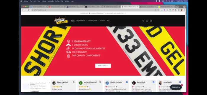
I also like that you have a clear value proposition. I can see you have a free delivery and you are mentioning it very well. You can also provide a money-back guarantee to increase the trust factor.
Also, the CTA button is white which is not making it very visible. I would suggest using a different color to make sure users can see the button more easily.
Down there on your page, you can have a interest page where you tell us about your mission and vision. This will help you win customers’ trust.
You can have your most selling products there as well for your users to see.
Lastly, again, you can have a FAQs section to address all the common questions that customers might have.
Overall, you have a good page but you can improve it by adding a few things. We wish you all the best with your business!
So, there you go! That’s it from audit session. We hope that you found these comments and suggestions helpful. Stay tuned for more posts like this!
/