Landing Page Audits Part 2: Best Practices and More
Landing pages are important for any business. They are the first thing potential customers will see when they go to your website, and they need to be able to effectively sell your products or services.
But even the best landing pages can always be improved. That’s why we’ll look at some landing pages and see what best practices we can glean from them.
But before we move forward, I have a couple of announcements; if you are new here and reading this blog, join us on our Facebook group: Conversion Rate: Academy, where we have lively discussions on all things marketing. You can also get access to exclusive content.
We share exclusive tips, tricks, and resources that you won’t find anywhere else.
Let’s look at some landing pages and see what we can learn from them.
I have chosen 4 landing pages from our free weekly session in our Facebook group, where we ask you to share your landing pages to get expert audits and suggestions.
I will pick up the loopholes, tweaks, and changes that can be made to existing landing pages for a better conversion rate.
Tools I will Use for this Audit
I will be using two tools for this audit:
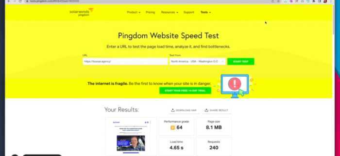
Pingdom.com – To check the page load time, the number of requests, and page size.
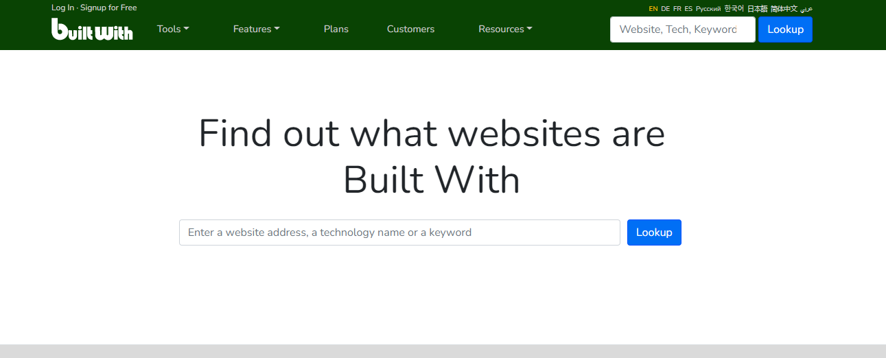
Built With – To check what technology has been used to build the landing page. You can also use this tool to spy on your competition and see what technology they are using.
Best Practices and More Landing Page Audits
Now before I move on, let me tell you what I will follow when auditing a landing page:
I will follow conversion principles and technical aspects and also give suggestions on what changes can be made to improve the conversion rate.
The conversion principles include:
1) AIDA principles – Attention, Interest, Desire, Action
2) Page load time
3) Trust icon and security features
4) Call-to-action buttons and their placements
5) above the fold content – what’s visible when the page
6) Readability
Let’s move on to the audit!
Landin Page Audits – Best Practices and More
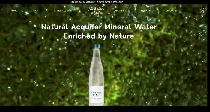
The first landing page is from a company called “Langkawi Pure,” a Natural Aquifer Mineral Water.
Let’s start with the speed test of the page using Pingdom.com.
The page load time is 933 ms which is super cool> let’s move to the ‘Above the fold’ content.

As I mentioned, ‘Above the fold should capture the attention of the user. Right now, I will look for 5 key elements:
1) Imagery: It’s here, and it’s good. The image is of the product, and it’s relevant. But when we click it, it zooms in. Personally, it’s a bit annoying as it doesn’t show the image. I would get rid of it. And if I have to show different images, I would add more images instead of the zoom-in option if I want to show more variety or shapes.

2) Headline: The headline is very plain, I must say. It doesn’t create emotions without any benefits added. It would be good to show some benefits like “Get relief from chronic pain” or something that can trigger an emotional response.
3) Call to Action: I would 100% change the call to action button color. I know you are thinking to create a consistent branding color, but the button color should be in contrast to the background, so it’s visible and easily clickable.
4) Social Proof: I don’t see any social proof on the page, which is essential for building trust. I would either add some testimonials or some customer logos. You can get a 5-star rating, which is an excellent way to build trust.
So, these are the changes that I would make to the “Above The Fold” section.
Let’s move on and see what we find below the fold.
This particular image is good, but it’s not working on the desktop, and I can see a broken image on the right side. Maybe, you can test it on different devices to make sure it’s visible properly.

I cannot see any more CTAs, which is not good. I highly recommend adding a CTA somewhere in the middle or at the end of the page. This way, even if people don’t scroll down, you have a high chance of conversion as the CTA is visible without scrolling.
So, down below, you have added social proof, which is excellent. I would move those up, though, as it’s not visible without scrolling, and people might miss it.

Some key points are missing, like FAQs, which are extremely important for building trust. I would add that as soon as possible, plus I would end the page with a CTR to increase the conversion.
So, highlights are:
1. Improve the headline to add some emotions and benefits
2. Change CTA color
3. Add social proof
4. Fix the broken image
5. Add more CTAs
6. Move social proof up
7. Add FAQs
8. End with a CTA
2) Landing Page Two
2nd Landing Page is from a company called Shisha Quality.

Let’s see how it fares on Pingdom:
The page load time is 644 ms which is pretty good! You guys are doing a great job.

Let’s see what we can find in “Above The Fold”.
This hero section on the desktop is pretty squashed and lost. There is too much padding here. It’s kind of pulled up. So, I would change that.
I would say to give yourself a real hero section; it’s fine to take all the content down and make it one nice big hero section.
I like you talked about shisha quality, benefits, and features in the bulleted points, but I would ask you to add more emotive language in the subheading. I like your CTR button; it’s working fine. Its color is also good.
I don’t see any social proof in the form of ratings or stars, but I appreciate you have added trust icons below the fold.

The sales collections stand out here. It flows perfectly with the color scheme and does not compete with anything on the page.
There you have added a star rating with your most selling products, which is excellent.

However, ensure you don’t add too much text because it doesn’t look so great here. Maybe, you can keep it shorter and to the point.

Or you can add some more imagery or any other icons instead of this much text. Good to see you have added FAQs down below.

Overall, the page looks great! I would highly recommend you work on the hero section and maybe reduce some text in the sales collections section.
Here are the key highlights:
1. Work on the hero section to make it bigger and more appealing
2. Use more emotive language in the subheading
3. Keep the text short and to the point in the sales collections section
4. Add more imagery or icons in the sales collections section
5. Excellent work on the star rating and FAQs!
We are moving to the third landing page, but guys, if you want your pages to be audited, join us in our Facebook group: Conversion Rate: Academy and post your URL; we would be more than happy to help.
3) Third Landing Page
The third landing page is from a company called “Aspect”.

Let’s see how it fares on Pingdom:
The page loading time is 8.98 s which is pretty high. I recommend you work on that as people might get impatient and leave the page.

I would recommend using a CDN and also make sure that you’re using proper caching. These are some things that can help reduce your page loading time.
Also, you can hire any freelancer to help you with that on Fiverr.com or Upwork.com.
So, since you have different services, your images are cycling and showing up. I would recommend you to keep those images static.

I like the color of your CTR. Yellow is working perfectly with grey.
Again, your social proof is missing. I would recommend using social proof in the form of customer testimonials or reviews.
You have added too much text right below and above the fold section. I would recommend you to use more bullet points and less textual information.

Maybe you can add this text into steps or a process. That might help people understand it better. Or you can break them into bullet points. This will also free up some space on the page.
Now your service pages. I like that you have used an image with a small text paragraph and a CTR, but adding some trust icon like a rating or anything in that image would be awesome.

The subjects are emotive, but the text is too small. I would recommend you to use bigger fonts and make it more readable.
Your services here are well written, which makes it easy for customers to select the service they need.

Lastly, your form. I would recommend you add some trust icons here so that when a customer fills out the form with their personal details, they feel more comfortable.

So, overall I like this page. I would recommend you to work on the page loading time and make it more readable with bigger fonts.
Some highlights I noticed:
1. Work on the page loading time
2. Use social proof in the form of customer testimonials or reviews
3. Use more bullet points and less textual information
4. Add some trust icons like a rating or anything in that image.
5. Use bigger fonts and make it more readable
These are some of the things I noticed. I really like the page overall. Great job!
4) Forth Landing Page
The fourth landing page is from a company called “Ash-Pal.com”.

Let’s see how it fares on Pingdom:
The page loading time is 583 ms which is outstanding!

The first thing I’m going to say here is that it’s not clear what’s happening. You have added too much info, which is confusing for customers. Your main headline itself seems like a complete content piece.
I would recommend you reduce the amount of text and use neutral imagery. Plus, I don’t see any social proof or customer testimonials on the page, which I think is essential.
Plus, you need to give a clear call to action (CTA) that leads me to the sections where I can learn more about your services. I’m not seeing that on this page.
The page doesn’t look real trustworthy. I would recommend you to work on that.
Your sections seem incomplete to me. You need to add trust icons, clear call-to-action buttons, and more information to make it look complete. Each section should have ratings so that customers can see that others have used your services and they’re happy with it.

The last part seems completely different from the rest of the page. Seems very texty, and the font size is not aligned with the rest of the text on the page. You need to add some bullet points and some benefits and divide the text into smaller paragraphs so that it’s easy to read.

I don’t see consistency on this page. This is something you need to work on. You need to re-evaluate the page and see what’s working and what’s not. Overall, I think this page needs a lot of work.

Some of the things I noticed:
1. Use less text and more imagery
2. Add social proof in the form of customer testimonials or reviews
3. Give a clear call to action that leads me down to the sections
4. Use trust icons, clear call-to-action buttons, and more information to make it look complete
5. Divide the text into bullet points and smaller paragraphs, so it’s easy to read.
6. Evaluate the page and see what’s working and what’s not.
7. Create consistency on the page.
These are some of the things I noticed. Overall, I think this page needs a lot of work.
Conclusion!
The audits were eye-opening. We found that the first two landing pages were very effective while the others needed some work.
Especially the last one, “Ash-Pal.com,” needed a lot of work. Your idea is excellent, but it’s not presented in the best way possible.
A landing page is about creating a first good impression and giving customers what they need to take the next step.
We often get too focused on the design and forget about the user experience. But, as we’ve seen from these audits, it’s essential to focus on both design and user experience.
If you want your landing page audit, please feel free to contact us. We would be happy to help you out!
/