We’re going to talk you through the anatomy of a converting landing page. What is important to have on your landing page?

Written by
Andy Haskins
Co-Founder & COO

We’re going to talk you through the anatomy of a converting landing page. What is important to have on your landing page?
Landing Page Guys churns outs a whopping 50-100 landing pages per month! Watch the video above to listen to Oliver Kenyon (co-founder of the Landing Page Guys) as he talks you through some examples of landing pages. He’s a real pro!
That’s enough boasting for now… let’s get started.
We’re going to talk you through the anatomy of a converting landing page. What is important to have on your landing page?
And most importantly…
Where should it be positioned for the most leads to be converted?
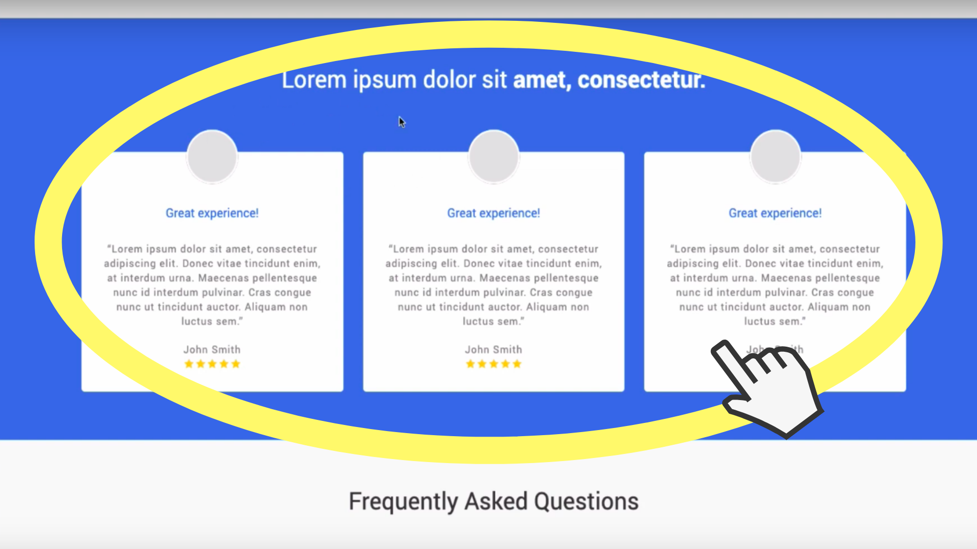
We’ll start with your logo.
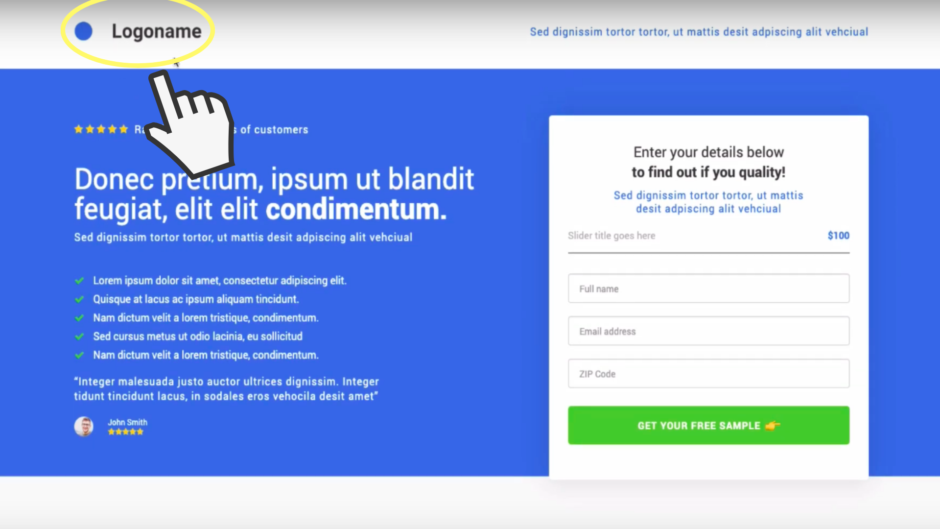
Above is a standard layout for a lead-generating landing page, this includes having your Logo at the top left of the page (circled in yellow), it’s clear and in immediate view.
This is perfect positioning for a lead-generating landing page.
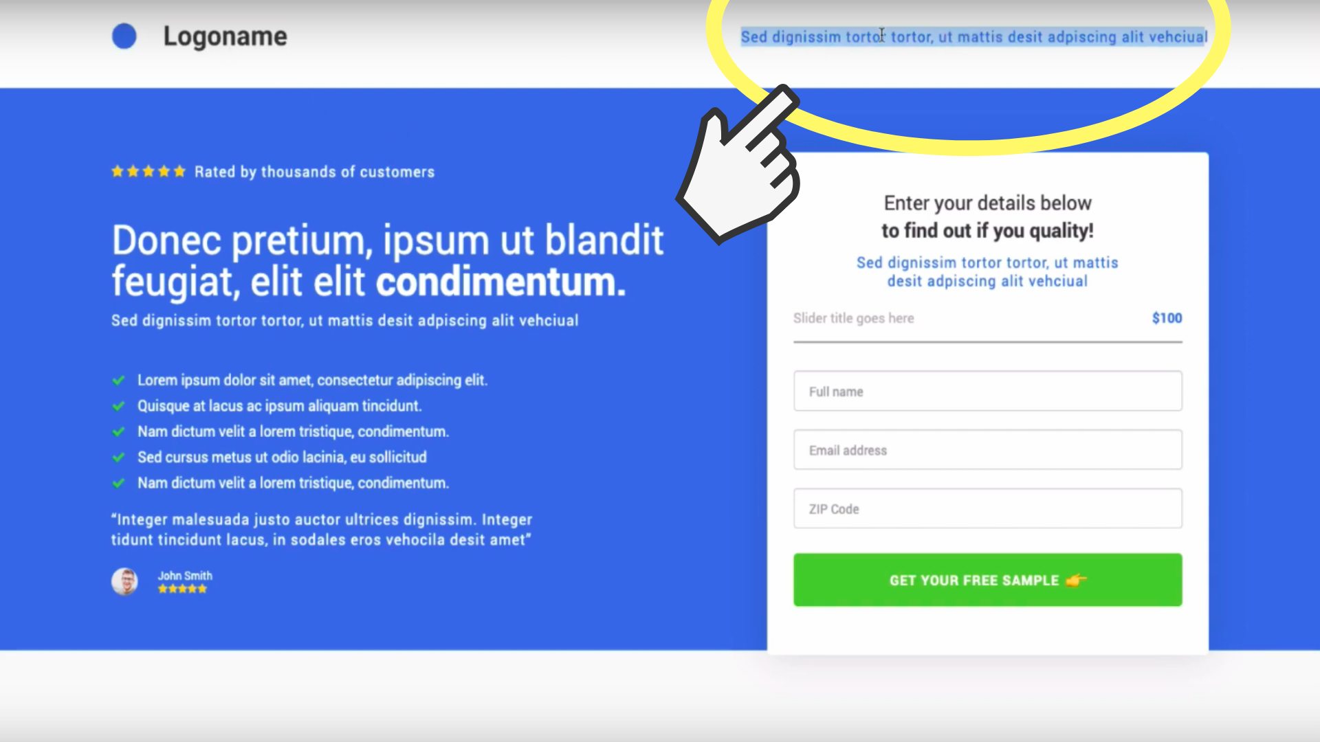
Circled in yellow in the example above is where you should be putting an urgency based message which incentivises customers to make an action on your page such as “50% off when you sign up today” or a timed countdown creating some urgency.
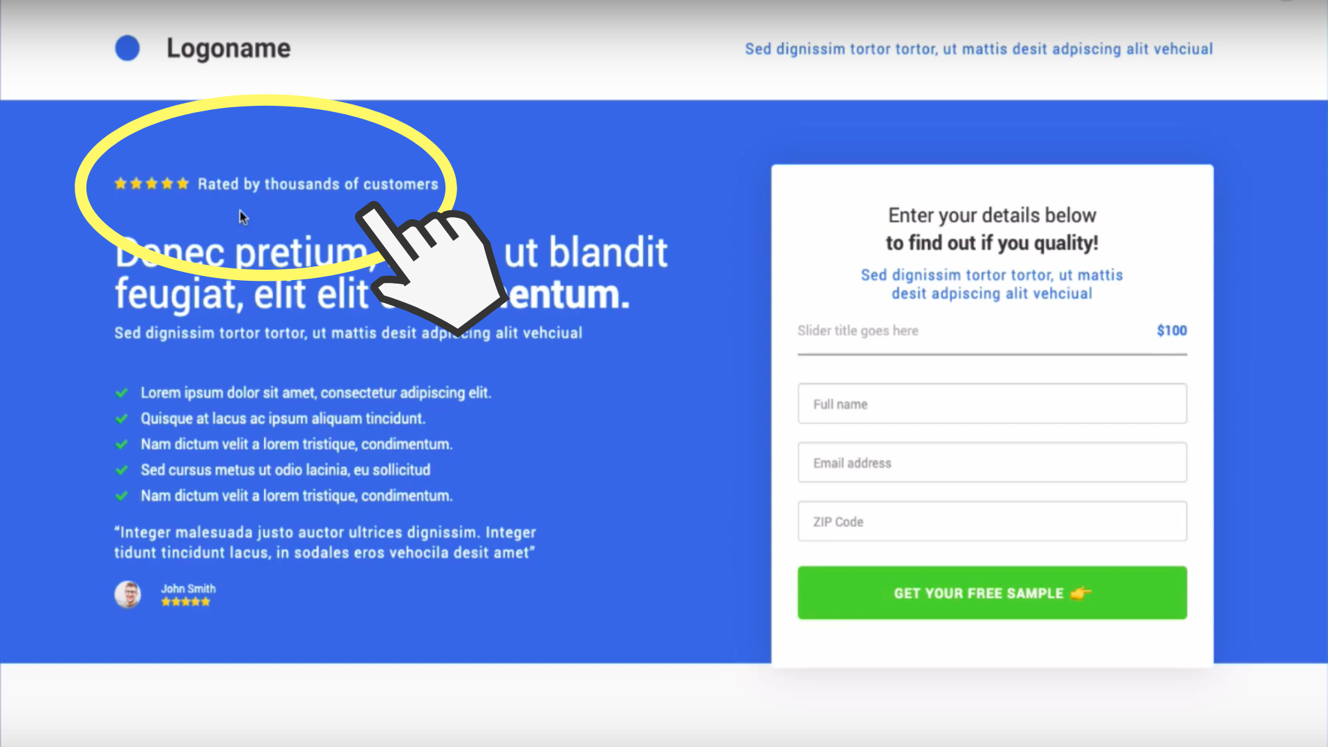
We live in a generation where everyone needs ‘social proof’, everyone likes to make sure that the product/service they are buying or using is going to be worth their time and money.
Circled here is a great example of social proof, a 5 star review with the words ‘rated by thousands of customers’ this gives your customer a sense of security. If you can provide some social proof on your page, it will show that there’s a lot of other people using your service.
What is the first thing you do before you buy a holiday? Or a new pair of trainers? You research it.
We don’t want anyone to have an excuse to click away from your landing page and if you provide them with the information they need without having to go and do their own search then they won’t click away.
Make sure you have a real and honest testimonial above the fold on your landing page, it’s been proven in thousands of landing pages that testimonials contribute to sales. Testimonials with photographs are the best as you’re seeing someone that is real and giving your customers another sense of security and a real review.
Please don’t use stock images of people! It goes completely against the honesty and warmth of the testimonial section of the landing page and will not go in your favour. If you can include a review with slight ‘downer’ in it (but not a completely negative comment) then this will make it look even more honest.
For example: We had never used this service before and we were a bit apprehensive (there’s your ‘downer’) however we were so impressed with the results we received, will definitely use again!
Keep up the great work” If you saw this as a potential customer you would think “Oh, that’s a lot like me, maybe I will use this service after all”
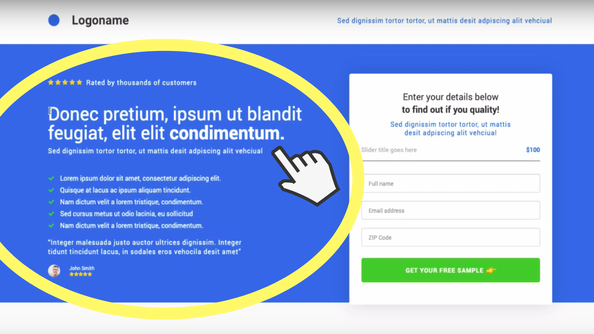
An odd number of ‘little bites’ of text or bullet-points convert better than even number. It may sound strange, but honestly! It’s true.
It’s a best practice and although you’re probably thinking “what, no way!” we do have the data to back it up. Just trust us on this one!
Lets move onto your Title Headline.
It needs to be a BENEFIT. Not a feature! In this title you should outline the benefit that people will get by filling in your form (in very few words).
The sub headline will support your title headline, perhaps it goes into a bit more detail about the headline and this sub headline can be a bit more feature orientated if you wish. Make the key words in your headline and subline bold to draw more attention to them.Going back to the bulletpoints, they also need to be benefits.
Keep it short and sweet and factual or as we like to say:
Keep It Simple Stupid (KISS).
Keep it Simple Stupid is a design principle which states that designs and/or systems should be as simple as possible – apply this whilst creating any content.The above mentioned layout is the best practice to follow on the left hand side of your lead generation layout form.
So we’ve covered the left of your lead generation page, but what about the rest?
You may notice on the examples we have provided the background is a solid colour (blue) this is great as it does not detract attention away from the actual offer that you are trying to entice them with, this having being said you can actually put photographs on the background and this can be quite effective providing they are RELEVANT to the product and deal you are selling.
For example if you’re selling Life Insurance you can put a picture of a family of all ages playing on the beach to symbolise long and healthy lives DO NOT USE STOCK IMAGES. Make sure your images are real and relatable to your audience. Real images that are relatable will entice your audience and create credibility.
If you do decide to put an image on your background, ensure that it is dark or that the opacity is lower on it as you do not want to detract attention from the star of the show… your deal!
Another thing which we recommend doing above the fold of the webpage is putting some trust seals in.
Has your company been featured on tv?In magazines?On a podcast?Have you worked closely with another well known trusted company?Do you use Paypal for payments?Now lets move onto the right hand side of the page where your all-important form will be. We will use the K-I-S-S phrase here again. You need to guide your visitors through your form, keep it simple.
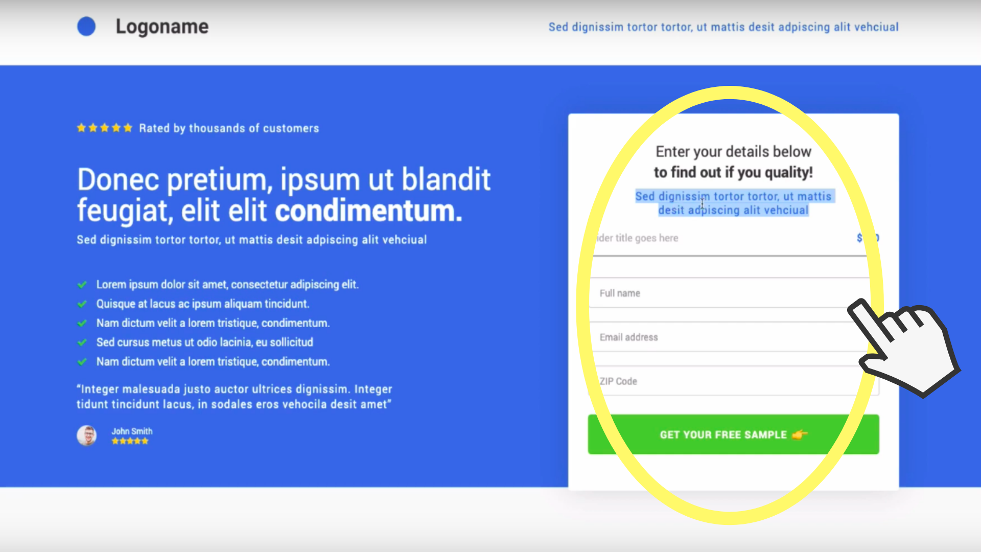
Put a title and include some urgency in your title “Fill out NOW to receive your free Landing Page Audit” then in the subtitle put a directional queue that assures your customer how easy and simple the form will be to fill in something along the lines of:
“Quick and easy to fill out and 100% free”
On the button beneath your form, ensure you write a descriptive CTA (call to action) that isn’t boring. People wont want to click on your form if you put ‘submit’ or ‘next’ put a phrase that makes them want to click such as ‘click here to see whether you qualify’ or ’click now for your free consultation”.
ALWAYS put an emoji on your button. It may sound stupid, but it does work. The pointy emoji on the form above is a very popular one as it indicates moving on to the next step/page.Moving onto the rest of the page (after the fold) – we preach the AIDA principle!
AIDA stands for Attention, Interest, Desire and Action. Your page should be a journey and on this journey you have three seconds to get your customers attention, after gaining their attention your aim is to peak your customers interest. The way we do that is, we use three small points of information.
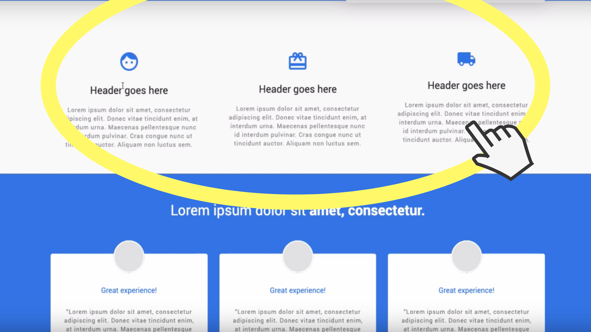
Oliver mentions in the video above that he would put a title above these ‘bites’ of information saying “It’s as simple as 1, 2, 3” and then go into the white boxes of information shown above.
These boxes are to explain how your lead generation offer is going to work in three simple steps, these steps need to have a few key pieces of information in them.
Step One: Fill in the form above.Step Two: We will get our expert consultants to give you a call back at a time that suits you.Step Three: Then sit back, relax, we’ll do the hard work and you wait for the results.
Step One is telling the customer what action they need to take for them to get that benefit that you’re promising.
Step Two is you saying what you’re going to do to facilitate that benefit and finally…
Step Three is them benefiting from number one and two. So now you’ve got their INTEREST.
Well done, but you’re not done just yet. Next up, the DESIRE.
This is where social proof comes into play – case studies, testimonials, videos, reviews etc. We outlined this in this simple template. Again, make sure you have real quotes on there, real reviews, real photographs (not stock images).
Now we’ve gone through desire we will move onto the next section…. FAQ.We put an FAQ section for the simple reason that we don’t want people to click away from the page once they are on it, it’s a landing page not a fleeing page! We aim to keep them there until they convert into a sale. You can eliminate people going onto search engines and searching for your competitors by answering their questions straight away on your landing page.
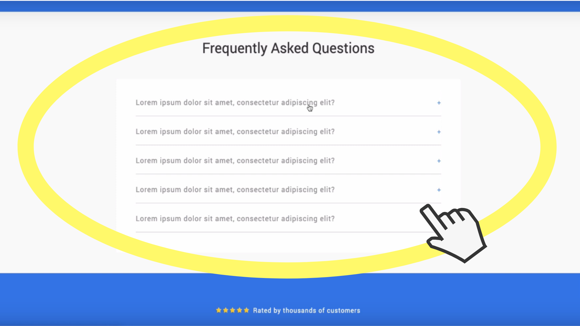
Gather your team together, have a meeting, grab a coffee and get your head in the mind of the consumer. What questions would they want to know the answer to, get them written down and get them on your page with the best answers possible.This is all part of the desire and then BOOM, at the end we hit the customer with the action.
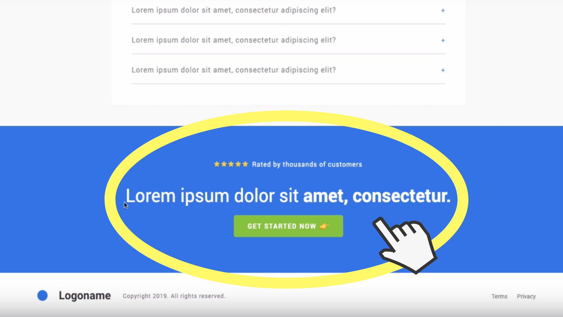
So we have repeated the social proof, we have repeated the CTA (Call to Action headline) and then BANG, there’s a button that when you click on it, takes you straight back up on the form that you need to fill out.There you have it, AIDA – Attention, Interest, Desire and Action.Ensure you have your terms and privacy at the bottom of the page and again your logo to reinforce your brand. The terms and privacy will be in pop out form, we really do not want people to click off your page for any reason.If you haven’t already watched the video make sure you check it out, it explains everything that we’ve explained here, but in slightly more detail.
And once again, if you’re not already in the Landing Page Lab group on Facebook what are you waiting for?
Join https://www.landingpagelab.com/ to get lots of tips, discussions and more of these videos, we will even audit your Landing Page for FREE!
Also subscribe to our YouTube channel for more help in sky-rocketing your lead generation.
Thanks for reading!
If you’ve enjoyed reading this blog and you don’t want to miss out on any tips like this in the future join our newsletter here
We don’t spam! We only send out one email every month with all the information you need to make your website/landing page successful.
3 more posts in CRO Fundamentals.