Welcome to another session of ConversionWise. In this post, I will talk about Mobile Hero Section: Key Elements for Conversion.
But before we move on, I would like to make an announcement. If you are reading this session as a blog post on our website, watch the video session of this blog on our channel on YouTube, “ConversionWise.

You can also join our free Facebook group, where we teach about getting higher conversions for your business and offer free audit sessions.
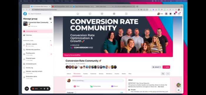
In this group, you will learn tips and tricks on how to build your business, increase sales, and improve the ROI of your online course or program.
Now that we’ve got that out of the way, let’s start with our lesson!
In today’s session, we r going to audit four landing pages for a pest control company to identify the key elements for mobile hero sections that can improve conversions.
Nothing sells more than a comforting feeling! And that’s exactly what the hero section on mobile devices can do. With a clear and persuasive message, it can help to boost your conversions on mobile devices.
Some key factors that make a mobile hero section effective are the headline, copy, images and video, CTA buttons, and social proof. A well-designed mobile hero section can help to improve conversion by improving trust and engagement.
However, not all landing pages are optimized for mobile devices. Often, marketers don’t pay enough attention to it or run into the design and technical issues while converting desktop pages to mobile.
That’s why, at Conversion Wise, we conduct regular landing page audits to help our Facebook community, our email list, and our clients improve their conversion rates.
We randomly select landing pages that members from our Facebook group have submitted and evaluate them for mobile hero sections. By identifying the gaps in these pages, we help marketers and businesses improve their landing page strategies and increase conversions.
So, without further ado, let’s begin our analysis of the pest control company landing pages.
In this session, we analyze 4 landing pages and give feedback on what’s working well and what needs improvement.
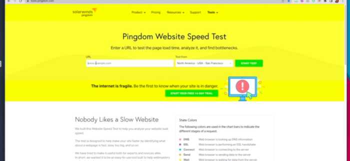
I’m going to use some tools to help me with my analysis. The first one is called “Tools.Pingdom”
With this tool, I can check the page speed and see if any issues need to be addressed.
The second tool I’m going to use is “Built With.” This tool will tell me what technology was used to build the landing page.
Now before I move on, I want to give you a quick overview of what we do at ConversionWise while conducting these audits.
We focus on conversion principles, and we also take a look at the technical aspects of the landing page.
The conversion principles we focus on are:
1) AIDA principles: Attention, Interest, Desire, Action
2) Page load time/speed
3) Trust Icon
4) Readability
5) Call to action
There might be more, but these are the main principles.
Let’s start with the first one.
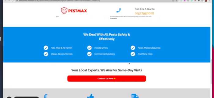
1) PestMax

We will start with speed first, as it is a critical aspect of the landing page. The speed score for PestMax is 2.20 seconds, which is not bad. But we’d still like to see it below 2 seconds, as the average for mobile devices tends to be around 2.5 seconds or less.
So, after the speed, we will go into our first conversion design principle, AIDA. This means you have to get attention, interest, desire, and action. We’ll evaluate the page based on these 4 principles to see how well it performs.
I’m going to look for 5 key elements on this page:
- Imagery
- Headline
- Copy
- CTA
- Social Proof
I can clearly see the imagery of the rat, well-optimized headline, and call to action, but I don’t see any social proof.
Since you are a pest control company, you may want to consider adding some social proof elements on the page to help build trust with your potential customers.
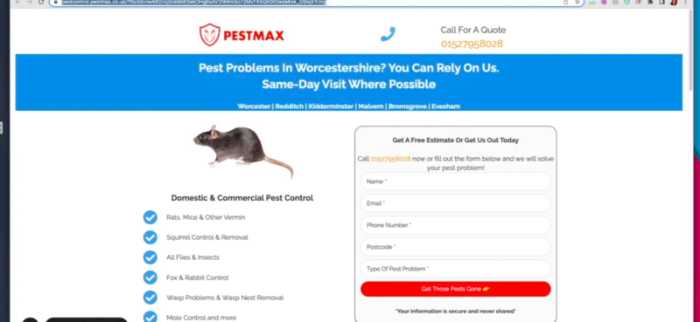
Also, pest control is a broad term, so you may want to consider adding more specific messages on the page. For example, a unique value proposition could help persuade users more quickly.
I like you have two calls to action; fill out the form or call us now. I would ask you to add secure transaction icons with the form to build trust and reduce the risk from your visitors. Also, if you could add the icons of famous businesses you have worked with, this would help establish your business’s credibility.
Now, finally going down from above the fold, I’m happy you have added real-life imagery and added value in the first paragraph. I like you have not used too much of text which is good.
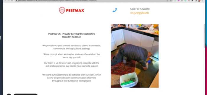
I see trust icons; I like how you have addressed each problem. But what about adding a CTA here that will lead to form if users click on that? I would also like to see a CTA here; this will add more clarity and lead users to take the desired action faster.

I would have a FAQs section here; you can add the questions people usually ask about pests. This would help build trust and answer common questions for your potential customers.
Lastly, I would again stress adding social proof above the fold and adding more credibility by mentioning famous businesses you have worked with.
Overall, PestMax has a good page design in terms of landing page best practices; however, there are some areas they can improve upon to increase conversions and build trust with their potential customers.
2) BomBaby
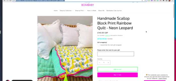
Now, let’s move to the second landing page I want to analyze, which is for a company called Bombay.
Let’s check the speed score for this page using Pingdom. The speed isn’t great, which is 3 .6 seconds. This is higher than we would like to see, which might affect conversions on this page.
Moving to the product page, I love your branding and can see a clear image of your product. It’s eye-catching, and I like how you positioned it on the page.
However, I would drag the logo to the left and increase the ratio of this pink bar which is very small right now. I would also increase the text size of your headline and add some more descriptive copy to really sell this product.

I can’t read this free shipping code; you should put it in a bigger format.
Let’s see the five elements I was talking about. I like the clear headline, and the images are good, but I would say to add scarcity; people love it.
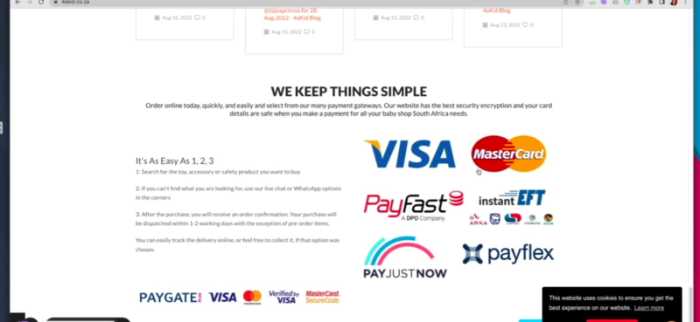
I like you have added clear payment options, but it could be better if you used trust payment gateway icons that your potential customers are familiar with. It builds trust and reduces risk.
I see you have added them below the fold, which is good. But could you add the social shares and testimonials above the fold? I would also extend the banner because there is too much white space here.

I would also use emojis as this helps to increase engagement and conversions. For example, you could use a “happy” emoji for your CTA button.
I like you have added text but don’t you think it’s too much like 10 bullet points here? I would like to see at least five or six.

I like here you have added more information about what you do and how you do it. But the only problem is text in this yellow circle is hard to read. I would like you to add in some h pictograms, so it’s more visually appealing.

Lastly, I would like to see the FAQs section, as I suggested for the first landing page. This will further help build trust and answer your potential customers’ most common questions.
Overall, Bombay has a strong page design in terms of landing page best practices; however, there are a few areas that could be improved to increase conversions and build trust with their potential customers.
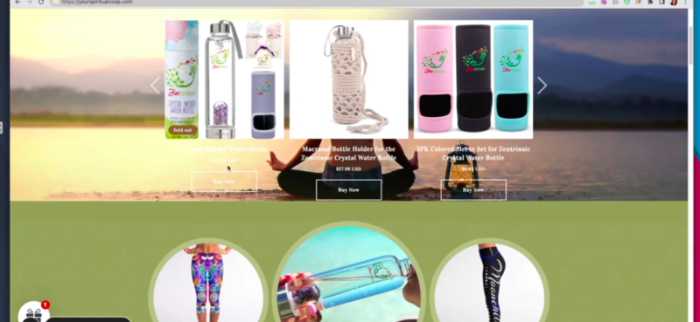
3) Your Spiritual Co-Op
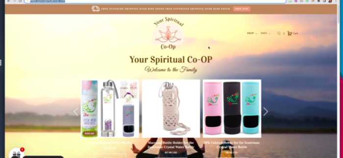
The third landing page I want to analyze is for a company called Your Spiritual Co-Op.
Let’s see the speed score for this landing page using Pingdom. The speed score is above 2, which is fine but could still be improved.
Moving to the product page, I would increase the text size of the banner text that talks about spending a particular amount and get this bag. I would also use more descriptive copy here to really sell this product.
I would also use emojis here, so it becomes more visible and clickable.
I would also see the five elements I mentioned for product page design, and it looks like you have all that covered in terms of CTAs, product image, and price.
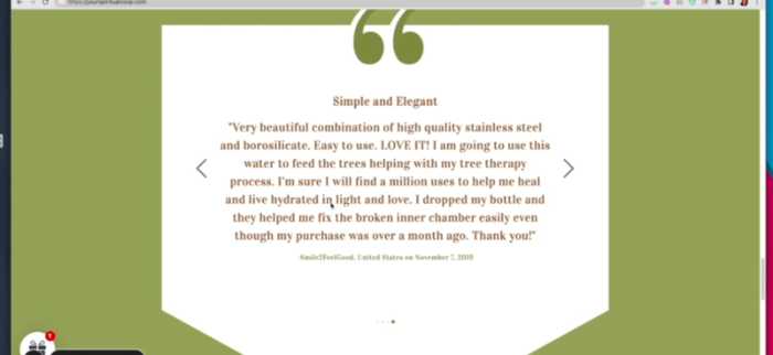
But the imagery isn’t ideal to me. I would recommend adding a testimonial to build trust and social proof. You could also add some more images of the products that have been sold in the past to increase confidence.
I would also change the addition as right now, it’s very vague to say, ” Welcome to the family.”
I also can’t read the text below your images clearly as it’s really, really small and hard to read. I would recommend increasing the text size here.
I literally can’t see the pricing of the product here. I would recommend adding it below your images or even a section about what you offer and how much it costs.
Though you have added the pricing, I can’t see it very well here. I recommend placing the price below your images or text so customers can easily see the price.

Moving down again, I can’t read this section. I would increase the text size to be more readable for your potential customers.
Your call to action is significantly less attractive, like not really any text, just a button. I recommend adding some copy and images here to make it more visually appealing.
Moving down to your products, but again I can’t read the text clearly. I would increase the size of the text, so it becomes more readable for your potential customers. I would also like to see reviews with each product too, as this helps reassure customers.

I like you have a review section, but some elements are missing, like real imagery, 5-star ratings, and more text. I would also recommend adding more reviews as this helps increase trust and confidence in your potential customers.
Lastly, I would like to see the FAQs section so your potential customers can easily find answers to some of their most common questions.
Overall, Your Spiritual Co-Op has some great elements in terms of product page design, like the call to action and pricing. However, a few areas could be improved to increase conversions and build trust with their potential customers.
4) 4AKID.CO.ZA
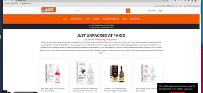
4AKID.CO.ZA is a website for parents looking to find baby and childcare products that are safe and reliable. Let’s take a look at their landing page using the Speed Score tool from Pingdom:
Again very slow and loads at 3.55 seconds. This could result in many potential customers abandoning your site if they are not patient enough to wait for it to load.
First of all, I would love to get rid of this grey banner which is to adding any value. Even if you want to share your number, this banner could still be gone easily.
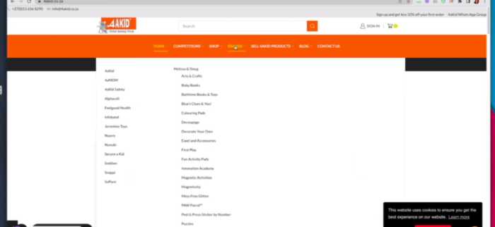
Very very long menu; I wonder if anyone is reading it or just going directly to the page they want.
Now, let’s find our five elements for landing page design, as a first impression counts, and I can see that your images are your product images.
I would remove this long text and place your text below the product images, as this makes it easier to read and understand.
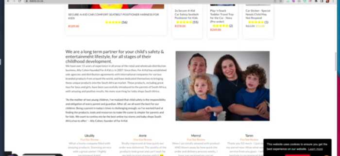
I don’t see all the elements here as we just move to the products, and I can’t see any information about the product.
Social proof is really a key when we add it with CTA, so I recommend adding some social proof here.
You need to have a repeat CTR to increase the conversions and trust of your potential customers. I would recommend adding a video that shows the benefits of using 4AKID to help convince your potential customers to purchase.
Lastly, I would love to see an FAQ section so your potential customers can easily find the answers they are looking for.
Overall 4AKID has some great elements in terms of product page design and information, but a few areas could be improved to increase conversions and build trust with their potential customers.
Key Take Away:
When designing a landing page for your website, you must consider the elements you include carefully. While some of these elements may seem small or insignificant, they often play an essential role in influencing potential customers’ decisions and increasing conversions. Some key features to consider include call-to-action buttons, product imagery, reviews and ratings, and FAQs. It is also essential to consider factors such as site speed and usability to make your landing page as effective as possible.
/