Kiera here, Marketing Executive at Landing Page Guys and I’m going to take you through how you should lay out your landing page utilising the AIDA Principle.

Written by
Andy Haskins
Co-Founder & COO

Kiera here, Marketing Executive at Landing Page Guys and I’m going to take you through how you should lay out your landing page utilising the AIDA Principle.
Kiera here, Marketing Executive at Landing Page Guys and I’m going to take you through how you should lay out your landing page utilising the AIDA Principle.
Before your customer even sets a virtual foot on your page, you need to ensure that your page loads timely! A slow loading page = lost customers!
To read more on how you can develop your landing page including load speed, responsive optimisation and cross-browser compatibility click here.
Your landing page should take your customer on a journey…. the journey of AIDA.
Attention, Interest, Desire and Action.
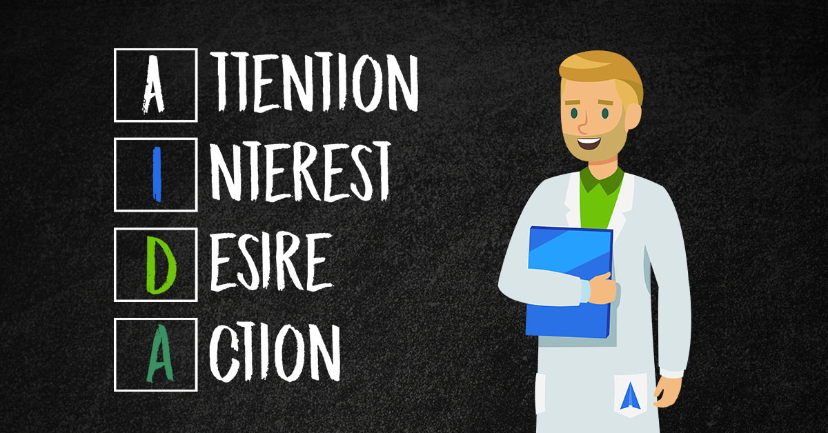
Strictly speaking above the fold of your landing page you should be focused on getting your customers ATTENTION.
A Bold Clear Headline
Talk about the benefits of your product/service here and NOT the features.
Here are some more pro copywriting tips for your website ????
1) Think about your Customer’s Pain Points. Then you can market the problem and sell the solution.
2) Focus on Selling the Solution, not Products. Your products are the solution though ????
You understand?
3) Ask yourself why you are the best option? Just because your solution can solve their business challenge, it doesn’t mean you have the only solution on the market. You need to be able to position yourself against your competitors and convince the prospective customer that your solution is the best one.
4) Use power words to entice your customers! Words such as skyrocket or life-changing. ????
Bullet Points
Bullet points are a short and easy way to convey the information you need to, an odd amount of bullet points converts better than even! We have no idea why, it turns out everyone likes things just slightly on the odd side of life.
So, an ODD number of bullet points is a great idea for your page.
A Photograph Of Your Product/Service
Did you know that adding visuals to your landing page can increase engagement by up to 94%? ????
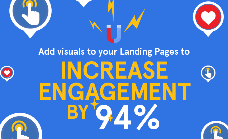
So get those photographs uploaded, make sure they are positioned well and easily viewable on your page.
There has been some research showing that point of view product images work really well as your users will picture themselves using your product or service. Don’t forget to compress images and videos that are high quality so they don’t slow your page load speed down.
So we have their attention, now we need to peak our customers interest.
You need to outline in this section how EASY it is for your customer to get your product/service and what it will do for them/how it BENEFITS them as mentioned above.
One great way to do this is using video. Another way to do this is doing a ‘step 1, step 2, step 3’ (seen below).
Show your customers how easy it is to order from you or use your service. Tell them about any deals you have for new customers.
Peak their interest.
Take a look at an example from a website we have designed below:
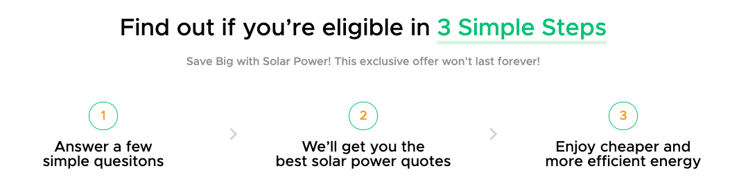
Above you see an example of the ‘step one, two and three’, showing your customers just how easy it is for them to pick you.
Creating and keeping their interest is usually the hardest part. Make sure that the information you have on your page is broken up into sections or bullet points like we’ve mentioned above and it’s easy to read, with interesting subheadings and visuals.
Focus on what is most relevant for your target market in relation to your product or service, and only convey the most important message you want to communicate to consumers. How it benefits them!
Now that the consumer is interested in your product or service, they know how it is going to benefit them we need to get them to really want it! How do we do this? Social proof and trust proof.
Long story short people trust other people. Hear me out with this – would you rather pick a restaurant with 2 good reviews or one with 100 good reviews?
It’s extremely important to have Social Proof and Trust Proof. We live in an age where if i’m a customer 9 times out of 10 I will go and do some research on your product. I’ll go on google or bing and type ‘review’ and your company name. If I’m about to do this as a customer, you’ve already failed as a company.
But why?
NEVER GIVE THE CUSTOMER AN EXCUSE TO LEAVE YOUR PAGE!
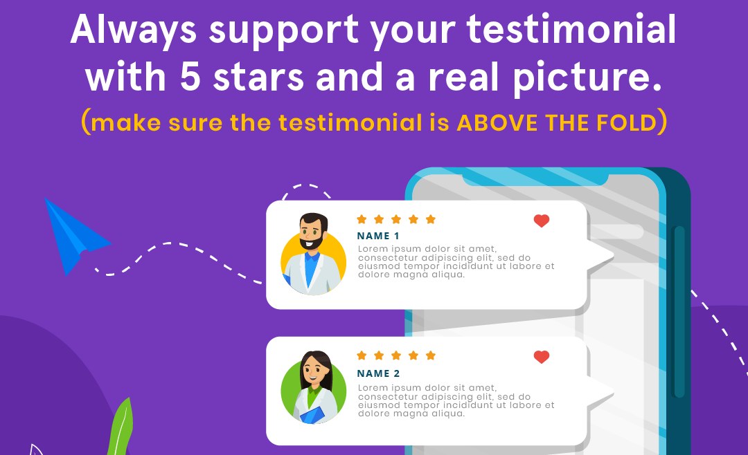
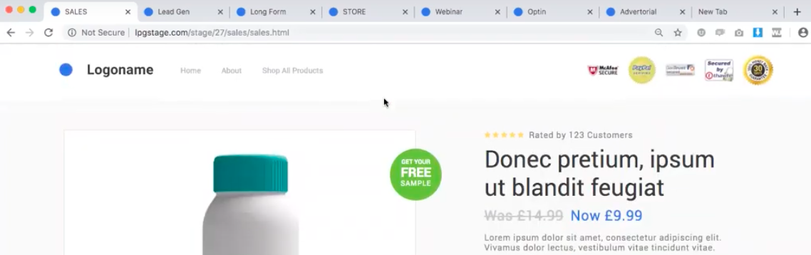
You should put the ’social proof’ on your page, readily available to them. A testimonial, a review, 5 stars, a photograph etc should be ABOVE THE FOLD on your landing page ready for your customers to look at!
Take a look at our home page, can you spot the testimonial, the 5 stars and the real photograph?
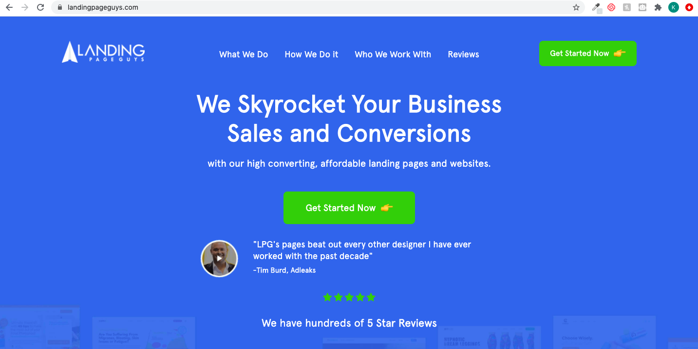
We know that you’ve spotted it by now, let’s zoom in so we can get a closer look.
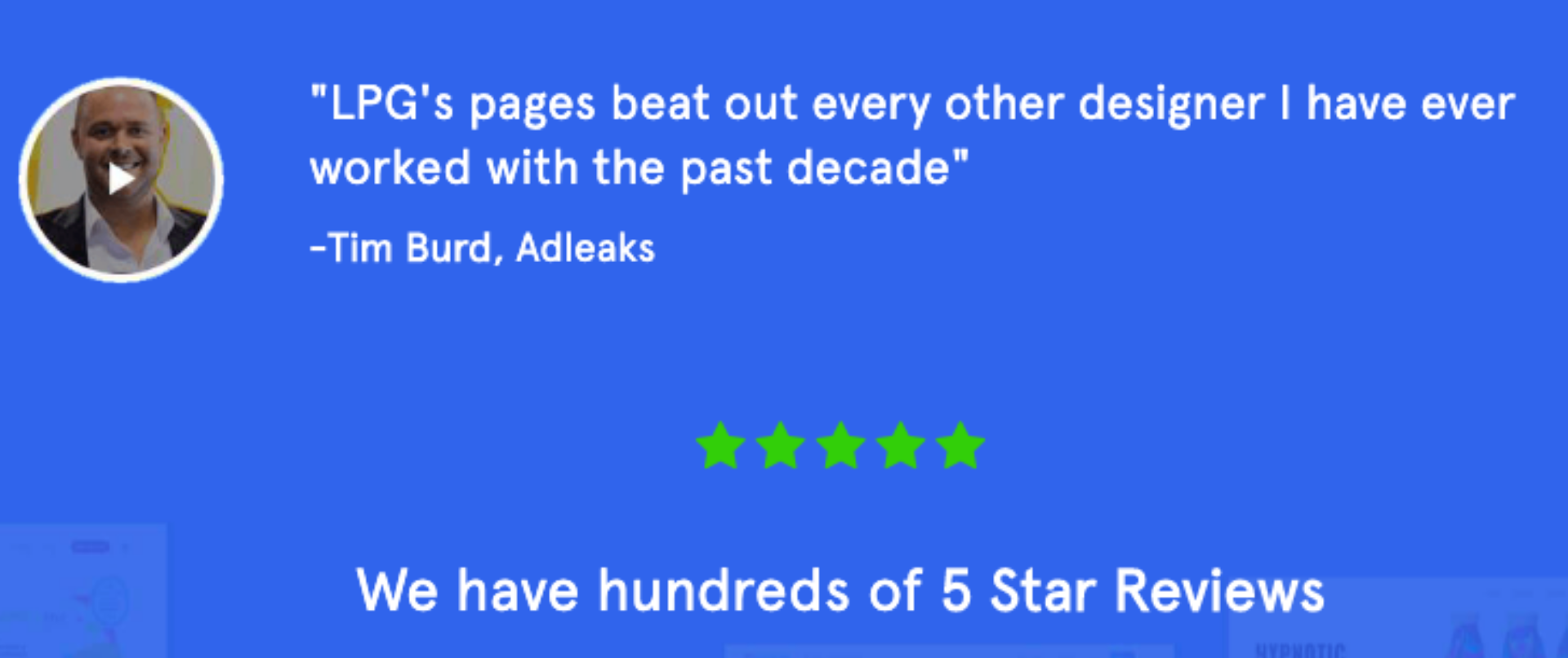
This tiny testimonial along with the text underneath saying ‘we have hundreds of 5 star reviews’ automatically puts your customers mind at ease, they no longer feel the need to search the web for proof on you.
Well done, you’ve officially kept this customer on your page for longer than 3 seconds, it’s looking good for you but the customer journey isn’t over just yet because next up on our list is trust proof.
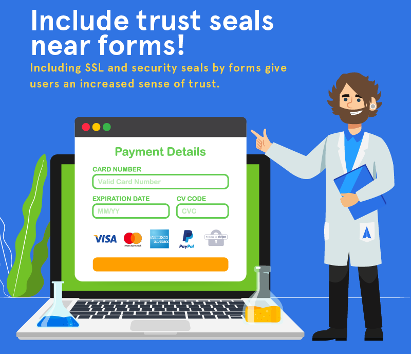
What is trust proof? It’s giving people a reason to trust you.
Normally this is done by supporting icons. See this example here:
In the header on the right hand side on this website they have placed trust seals such as a Money back guarantees, a Paypal Verified sticker, McAfee Secure sticker etc. Other examples of trust seals and security seals you could place in your header or on your checkout page are here:
Would you buy from them considering they now look very secure? I would.
These small trust seals are something that as a customer you probably don’t pay much attention to, however you would notice if they weren’t there.
These seals are how you show your customers that you’re a trusted business.
As a side note, if you have a checkout page you NEED to put SSL and security seals on it!
Last but not least, the all important action. Our overall aim is to get our customer to the point where they complete the action we want them to, whether its filling out a form, making a phone call or paying for our product/service.
Here’s where our VERY IMPORTANT call-to-action comes in. We have a few simple but important tips in the images below, take a look before we go into more detail.
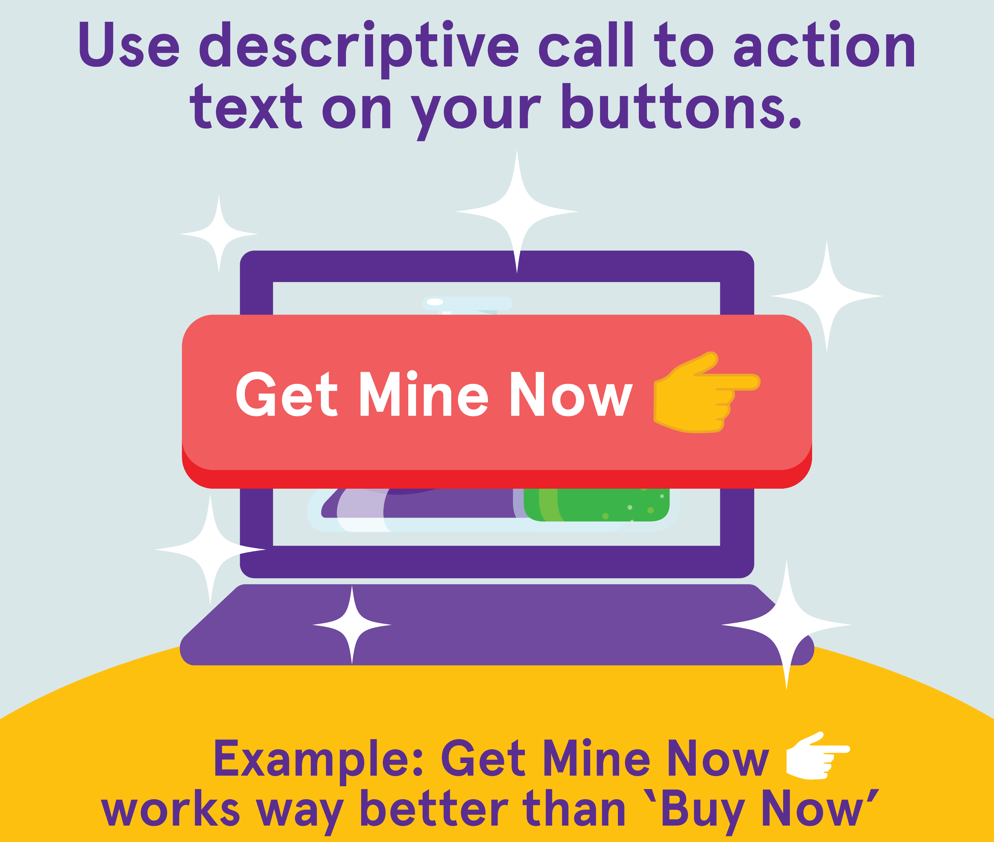
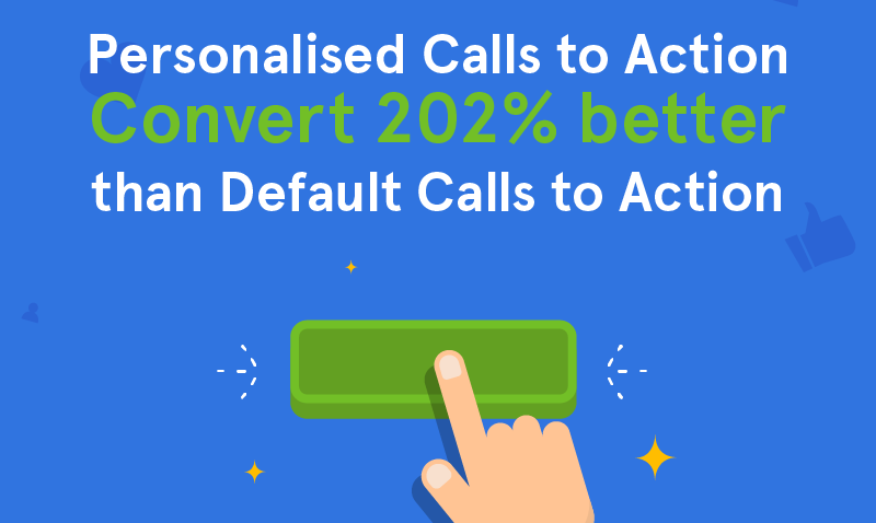
Personalising your call to action adds something extra to it!
By saying ‘Get Mine Now ???? ‘ you are convincing the customer that it can be theirs so easily, they just need to click your CTA button.
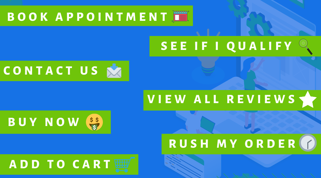
Another big tip to get you started when choosing your CTA is…
DON’T FORGET to put an emoji on your CTA button!
It may sound crazy but putting an emoji on your call to action buttons is guaranteed to up your conversions. ⬆️ ????
Some great examples are shown below:
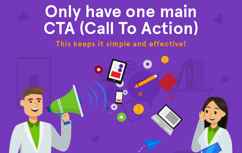
Your call-to-action should be straight to the point and easy to follow, don’t have mixed messages on your page >>> don’t ask them to fill out a form at the top of your page above the fold and then ask them to “Add to cart” half way down the page. Have you ever heard of the phrase KISS? It means Keep It Simple Stupid and it really does work! Keep it simple ????
We hope you’ve enjoyed reading this blog and don’t forget to
sign up to our newsletter to be the first to see all of our new blogs and videos!
3 more posts in CRO Fundamentals.