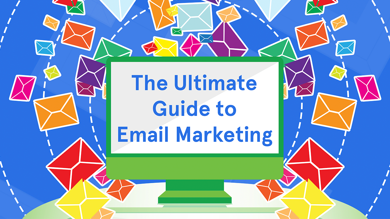
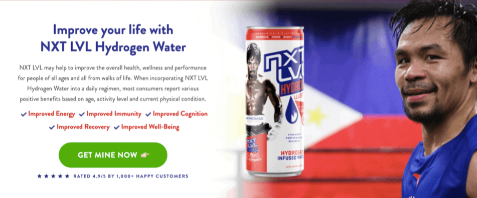
If you’re spending tons on your traffic already but your conversion rate is less than 3%…

Written by
Oliver Kenyon
Co-Founder & CEO

If you’re spending tons on your traffic already but your conversion rate is less than 3%…
If you’re spending tons on your traffic already but your conversion rate is less than 3%…
Can you imagine how much you’ll be able to scale your business a lot faster if your conversion rates doubled?
Even a slight, sustained increase in your conversion rate could be the difference between having to let go half of your team or hitting several business milestones within the next year or less.
Well you don’t have to daydream anymore because it’s normal for our landing page designs to not just double but even triple or quadruple conversion rates.
And we’re about to show you exactly how we do it so you won’t have to keep bleeding money.
(For comparison, across industries, the average landing page conversion rate is about 2.35% while the top performing 25% sites are converting at 5.31% and above.)
As a full-stack Conversion Design Agency with a mission to make high conversion rates achievable for everyone, we’re excited to share the top strategies we’ve learned for the last 9 years about crafting high-converting pages.
Buckle up because this is an epic read! By the end of this, you’ll know exactly what to do to create massive growth opportunities for your online revenue streams!
Conversion Design is the systematic use of scientific and research-based persuasion principles to design a page that gets users to take a specific action. This action must advance the business goal. Depending on how your marketing funnel is designed, the target action could be: to opt-in, register for an account, get a free trial, buy, watch a video, or complete a form.
But the best way to picture Conversion Design is to think about getting your page to do the job it’s meant to do.
Your page’s job is three-fold. It needs to:
1) Make your ideal prospects want your offer (or whatever your goal action is).
2) Make them want it now.
3) And make them want it only from you.
Creating a page that gets those jobs done is The Why of Conversion Design.
When we’re being cheeky, we like to say:
“Conversion Design is what you need when you’re launching a product, offer or business online and you absolutely want your pages to convert from *day one* — not day number who-knows-when-so-let’s-experiment-and-see-what-works.”
This is partly why we say “CRO is problematic”.
Don’t get us wrong — Conversion Rate Optimization is great and all, but CRO costs (and we’re not just talking about monetary costs) can rack up to astronomical heights.
It’s tongue-in-cheek really (after all we are staunch practitioners of CRO), but here’s what we mean…
1. Not many people know how to design and launch sites that convert at rates higher than 3% right from the get go.
So usually they launch their “MVP” (minimum viable page) and then tweak things from there by buying tons
of traffic and running experiments.
2. Testing is vital and we absolutely recommend every business to practice it. The trouble is that testing on a
reiterative basis to find what works requires time, not to mention large budgets and data, as well as the
expertise to make sense of the numbers.
3. Knowing the most important thing to prioritise test-wise isn’t always clear because often we marketers
have to make do with missing, inaccurate, or even false information…
And by the end of some experimentations, the results can still turn out to be inconclusive so you go back to the drawing board.
And if you’re hiring a CRO agency, you often have to pay astronomical retainers from the get go.
So you could end up spending thousands to conduct various tests.
You could spend thousands every month sending visitors to obtain data on the tests…
And still end up not knowing exactly why some of your pages are converting abysmally!
So you keep on hypothesising and testing…
While your bill keeps racking up.
Of course the whole idea is to eventually learn valuable, actionable insights that you can then turn into profits.
So CRO is worth doing.
But the reality is not many businesses have the time, generous budgets and all the multi-faceted expertise needed to run AB and multivariate tests ad infinitum until they figure out what works best.
So what exactly do we recommend?
Well first, let us tell you how we “stumbled upon” the solution…
Back when we were budding affiliate marketers, we ended up creating and growing AffiliateFix.com (now the largest online affiliate community).

In our quest to engineer as many profitable campaigns and funnels as possible, we invested in recruiting and training a team of top-notch website designers and developers.
It took us thousands of £££ and countless hair-splitting failures, but as online entrepreneurs with a single-minded focus of becoming young millionaires, we eventually figured out a replicable process to make our team build high-converting pages for our experiments ventures.
It was around that time when Tim Burd (a.k.a. The Facebook Godfather because he’s one of the leading authorities on Facebook Ads) noticed how our web assets were both beautifully designed AND high-converting.
Of course, they got his attention.
Naturally, he asked us to build some for him.
Naturally, we didn’t dare refuse.
Eventually Tim brought us in to do high-converting pages for Debt.org.
It was such a high-profile project so we were under immense pressure to build pages that converted from day one.
Long story short, our team did not disappoint.
So even though we never planned on running a web design and development agency, word about our work (and their phenomenal results) spread faster than we could say Conversion Design.
Our clients’ results quickly attracted more of those who needed landing pages that could convert well immediately:
* Top affiliate marketers
* Digital product owners
* Product launch marketers
* Media buyers
* Online marketing agencies
* Lead generation companies, etc.
And just like that, Landingpageguys.com was born.
It didn’t take long before we found ourselves speaking at high-profile events.
We started sharing what we’ve learned with multiple 8 to 9+ figure companies on how to scale even more by skyrocketing their online sales without spending more on traffic.
That was 9 years ago and although we are now ConversionWise and a whole host of many other things have changed since then, our idea of a “power trip” still revolves around the same thing:
“How fast can we turn poorly performing pages into record-smashing ones?”
After working with the fiercest Direct Response companies worldwide across almost every vertical in existence, we’ve improved and perfected our Conversion Design Blueprint.
(In fact, our team of Conversion Design experts now runs every page through a comprehensive 159-point Conversion Design Checklist as part of our stringent Quality Assurance process. But more on that later.)
Now, because you’re here reading this, you’re probably spending tons buying traffic but your landing pages are converting poorly…
And the most frustrating part of it is that you have no idea WHY, or how to fix it.
So let’s explore the likely reasons why your pages are performing poorly…
You probably feel overwhelmed whenever you think about designing your pages for higher conversions.
“Guys, there are so many variables to get right! Where do I even begin?
There’s the market research, the funnel strategy, the page architecture,
the copy, the aesthetics, the tech side of things, the custom integrations,
the proper tracking, etc etc.”
We feel ya.
So let’s simplify what you’re dealing with.
After optimizing over 3,273+ landing pages, stores and online marketing funnels across hundreds of industries…
We can say that most pages do not convert mainly because…
1) They’re confusing and unfocused.
2) They’re not credible nor compelling.
3) They’re not built to create a seamless, intuitive and pleasurable experience for mobile users.
Obviously there are many “little things” and contextual nuances that could be at play, but this is the “80/20” version of it.
Let’s break that down further.
You’d be surprised how lack of clarity and focus is often the cause of many “DBCs” — deaths by conversion.
Your pages suffer from this if:
Some symptoms of this are:
– It’s not easy to use or navigate around it.
– The text isn’t readable. This could be a font, size, weight, colour or contrast issue.
– The way things are organised isn’t intuitive or adhere to what users would expect.
Some website designers like to do fancy or “creative”, avant garde designs to conjure the illusion that they’re creating value.
But when you hire designers that don’t understand persuasion architecture, their pursuit of “pretty” often just serves to derail your conversion goals (and you’re paying them for it!).
Just like you’d look uncool wearing underpants over your bottoms (even the Man of Steel himself no longer does)…
Or just like there’ll be disastrous consequences if you propose marriage on a first date, there is a right order when structuring your message if you want it to land well and have the desired effect.
For example, before you ask users to do something you have to first explain what’s in it for them, right?
This is basic human psychology.
And yet, we still see many pages telling the user to act right off the bat without making a strong case first as to why.
So what’s the optimal sequence when it comes to structuring persuasive pages?
For this, we follow the AIDA principle:
A – grab their Attention.
I – spark their Interest.
D – build your case so they deepen their Desire (not just for your offer but they must want it from you).
A – tell them what Action to do to get what they want.
Stick around because later I’ll show you in great detail how exactly you can apply AIDA to design high-converting pages!
If what your page is saying isn’t aligned with the thought processes of your readers, they won’t feel understood.
When this happens, you lose their attention and they click away.
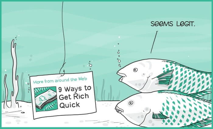
Just like it’s ineffective to bait fish with a dollar bill, we marketers shouldn’t use random hooks to attract our prospects’ attention.
And yet it still happens all the time.
Later I’ll reveal the secret sauce that will let you craft powerful, sticky messages that inspire people to take action.
Often, these competing elements don’t even help advance the business goal.
Or everything is thrown on the page, which just overwhelms the user.
This is one of the worst things you could do because when someone lands on your page, what you want is to lead their thinking towards a goal.
And you can’t do that by giving them all sorts of distractions.
So ask yourself:
Do your pages create mental noise?
Subscribe to our Newsletter! Follow us on Insta!
Submit Form! Buy Now!
Call Us! Like our YouTube videos!
Buy me a beer!
Follow me on OnlyFans!
I’m joking.
I don’t drink beer.
My point is — if someone did this to you in real life, you’d probably get weirded out and back away, right?
The same principle applies online.
Of course your website’s home page naturally will have many links because the goal of most home pages is to tell anybody where to go, depending on their reason for visiting.
But when it comes to post-click landing pages, we recommend having only one goal and a clear CTA.
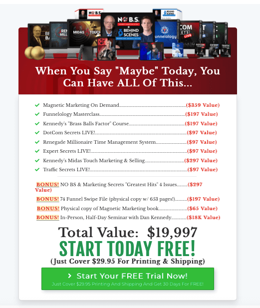
In some cases, it’s not a case of overwhelming Calls to Actions but vanilla CTA’s.
Y’know — they’re bland, run-of-the-mill, and worse, they’re practically incognito.
Like the ones below:


When it comes to CTAs, think Va-Va-Voom.
You want them to grab the eyes and seduce the mind.
Later we’ll show you 50 Shades of CTAs so you’d never be caught messing around with vanilla ones ever again. *wink*
In many cases, pages don’t convert because the prospect doesn’t understand the true gravity of the value being offered and how superior it is compared to their other options.
So is your messaging strategy conveying your value proposition powerfully enough?
Study the screenshot below and observe how well it does that particular job.
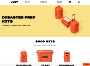
The space “above the fold” is prime real estate because it’s what visitors see after they click on an ad and they land here.
If what you put here fails to give them enough reason to scroll and read further, it’s a lost opportunity.
“Disaster Prep Kits: Don’t wait until it’s too late” is redundant because it’s not adding anything to what the prospect already knows.
Someone who clicks on the ad and lands here already believes in preparing ahead for disasters.
So tell them something else that will help move them forward.
At this particular point in their journey, you could advance their decision-making by enumerating the many reasons (in bullet points) why your disaster prep kits is superior than the other options in the marketplace.
Stick around because in a few minutes, we’ll show you the 5 critical elements that you must have above the fold to increase your conversions.
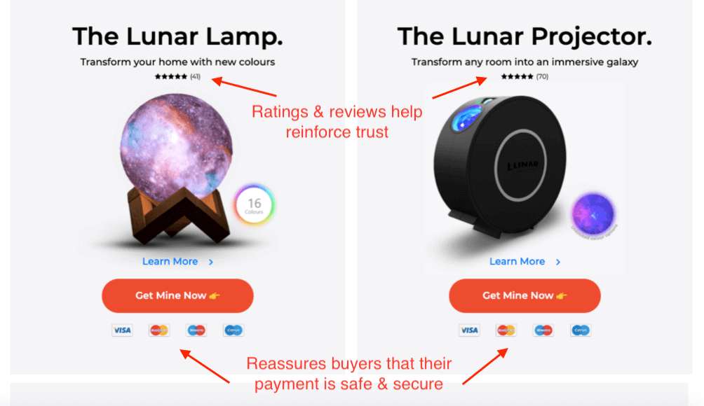
People actually love to buy. But they don’t buy when they don’t feel safe.
Reflect back to your own thought processes when you decided NOT to buy something, and you’d probably remember how one of your reasons was because you didn’t believe the vendor’s claims or you found their offer ‘meh’.
Your poor-performing pages suffer from the same problem if…
Or the way your page is structured doesn’t meet the expectations of your target prospects.
A good example is when clickable items don’t look clickable to users or they click on non-clickable elements.
When web users look for specific information, they usually have an expectation on how or where they ought to find it.
If your “creative” design conflicts with their expectations, you could make their experience unnecessarily frustrating.
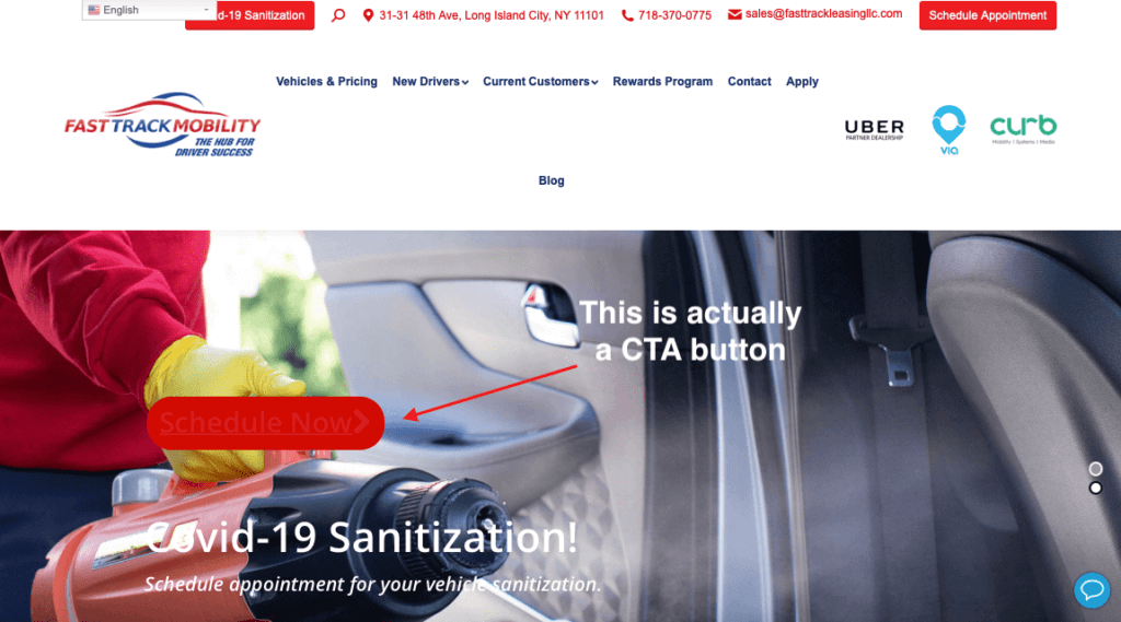
Would you have been able to spot the CTA button in the above page if I hadn’t drawn a red arrow pointing it out?
Notice the navigation links at the top and how the link to their Blog is so far away from the rest of the navigation links.
Also, the drop down menu for language selection is blocking another element.
I point these out not to be nasty but because these seemingly harmless design blunders can make you look unprofessional (and thus untrustworthy) in the eyes of your prospects.
There are many “little big things” that can cause people to distrust you:
– Lack of “Safe and Secure” reassurances or Trust logos.
– Lack of information about how you process their personal data and protect their privacy.
– You don’t provide convenient ways to contact you (e.g., phone number, office address, instant chat, etc).
– You don’t show enough proof of your legitimacy.
– You don’t provide risk-reversing Guarantees.
– You don’t explain how — should they change their minds — they can return their purchases for free,
using convenient ways (and easily get a refund within X days or hours).
– You’ve made promises and claims but you haven’t backed them up with compelling evidentials.
– You’re not showing enough Social Proof, case studies, testimonials, etc.
Your message isn’t creating an emotional connection with the reader.
This is the case if:
– They feel you’re talking AT them, not to them.
– You’re talking about “your stuff” more than about the things that concern your audience.
– You’re harping on about features and using only logical reasons and arguments.
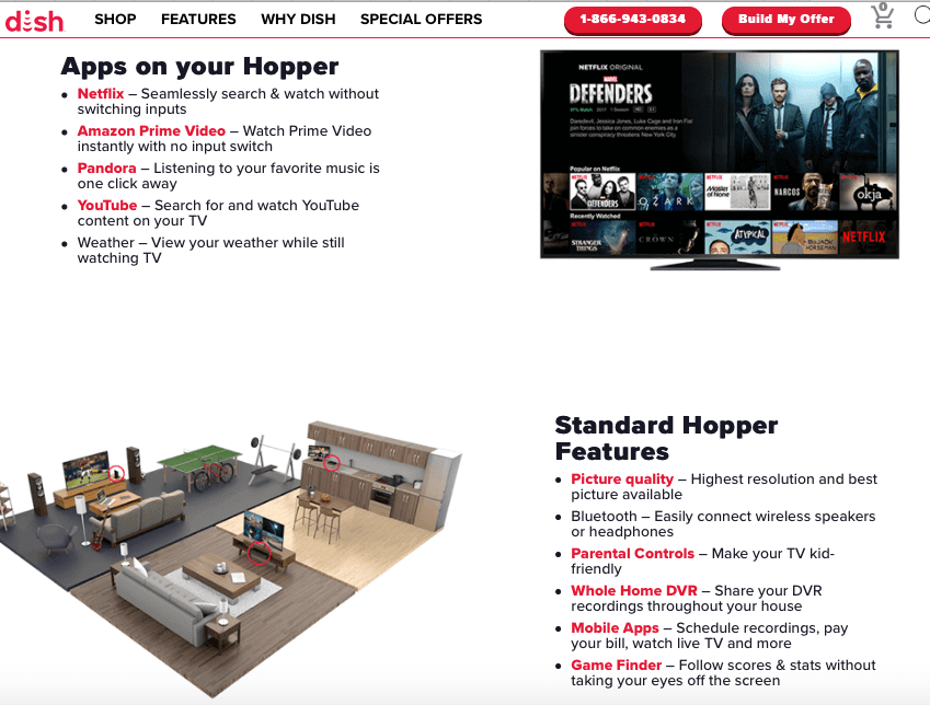
Now imagine if Dish just listed the features (text in red) and not bothered explaining to us what benefits we would enjoy (text in black) because of those features…
Either we begrudgingly perform some mental gymnastics to figure out what those features would mean to us or we click away, right?
Many pages still confound their visitors this way.
Instead of what the prospect needs to hear in order to make the best decision for themselves.
I’m sure you’ve endured this kind of messaging many times before:
“We are the pioneer in _____ so we’re one of the greatest ____ companies in the world.”
“We are your best choice because we do everything under one roof.”
“Our team is world-class because we pride ourselves on creating a culture of openness, diversity and equality…”
Did it make you yawn?
“We-we copy” talks about us marketers and how great we are and how everything we do is tremendously magical, etc.
It may feel good to us but for our prospects, nothing could be more boring.
So to engage your audience, frame your message from their point of view — not yours.
You can fix this fast by adding “so you don’t have to _______”, or “so you can do/be/have _______” as the second part of your not too conceited “we-we copy”.
For example:
“As the pioneers of Conversion Design, we’ve committed every disastrous Conversion Design mistake so you don’t have to. As early as this weekend, you can apply every profit-boosting strategy we’ve learned for the past 10 years that added millions of dollars in revenues to over 3,250 businesses in over a hundred verticals.”
I’m being facetious but you can see how everything is framed based on the interests of your prospects.
Remember that risks are not just financial in nature. Risks could be their:
– Time investment
– Their energy
– The hassle of returning and refunding if they make a mistake
– The learning curve involved
– The adjustments they will have to make if they switch
– The operational losses/costs they’ll incur if unexpected delays happen
– The potential backlash they might suffer at home (or their workplace) if buying from you turns out to be a bad fit, etc.
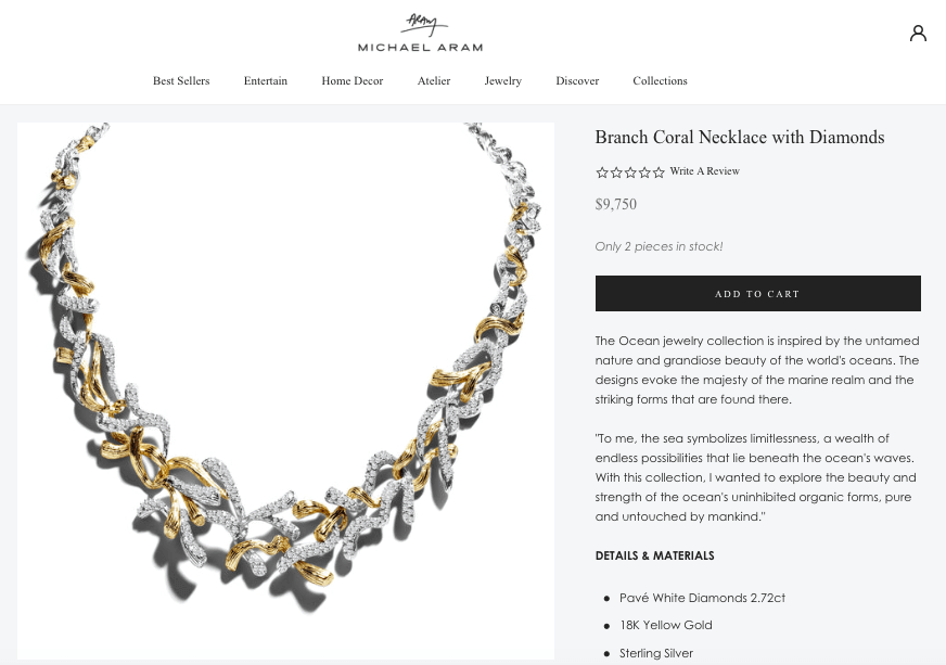
Your prospect’s perceived cost isn’t just about the $9750 price tag.
And not necessarily because the offer is indeed boring or useless.
It’s more so that the messaging fails to build a compelling enough case to make it irresistible.
This is the case if your prospects don’t fully grasp all the valuable benefits they’re going to get.
And it’s usually because you simply haven’t explained or demonstrated it well enough in ways they understand.
Pages that use merely logical arguments instead of appealing to both emotions and logic tend to convert less.
It’s also very easy to enumerate mere features instead of also stating clear benefits.
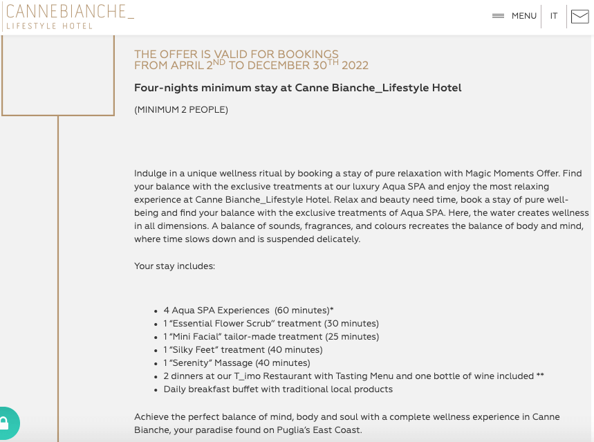
In the example above, no further details are given about the massages, meals and spa treatments so we have no way of differentiating their offer from what’s out there in the marketplace.
This is the case when you haven’t made a strong case as to why your prospect should choose you over all their other options in the marketplace.
Your UVP shouldn’t just explain what makes you or your solution different.
It’s more about conveying what makes you better than all their other options or what makes you the best choice for them.
Keep reading and I’ll show you some examples of winning UVP’s later.
Usually this is the case when you don’t give buyers enough reasons or added incentives to act immediately.
Stick around and we’ll show you various ways to leverage persuasion principles like Consistency, Commitment, Urgency and Scarcity to compel your prospects to act right away.
Nowadays mobile optimization is no longer a nice-to-have, it’s a do-or-die thing because…
Mobile web traffic has consistently accounted for about
half of all global web traffic since the beginning of 2017.
(Statista, 2020)
—–
51% of shoppers have completed an online purchase with
a smartphone. (Pew Research Center)
When it comes to designing the page layout, you must consider how your audience consumes content and the device they’re using.
So ask yourself the following questions…
If your pages are built by developers who don’t understand conversion principles, the pages are likely to be slow to load or the code is clunky and bloated.
Later, I’ll show you some tools (many of which are free) that can help you fix these issues.
This is the case if some elements appear wonky.
Or the User Interface hasn’t been adapted to account for big thumbs.
Or the user can’t click on specific links because your page isn’t coded to adjust to their device or browser.
Most users won’t have the patience to keep navigating around your page when some elements aren’t rendering properly.
Usually, all it takes is a couple of small inconveniences and they click the back button, never to visit again.
There are many other conversion killers but those are the top ones in our experience.
Of course every case must be taken in context. But stick with us and we’ll break down the nuances involved.
Earlier, we were harping on about “the problems” with Conversion Rate Optimization…
So what do we propose?
Our solution is simple:
If you need high-converting pages from day 1 (and who doesn’t, right?), apply Conversion Design on each and every single page you build, launch them, and then implement the best CRO you can considering the resources you have.
That way, you give yourself a great head start because your page converts at a relatively decent rate right from the get go and then you improve it from there.
As a marketer, you have several forces working against you by default:
> The increasingly noisy marketplace.
> The competition that’s getting more cutthroat by the second.
> The ever changing rules in the online landscape.
> The evolution of your target audience’s tastes, needs and identity.
> The rising cost of advertising.
These are just some of the challenges that are pulling you down way before you even begin.
That’s why now, more than ever, you need tools in your online marketing toolkit that give you sustained power to outlast the pull of those gravitational forces.
In this respect, Conversion Design is a win-win.
By using Conversion Design, you meet your goals by paving optimal decision-making journeys that help them arrive at the best solutions.
Apply our Conversion Design Blueprint and you will achieve extraordinary uplift in your pages’ conversions regardless of your niche, industry, target audience or experience.
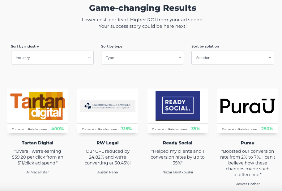
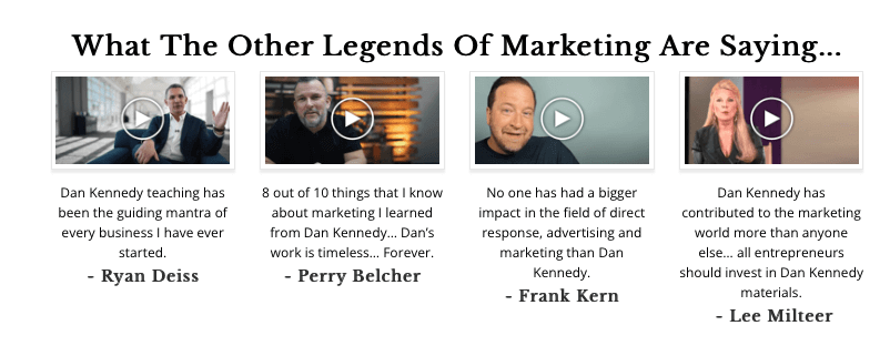
I say this with confidence because conversion success stories like the ones below are common in our community.

Plus…
→ It’s affordable.
→ You can apply it even with no previous experience.
→ You and your team can learn Conversion Design principles and apply it yourself — even if you’re complete newbies
→ You can apply it even when you have no previous data.
So it’s perfect for new launches, shops or startups.
→ You can leverage it regardless of the platform you’re using.
→ You can apply it to any offer, in any industry.
→ You can implement it quickly and easily.
→ You can improve both the macro (page structure, UVP, platform, mobile responsiveness) and
micro elements (user intent & behaviour, demographics, traffic sources, etc) that affect the
persuasive power of a web page.
Simply put, Conversion Design reduces the risk of sustained losses and provides increased chances of campaign success.
Conversion Design is really about designing persuasive experiences for your ideal prospects.
That’s how you turn your visitors into leads and leads into sales.
But how do you design a persuasive experience for someone without knowing them intimately?
You can’t.
And that’s why the real secret sauce behind persuasion isn’t what you do or say while you’re trying to influence them. It’s all about the stuff you do before.
The most persuasive communicators are those who know what their prospects are really hungry for — and they give it to them.
(By the way, if you follow nothing else but THAT when designing your offers, you’ll end up with a compelling offer.)
You know what’s required to build sturdy skyscrapers?
The taller they are, the deeper and stronger the foundation needs to be.
In fact, the world’s tallest buildings have foundations as deep as 90 to 282 feet below ground!
The same principle applies to marketing.
If you want your message to stick…
If you want your influence to ignite people’s imaginations and inspire them to act…
You must do some “deep digging” first before you even get in front of them and do your li’l song and dance number.
Here are the foundation-building stuff that we do:
Your entire marketing engine is an ecosystem.
So before we do any page for any client, we analyse the funnel which the page will be a part of, including where the traffic will be coming from.
It’s essential that we understand the journey the prospects are going to take.
We take time to understand what they already know, what they still don’t know and the most important things they should know by the time they land on the page we’re about to build.
We recommend you do the same.
Clarifying “the one goal” is important because when you build the page, there should be no links or Calls to Action that could detract them from that goal.
Every single element on the page must either contribute to advancing *the one goal* or it has no business to be there.
Find out everything you need to know about your prospects.
It includes their:
* Psychographics
* Demographics
* Their thought processes as they go through each stage in the buying journey.
* Devices and browsers they use, etc.
It’s important not to make any assumptions. Clarify what they need to know about you and your offer in order to feel good about moving forward.
Generally speaking, by the time they land on your page, a typical prospect’s thought processes goes like this (they change slightly depending on their specific role, or if it’s B2B or B2C)…
“Who are you, what do you offer and why should I care?”
“My problems are _____ and _____, and what really matters to me is ______. How can you help me achieve those?”
“What can you do for me, exactly? And what else? How’s my life going to change?”
“Can you show me how it works?”
“And I should buy from YOU because…?”
“What makes it/you unique? What about it/you is new or unexpected, exclusive or rare?”
“Do I really need to solve this problem now though? But why?”
“Who else have you solved this problem for, and what are their results? (or who else is using it and how did their lives change?)”
“How exactly is it going to improve my body/lifestyle/business/health/status/wealth/relationships, etc?”
“Sounds impressive, but can you show proof of your claims?”
“Can it work for me though? But I’m lazy/totally inexperienced/too stupid/too young/too old/too good-looking, etc.”
“Hhhmm I think I’m going to check out what other vendors with similar solutions are offering. You know – just to make sure I’ll pick the best deal…”
“Is it safe? Can I try or test it risk-free?”
“How does it compare to alternative solutions that can do the same job for me?”
“OK, me likey! What do I need to do now?”
“And what happens next if I do that?”
“Waitaminute… I’m not going to regret this, am I?”
“Yeah rrriiiight. But what if I regret it though? What then? Is there an “undo” button if I don’t get the promised results?”
“Fiiinnee. But can I get a discount or some added extras? Y’know, to sweeten the pot?”
Your deep understanding of your prospects’ psychology is what you will base everything on: your offer, your message, your funnel flow, your page design, etc.
This is a huge part of making any page you build as persuasive as possible.
“Yeah but why this, why you, and why now??”
Whether secretly or out loud, that’s what your prospect is asking (after you manage to get their attention, that is).
Your answer to that question is your Unique Value Proposition.
Your offer and UVP needs to be compelling and irresistible to your target market.
Your UVP is not just a one-sentence statement or a catchy slogan. It’s a powerful promise that conveys — in concrete terms — how you will improve your ideal prospects’ lives.
So convey your UVP on multiple levels and in many ways.
You could convey your UVP by highlighting a unique trait that your product has. For example:
“Original, patented safe LED activating technology”.
Or you could talk about how you do what you do:
“When it absolutely, positively has to be there overnight.”
Your UVP could be strengthened by helpful details.
For example, you can highlight the ingredients or raw materials you use, where you source them from, or the values you uphold:
“We have been machine embroidering our dog clothes right here in Oz to ensure the highest quality, personalised dog clothes on the market.”
This is a good value statement if your prospects believe it’s important that you don’t use sweatshops in less developed countries to help ensure that your products are never made by underpaid workers or exploited children.
Plus, it’s a tactful way of saying “this is partly why our prices are higher than other options in the marketplace.” —without actually saying it. It builds their case about why they’re more expensive but in a way that makes people happily pay for premium price.
Looking at the image above, notice how the Social Proof elements bolster our UVP.
We let our results speak for us.
See how it’s more powerful that way?
Here are our top tips:
1. Make sure it’s clear:
Get rid of any business-speak, jargon or any vague, generic-sounding statements.
Better yet, use the words your customers use.
2. Make sure the benefits are concrete:
If your UVP is about new or unique values that your product offers, make sure to spell out
what the product does, how it works, and the end results the user will enjoy.
3. Keep it simple: it must be read and understood in less than 5 seconds.
4. Incorporate it in your headline in the area above-the-fold.
5. Make sure it matches what your ideal customers actually value.
If your UVP is boasting about speed but your prospects value quality more (for example) then it’s a mismatch.
6. Your Value Proposition should appeal to both logic and emotions.
Some people relate to the world more through the lens of their emotions, while others
are more in their heads.
To be more persuasive, craft your value statements to appeal to both.
7. Of course, it should be something that you can actually deliver — not just an empty promise.
Avoid hype or any unsubstantiated claim. Make sure you can back everything up with solid evidences.
8. Make sure your UVP is being conveyed on all of your pages (home, about page, product/service page, etc.)
not just in a specific section.
9. Convey clearly what makes your product/service not only different but superior than their other options.
Build your page using the platform that best matches your business needs.
We’ve used just about every platform there is to build landing pages so we have a solid grasp of what’s out there and their pros and cons.
Because your platform affects the way you execute your campaigns, we advice you assess your short term and long term business goals so you can determine what platform is going to work best for you.
The good news is that the Conversion Design principles work the same regardless of what platform you use!
Where do the eyes need to be drawn towards?
What elements need to stand out the most in order to maximise conversions?
Which parts of the message are best conveyed via images as well, and which ones will be more impactful if in video format?
How can we design the page so it conveys what they need to know in a simple, easy-to-digest, and memorable way?
These are just some of the questions we ask at this stage and then we use colour psychology, strategic use of space and visual hierarchy to deliver on those prioritisations.
If you don’t reflect on these questions, you could end up with an online equivalent of this:
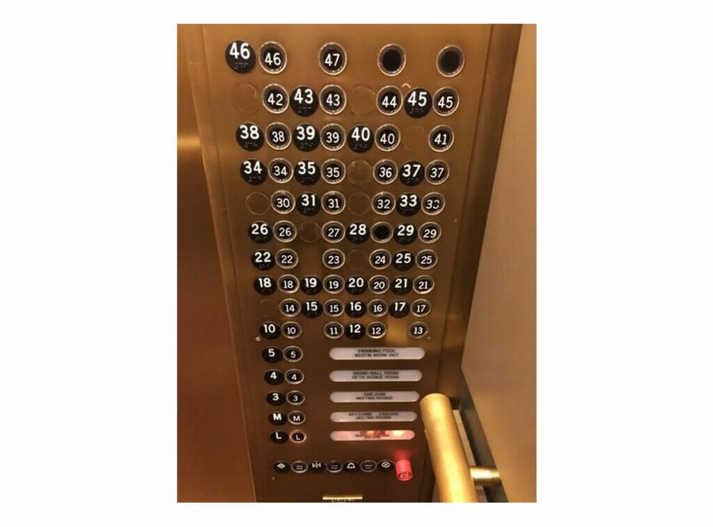
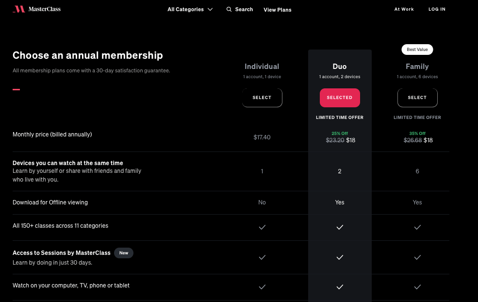
A key take-away here is that not all elements on your page are equal.
There are elements you want to stand out more, depending on your goal and the narrative you’re developing to get to that goal.
For example, Masterclass.com three options but they are drawing people’s attention to the “best value” option:
Using your deep understanding of your target market’s psychology, make sure your Unique Value Proposition is conveyed clearly and powerfully all throughout the page, in more ways than one (not just in the headline, for example).
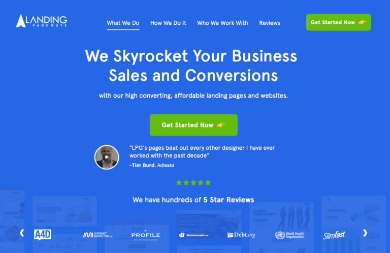
Looking at the old LandingPageGuys.com home page above, notice how the various social proof elements (the brand logos, the video testimonial, the 5-star reviews) support the big idea behind the headline.
You want to convey your value proposition in one glance. So that even without thinking about it, the reader gets it and they’re enticed to keep exploring.

AIDA stands for Attention, Interest, Desire and Action.
This is the sequence we recommend you follow when structuring your messaging on the page.
The rest of the page is useless if the first thing they see when they land on your page fails to capture (and hold) their attention.
Picture this:
Your target prospect (let’s call him Bob) clicks through your ad and now he’s on your page.
Having fallen for so many click-baity stuff in the past, the first thing he’s going to establish is if your page is relevant to him.
At this point in his journey, the main questions on his mind are:
* What’s in it for me?
* Is this really worth my time and attention?
* Should I do this now, later, or never?
All fair questions. After all, there are so many other things Bob could be doing instead.
Research says we have about 5 to 7 seconds to elicit favourable answers to all those questions. (The average reader has an attention span of only 8 seconds).
So the first thing they see when they land on your page (before they even scroll) must convince them to STAY and engage with the rest of your page.
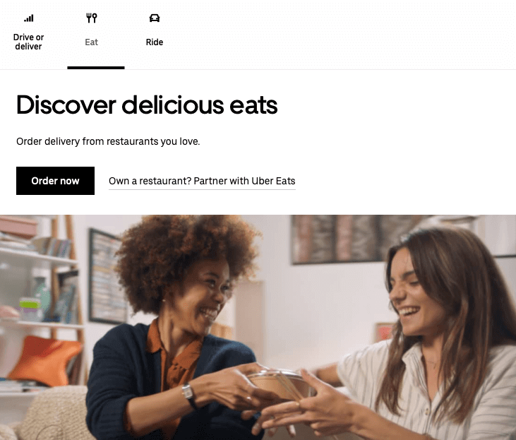
So, when designing the above-the-fold section, we make sure it has the following elements…
1. A benefit-driven headline (that conveys your UVP)
2. Social proof elements
3. A hero image or video that reinforces the powerful ideas behind the headline.
4. Emotive, benefit-driven statements or bullet points (when applicable)
5. A clear and conspicuous Call to Action.
You can see them in action here:
These elements above the fold work together to achieve one goal: engage your prospect enough to scroll down and read the rest of the page.
Once you have their attention, develop their Interest.
This is where you showcase the Features and Benefits of your offer.
You can do this in many ways but the most common is listing them in bullet points to make it easy to read and digest.
Make sure to emphasise the benefits of the features.

If your product has various use cases and is used by different user profiles, adjust your messaging so it appeals to them considering their needs and the benefits they are after.
One of the most common reasons why we buy what we buy is because it holds the promise of making our lives easy.
So always highlight on your page how exactly your offer delivers on this.
Show them the transformation they will enjoy and how it is within easy reach.
To keep things simple, convey it in three to four quick-and-easy steps.
Show them how EASY it is to implement, to use, or how little it takes to get the benefits.
“Easy”, “instant”, “new and improved”, “effortless”, etc are music to our ears.
We humans like all the benefits without the pain and with little effort.
So if your offer actually delivers on those, highlight it, demonstrate it, say it different ways to drive it home.
It’s important to make it easy to read even for skimmers so they stay engaged.
You want both the design and messaging to make them keep scrolling.
After creating Interest, go deeper and add fuel to their Desire.
A common mistake many marketers make is to use hooks that don’t actually appeal to their target prospect’s appetites.
They make promises and claims that don’t “hit their prospect’s spot”.
Again, this is how deeply knowing your target WHO really pays off.
You can’t foster Desire if your messaging doesn’t match their motivations.
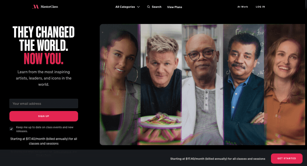
For example, if you’re marketing to those who love learning about a wide variety of things, what headline would attract them more:
“Learn a new skill every day!” or “They changed the world. Now You.”
The first motivation is more about self-gain (nothing wrong with that) whereas the second one is deeper than becoming smarter than most people.
The second motivation goes beyond the accumulation of knowledge —it’s more about using one’s knowledge to benefit other people’s lives.
Which headline would convert more depends on who you’re dealing with and their deeper (even unconscious) wants.
To foster Desire, find out these deeper longings that your prospects have and then add fuel to it.
This brings us back to the importance of understanding your prospects deeply.
Then convey the value you offer in many ways, from various angles.
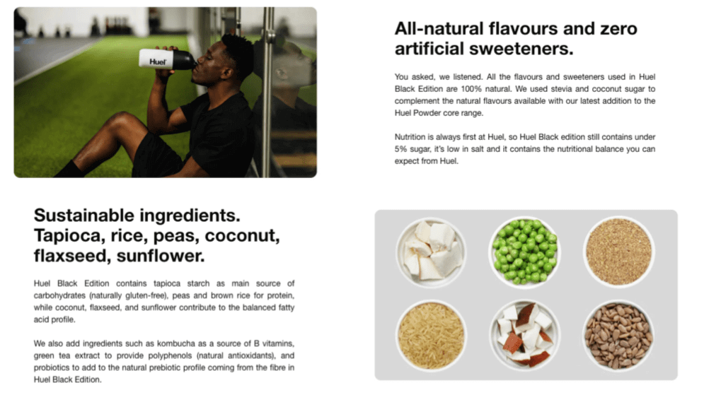
If your market research indicates that sustainability and all-natural ingredients (for example) are their top buying criteria, then emphasise those in your messaging.
An important aspect of creating Desire is backing up your claims with Social Proof.
If you can obtain testimonials or case studies from people/brands that your prospects admire, know or trust, (or that are very much like your target prospect), that’s even better.
Video testimonials are great for this.
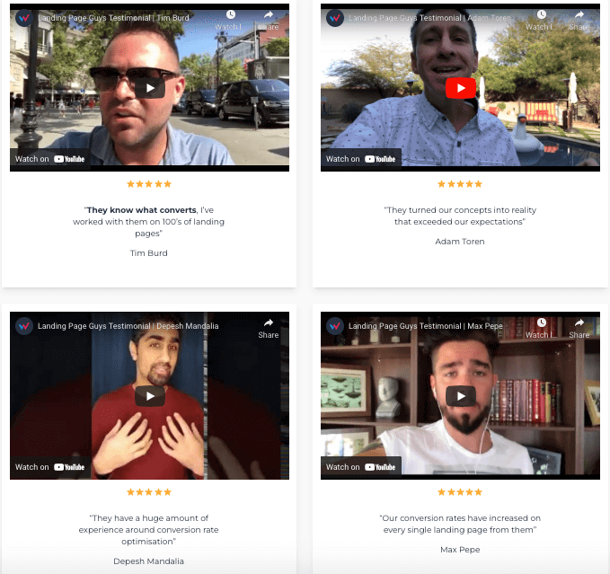
When your prospects understand what makes you a superior choice over your competitors, it’s so much easier to champion you to the other decision-makers involved.
Use evidentials that appeal to both their emotions and logic.
And don’t use random testimonials.
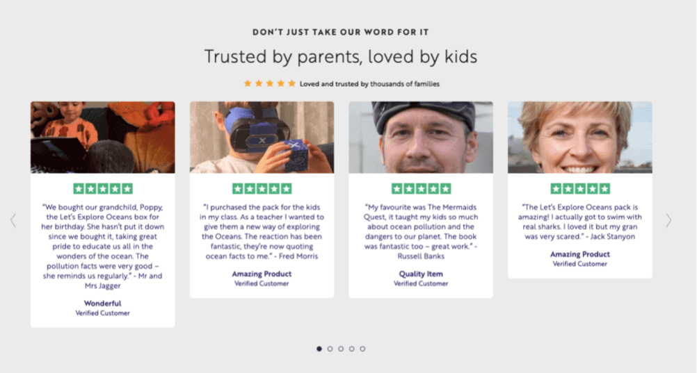
Read the testimonials above and you’ll notice how the first one is from a grandparent, while the second one is from a teacher. The third one is from a parent who is happy that his kids are developing their ecological awareness, while the fourth enjoyed the priceless experience of “swimming with sharks” without being afraid.
They’re all talking about the same benefits but they’re presenting it from different angles and from their unique perspectives.
Imagine this is your product. Whether your visitor is a grandparent, a teacher, a parent, a teenager, or an adult who can’t or won’t dive in real life, these testimonials are “hitting their spot”.
So don’t just slap on random, vague quotes from your customers on your page and think of it as social proof. There’s more to it than that.
Now if you’re using reviews and ratings, we encourage displaying genuine star ratings.
Funnily enough, if you have only perfect ratings all the way (you Demi-God, you!), it actually tends to rouse suspicion. Some people might think you’ve paid people to post fake perfect reviews.
So don’t sweat it too much when you get the rare 1 to 3-star rating from grumpy old farts.
(Of course it helps if you offer unhappy customers a way to resolve their dissatisfaction).
My point is that “imperfection” in your star ratings can actually make you look more authentic and thus credible.
Another way to build Desire is to showcase documentation of your customers’ or clients’ results.

Avoid using stock images because they can feel impersonal and make you look inauthentic.
People still buy from people, so use genuine photos or hire a photographer if possible.
Take professional photos of your people, products, process, events, your customers or your workplace and use those on your pages whenever applicable.
There are more examples you can draw from in the Social Proof section of this article.
After building Desire, inspire them to take the target action.
Do this by reversing the perceived risks (ethically, of course).
A great way to reverse risk is to have strong guarantees. The more “ridiculously unfair” it is to you, the more it inspires confidence in the buyer.
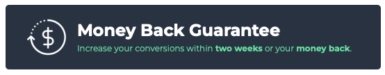
Most buyers don’t intend to actually take advantage of your guarantee, but they use it as reassurance that if things don’t go as planned, they can reverse any damages.
The more your guarantee reduces their risk to zero, the more you make them feel safe.
If there are genuine reasons you can use to convey Scarcity, then leverage them to help create a sense of Urgency.
The fact is that we humans love the status quo. We don’t like doing anything (even if it’s beneficial) unless we’ve got compelling reasons.
That’s why it helps to give your prospects plenty of incentives (that tap on both their intrinsic and extrinsic motivations) to motivate them to act now.
Read on to learn how to make your Calls to Action super persuasive.
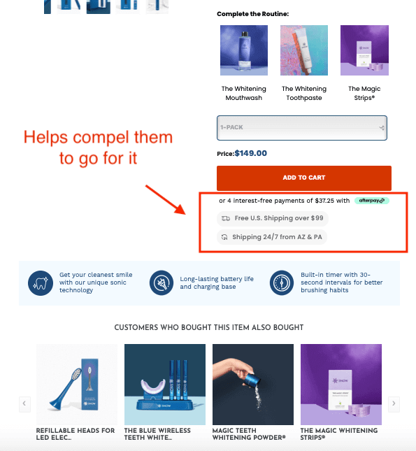
“What colour should I use for CTA buttons?” is one question we get asked often.
Contrary to popular advice, it’s not really about the button colour per se. It’s more about how it stands out from the background and the other elements around it.
If, for example, your primary brand colour is red, then using the same colour in your CTA button is just going to make your CTA button blend in with the rest of your site and therefore “disappear”.
So instead of getting fixated on the colour question, think more along the lines of prominence and strategic placement.
The more prominent and well-placed your CTA is, the more chances it has of getting clicked.
You can make your CTAs prominent by adjusting their size and weight.
A good guideline is to make it big and dense enough to still grab the user’s eyes even if they’re just doing a quick scan of the page and aren’t even really reading most of the text (a habit we’re all guilty of).
And if you’re selling different packages but you want more people to gravitate towards a specific option, then consider emphasising that one by making it stand out more.
When it comes to strategic placement of CTA buttons, don’t overdo it.
Don’t place a CTA after every paragraph because that can be perceived as being “pushy”.
And nobody likes pushy salespeople.
Be strategic and place your CTAs within the reader’s normal eye path.
A good question to ask yourself is:
“Based on the user’s behaviour and thought process, where does it make sense to have a CTA button?
And where does it NOT make sense to have it?”
Hint:
Just like it doesn’t make sense for a waiter to ask what you want to order without first giving you a menu to choose from, it doesn’t make sense to have a CTA before the prospect even understands what you offer, why it matters, what benefits they can enjoy, etc.
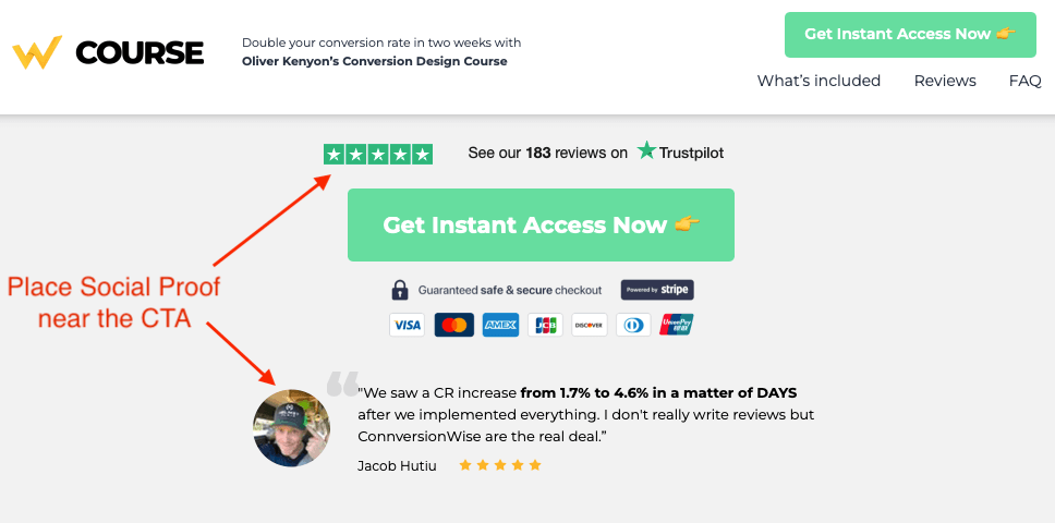
Supporting buffers are point-of-action assurances like Trust seals, a Social Proof element or short explanations right next to the CTAs.
They’re all about risk reduction.
Use supporting buffers to help calm down any doubt or anxiety that may come up when they’re about to take action.
When users know what to expect, they feel in control. It’s important for them to feel that they’re the ones calling the shots.
They feel more safe to move forward when they have more certainty so give it to them.
One way to do this is to tell them what will happen after they click.
For example, what are most people afraid of when you ask them to fill out a form and put their phone number in as a required field?
“I bet their pushy sales people will call me” or “Oh no they’ll bombard me with text messages.”
If it’s too early in their journey to actually want to talk to a salesperson and you ask them to give you their phone number, what do you think will happen?
Chances are they’ll be tempted to abandon the form and click away, right?
To help prevent this, write a reassurance under the phone number field that says something like: “No salesperson will call you.”
Another example is:
What do most people worry about when you ask them for their name and email?
“Hhhmm I hope they don’t sell my personal information…”
Assuming it’s true that you don’t plan to do such a thing, then write a short reassurance somewhere near the CTA button or right next to the said fields in your opt-in form:
“We promise we won’t do anything naughty with your personal data.”
I’m being silly but you get the idea.
This is why knowing your prospects intimately is really the secret weapon here.
If you know exactly what they’re thinking and feeling at a specific moment in their journey, then you’ll be able to align with them and say what they need to hear at any given time.
A common mistake we see is generic, ‘meh’ copy.
Make your CTA copy emotive and benefit-oriented.
How?
Tell them what payoff they’ll get if they click.
Compare the following:
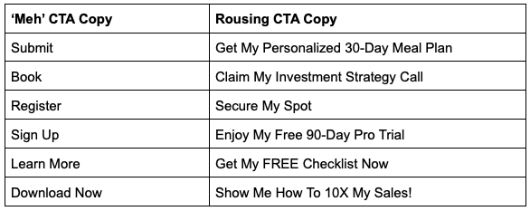
Notice how the ‘meh’ CTA copy is all about the effort you’re asking them to put in (what it’s going to cost them), whereas rousing CTA copy is all about the value they’re going to get rewarded with if they act.
See the difference?
Don’t think it’s just a non-threatening button because users do weigh the costs of clicking VS the pay off.
So make the CTA copy focus on the value they’re getting — not what they are giving up.
Here’s a good example from Clickup:
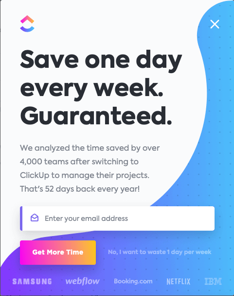
Notice how they use well-known company logos below the CTA as Social Proof.
They could also add a line above it that says “Save more time just like…” above the logos to contextualise and reinforce the CTA even more.
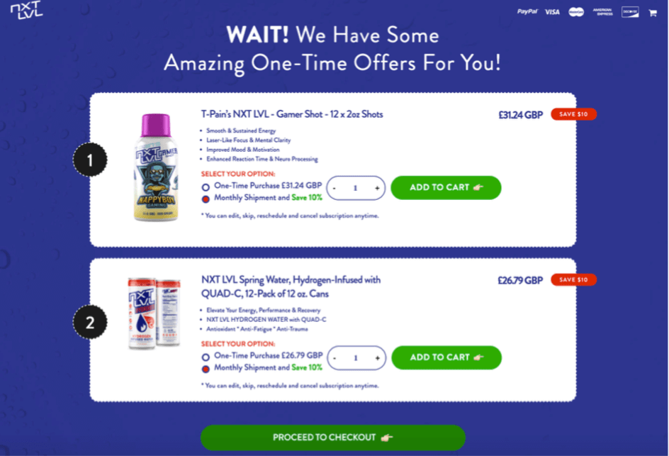
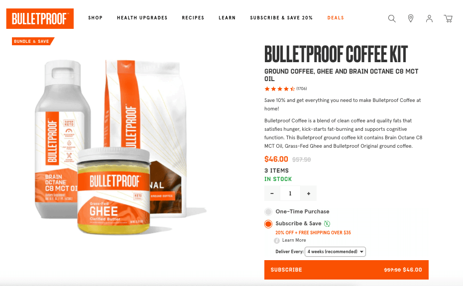
* Repeat your same CTA consistently throughout the page, back it up with the same Trust Seals and Social Proof elements (when applicable) to reinforce that it’s safe and secure.
* In our experience, putting emojis on CTA buttons boosts CTRs by as much as 40%.
It’s amazing how adding a “pointing finger” emoji works as a directional cue and boosts click through rates tremendously. We encourage you to test it on your pages.
* Finally, don’t have too many CTAs on a page.
You can repeat the same CTA on the page, but stick to the same one. Research has shown that when we’re given too many things to choose from, most of us end up choosing none.
The AIDA principle pertains more to information architecture. So use it as a guideline when you’re planning the structure and sequencing of your message as you strategize the page layout.
Now let’s tackle the psychological principles of persuasion that you need to apply to your pages.
Some of these principles are discussed in great detail in the book Influence: The Psychology of Persuasion by Robert Cialdini.
The more authoritative you’re perceived to be, the more it’ll boost your credibility and the more people will trust you.
So put elements on your site that can boost your authoritativeness.
Here are some ideas:
* Interviews & Guest podcasts you’ve done
* Awards and recognitions
* Press Appearances
* Videos of your speaking engagements
* Certifications, badges or Qualifications you have
* Create a course or write a book
Speaking at events and getting interviewed as an expert in your field is a great way to establish yourself as an Authority figure.
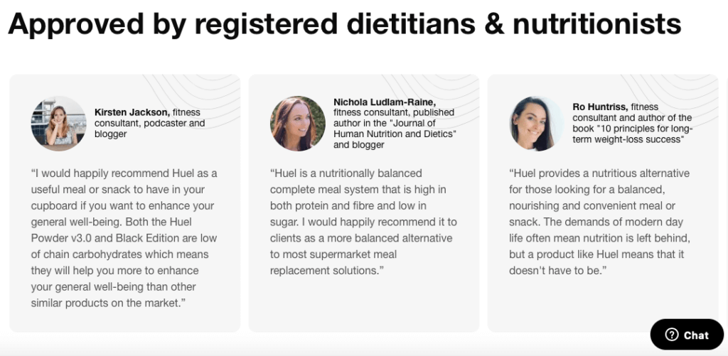
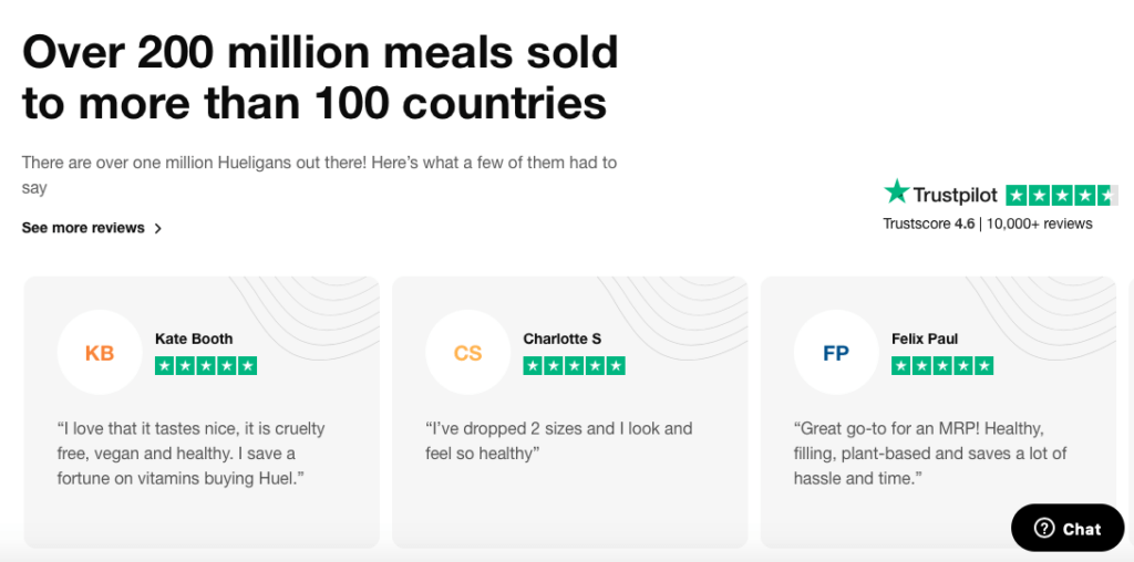
Yep, don’t bother publishing any page if it has no Social Proof element to it.
There are so many ways you can leverage the power of Social Proof in your Conversion Designs.
Here are some examples…
Vague claims are not credible at all so avoid them altogether.
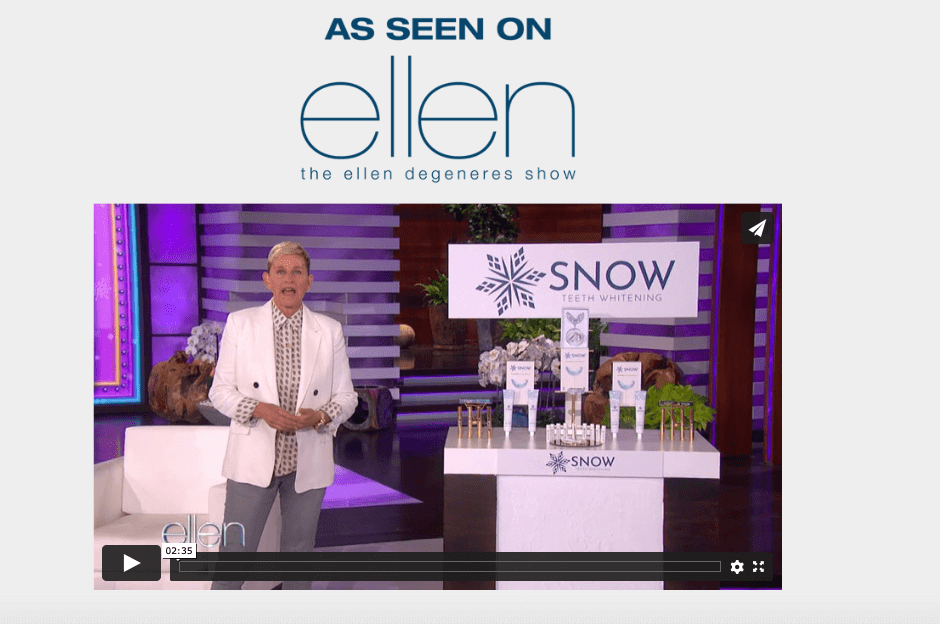
Appearing on a popular show can boost Credibility and Social Proof.
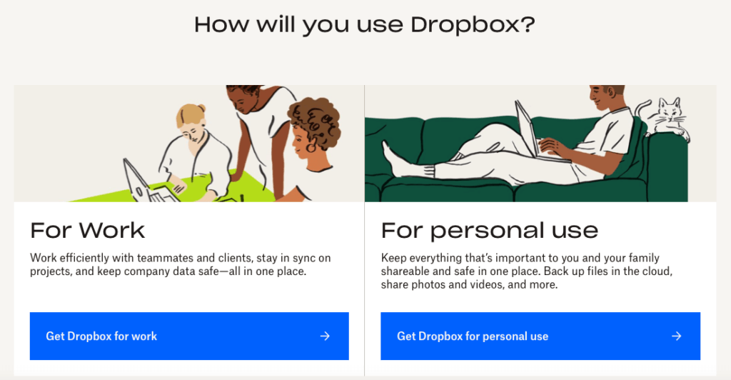
When it comes to testimonials, prospects tend to get more convinced when you feature stories or case studies from people just like them.
So if you cater to multiple types of user profiles, feature a variety of case studies and testimonials.
In the screenshot below, Dropbox has 7 of these stories, each with a different User Profile.
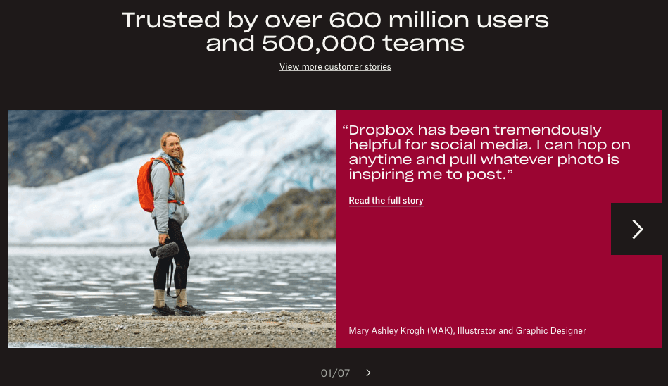
When you feature a variety of Success Stories like this, chances are high that any of your prospects will be able to find one they can relate with the most.

So make sure to feature stories from users just like them.
As social animals, we have a herd mentality.
Most of us default to thinking that if thousands of people already tested it and they approve of it highly, surely they can’t be wrong.
So we can’t help but conclude: “Hey if it’s good enough for millions of people, they must be on to something!”
It’s a built-in mental shortcut we use because we are cognitive misers.

So have a Social Proof element everywhere. Don’t just lump all your Social Proof elements in the Testimonials or Case Studies page or section.
Think of Social Proof as an essential spice to pepper all over your page to give it that vital zing.
Having Social Proof elements near or around your CTAs helps sooth any user anxiety that tends to come up.
Having Authority figures or Influencers to endorse you is a good form of Social Proof.
Getting your customers to write reviews on Trustpilot is a great way to have Social Proof.
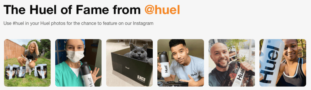
Getting your fans to take pics with your product and posting it on their Social Media is a great way to gain Social Proof… and free publicity!
Another one of our human quirks is when something is limited or harder to obtain, we just can’t help but want it more.
Our brains are wired to think that the more rare something is, the better it must be. So we value it more.
Here are several ways you can use it to make your page more compelling…
“Limited Time only” is the most common application of scarcity.
If you’re offering a service, there’s a built-in limit because you and your team can only serve a certain number of people at a time.
You could decide to only accept a certain number of clients for the next month because you’re highly in demand and have limited bandwidth.
Let them know when you have a limited number of stocks.
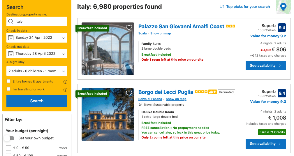
“Only 1 room left at this price” can motivate the reader to act more decisively.
A similar version of this tactic is to show how many other people are considering the same offer you’re eyeing.

Notice how the “Stocks selling fast” warning on the product page helps foster a sense of urgency.
I’m sure you’ve seen “By Invitation Only” marketing strategies.
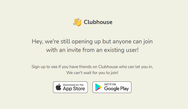
Clubhouse is a live-audio Social Media app. According to their blog, they grew their user base from 600,000 in December 2020 to 2 million users by January 2021.
You can use a similar tactic when you only work with people who fulfil certain criteria. Having a vetting process and accepting only clients who pass it can make you even more desirable to work with.
If you’re selling physical products, one tactic you can use is to make your product available only from exclusive or prestigious distribution channels.
Limited Edition works because it gives your products a prestigious glow.

When Puma launched their Puma King Luxury Edition in 2013, they put subtle gold details in the heel and sides of the shoe and created only 999 pairs.
Priced at £195 (US$275) per pair, even the shoe boxes became collector items!
One-time offers work because they limit the window of time that people can snap up an incredible deal that they will never be offered again.
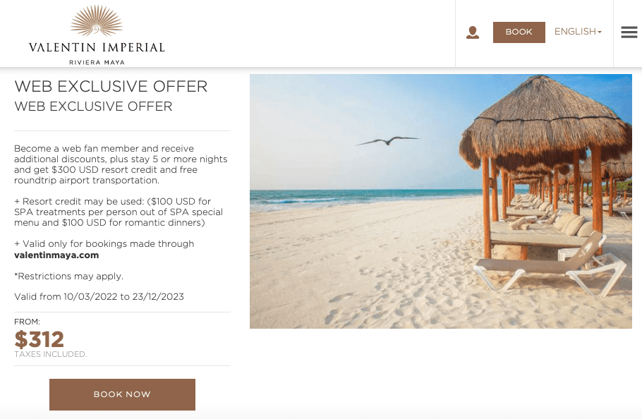
You can create enticing promotions for special occasions, or for those that meet certain criteria (e.g., new customers, Members only, groups, “Women’s Day Special”, etc).

If most people buy your product offline and you want to encourage them to buy online as well, you can create “web exclusive” offers.
We humans don’t like to change unless we absolutely have to, don’t we? Sometimes we even change only when we perceive threat or danger.
So even if what you’re selling is indeed life-changing on so many levels…
Even if your offer creates transformative results and there’s no risk whatsoever, you can bet that people are still going to resist you.
Because as far as our primitive brains are concerned, doing any Call to Action means getting out of our comfort zone, which means pain.
This is why you have to design your pages assuming that people will procrastinate, make excuses, and rationalise why their status quo isn’t actually so bad.
“We feel we must always align our outer actions and promises
with our inner choices and systems such as our beliefs and values.”
~ Robert Cialdini
We all have a self-image and our actions are consistent with that identification.
Once we decide to commit to something, we use rationalizations to convince ourselves that we have made the correct decision for us.
When we do an action or behave a certain way, we justify it so we can feel it’s “right”.
And when we do something that is misaligned with our beliefs, value system and our self-image, we feel that something’s not quite right. To resolve the tension from this cognitive dissonance, we make adjustments to our inner aspects.
This is why successful brands are those that make you feel good about yourself when you buy their products.
We all have a deep need for safety.
Predictability is one thing we equate with psychological safety.
When we’re about to buy something and we feel there are no sneaky surprises lurking around the corner, we feel more confident to move forward.
We’ve found that buyers abandon carts less when they know exactly what’s going to happen next.
That’s why we design Ecommerce carts this way:

If your promises are consistent with your product quality and delivery, your customers relax, they let their guards down and they trust you more.
The more predictable and consistent their customer experience is, the more likely they are to return and buy again.
So make sure your pages are consistent with your ads, your brand, and what you actually deliver. Make sure your campaigns are not sending mixed or contradictory messages.
Let’s say you don’t particularly identify as a funny person.
Then one day, after you cracked a series of lame dad jokes, your new colleague declares — in between guffaws — that you are hilarious. Chances are you’ll make an effort to be more funny than your normal self whenever you see him. At the very least, you’ll want to keep your banters playful because it helps reinforce their image of you.
This is the Pygmalion effect. Simply put: we fulfil what is expected of us.
As a marketer, one way to apply it is to:
Promote ideas that if your prospects believe about themselves, will help you advance the sale.
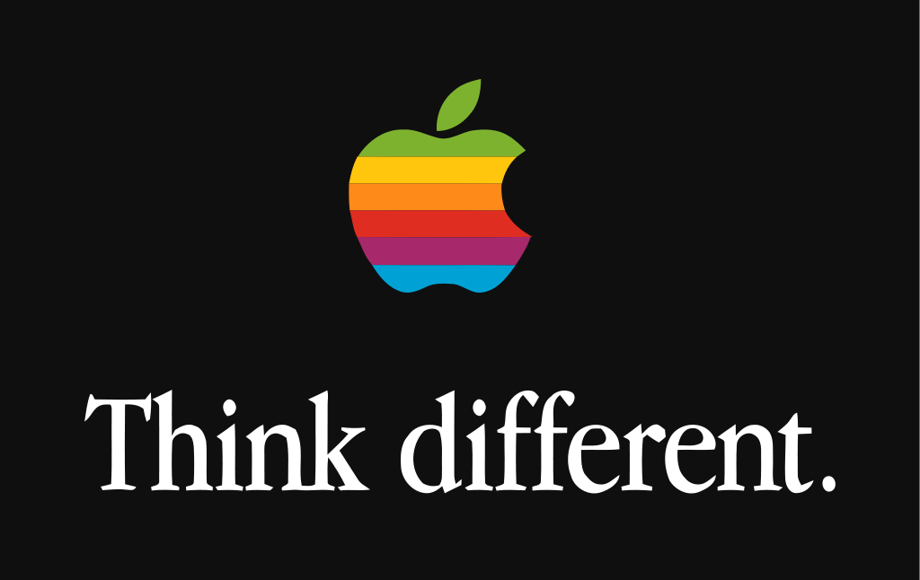
Years ago, when I asked my friend John why he owns a lot of Apple products, he said it’s because he resonates with the brand’s ethos. He believes that they are committed to making beautifully designed, superior products that revolutionize the way he pursues his creative endeavours.
Or at least that’s his rationalisation.
As his friend, I also know that John sees himself as an unconventional thinker and an extraordinary artist. So I think that when he experiences Apple’s messages (“Think different”), he feels resonance because his self-identity is reinforced by buying Apple’s products.
Products that bolster our ideas about ourselves or the self-image that we want to create will compel us to buy.
So when you design your pages and craft your messages, ask yourself:
What do my prospects believe or want to believe about themselves?
How can I position my product/service to help them reinforce those beliefs or become more of those?
After tasting free samples of ice cream, you’re more inclined to buy, right?
This is why some organisations ask you to sign petitions. On its own, the impact is very little. But by putting down your name and signature, you’re publicly declaring that you align with their cause. Once you do so, you’re likely to get more involved in supporting their endeavours.
How to apply this foot-in-the-door technique to your marketing:
Ask people to take a small action or commitment. After they agree to it, ask them to make a slightly bigger commitment. Repeat.
The idea is to get them to speak and act in accordance with the idea that you want them to adopt. By doing so, you are in effect conditioning them to align their beliefs with their actions.
If it’s not feasible to “give away” your offer that much, try giving a “sampler”.
Because you’ve done your research, you know your target audience very well.
You know their fears, concerns, objections and most common questions.
So leave no stone unturned by addressing all those on the page.
The best way to handle objections is to prevent them.
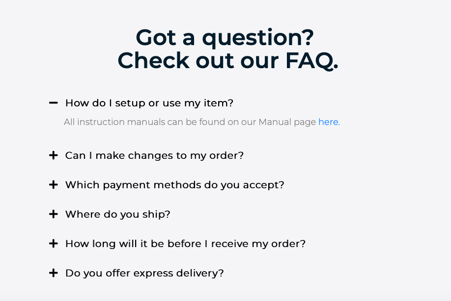
This is why we add a Frequently Asked Questions (FAQs Section) at the end of the page to address any remaining concerns.
Answering their questions empowers them to feel good about moving forward.
If you can’t help but use stock images of people, do your best to be more inclusive.

If you’re marketing to people of all races, demonstrate it in the images you use on your pages.
Don’t let your designers put irrelevant photos on pages for the sole purpose of breaking up the text. Like this one:
I don’t understand the connection between the copy, the product’s value proposition, and a man’s crotch (I think) that’s about to go under water… Do you?
Think of images as sales copy in visual form.
So use ones that add value to your message. Otherwise it hasn’t earned the right to be there.
A good question to ask whenever you’re deciding what images to use on your pages is:
“What images would help sell the offer even if the prospect
only reads 20% of the copy?”
There may be times when you’ll still come up empty, and that’s OK.
Because it’s the asking of the question that helps create “a conversion mindset” which then sets you towards the right direction.
As a general rule I advise people to use professional photos, but sometimes breaking “best practice” actually works.
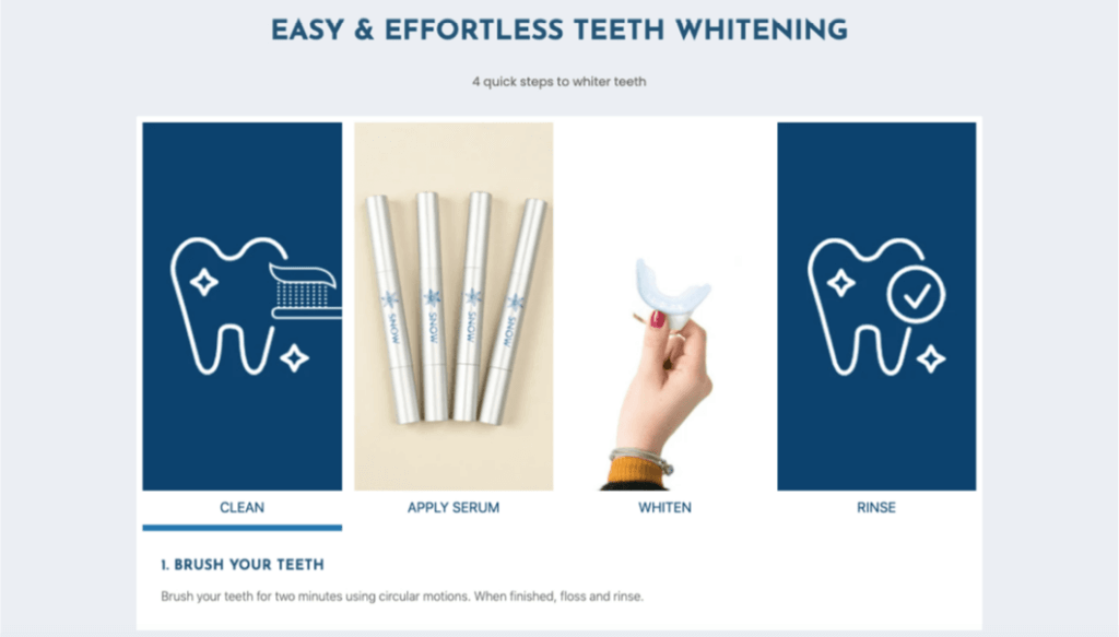
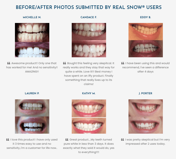
Check out how our client Snow leveraged the selfies taken by their customers to demonstrate their products’ benefits, thus boosting their Credibility.

Notice how the images convey exactly what their headline “Real People. Real Results.” is saying. Which, by the way, does a great job of addressing the common scepticism of many people when they read product reviews and testimonials.
But what if your offer doesn’t create a physical transformation (which will be difficult to visualise using “before and after” photos)? Or when what you’re selling is unfamiliar or somewhat technical in nature?
What images should you use then?
You can get creative and think of how to create visuals that:
* Demonstrate the experiences your product or service will allow your prospect to enjoy.
* Illustrate the supporting ideas behind your claims, such as stats, graphs and charts.
* Reflect back to them the person they are now versus the upgraded version they’ll become if they act now.


You can also use a product comparison charts to help buyers choose the best option for their needs, like this:
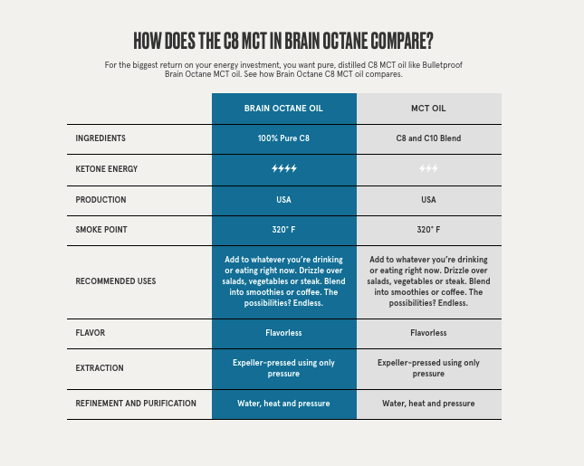
Remember also that your prospects will compare your products to your competitors’ so you might as well control that narrative.
If you can effectively demonstrate your product’s superiority by comparing your offer to the other options in the market, do that.
Not everyone likes to read huge chunks of text for hours on end.
So sometimes, parts of your message are best conveyed via a video.
If you want videos on a key landing page, add subtitles to make it consumable on mobile devices, even without sound.

Leverage Video Testimonials on your page whenever you can.
Video testimonials are more powerful because they are harder to fake compared to written testimonials with people’s mugshots.
Video testimonials give more Credibility and Social Proof.
In our experience, it’s still hard to find developers who are aware of — and practice applying — persuasion principles to their work.
Because many don’t see their roles as sales or marketing-related, their skill sets don’t allow them to build highly persuasive pages. (This is why we felt compelled to create our Conversion Design Course).
We recommend you forward these tips to the developers you’re currently working with so they can apply them to your pages.
Remember the critical elements we mentioned earlier that you must show above the fold?
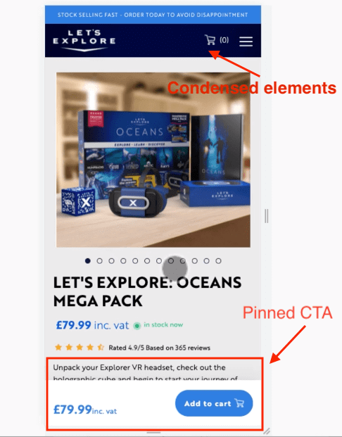
The same principle applies when designing for mobile users.
The only difference is that on mobile you have less space, so incorporate those critical elements in one scroll whenever possible.
Condense certain elements to improve usability, like:
* The menu
* Cart
* Navigation
* Get rid of big white spaces in between sections to maximise the real estate.
On important pages, you might want to pin your Call to Action on the screen so they can click it conveniently wherever they go.
How fast? When we develop pages, we aim for 3 seconds or less.
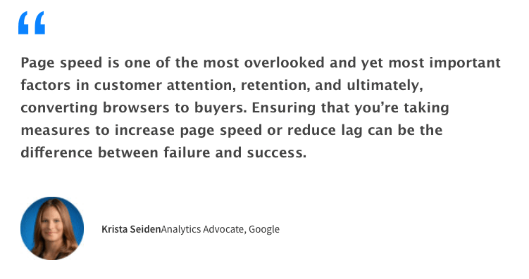
Page speed matters because…
1. Are you doing SEO? Google uses mobile loading speed as a ranking factor so it affects your organic traffic.
2. Are you buying ads? Faster loading landing pages means better Google Ads Quality Score (QS). Better QS means lower cost per click, higher click through rates, higher search impression share and high conversion rates.
3. If your page is slow, users click away faster than you can say Adios!
With every additional second of load time, website conversion rates drop
by an average of 2.11%. That’s between seconds 0 – 9 though.
Between seconds 0 to 5, conversion rates drop by a whopping 4.42%! (Portent, 2019)
Bottom line: the faster your site, the higher your conversion rates will be.
In 2019, when Unbounce surveyed 750 consumers, 70% admitted that page speed affects their willingness to buy from an online retailer.
Considering all these, you’d think that most marketers, designers and developers prioritise mobile load speed when delivering their work.
Sadly, it’s a big fat NO.
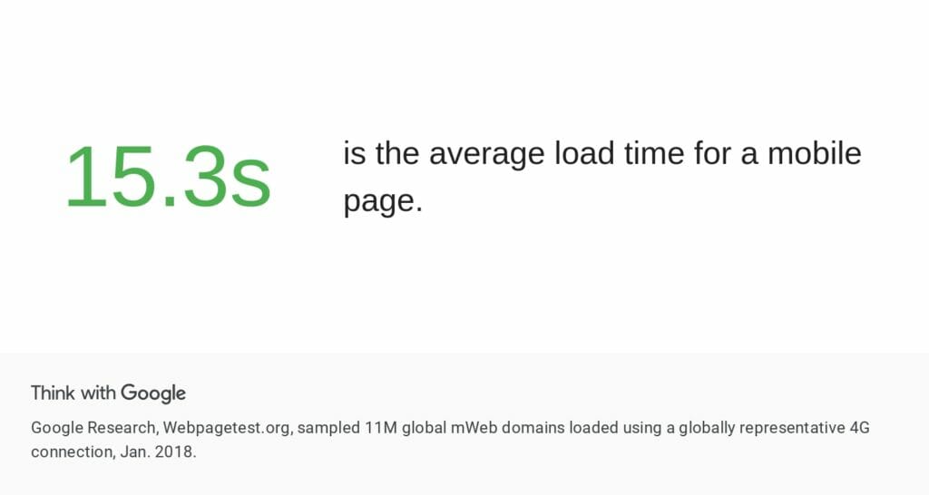
In fact, the average mobile page takes 15.3 seconds to fully load according to Google Research.
That’s slower than an inebriated, high-as-a-kite sloth.
We encourage you to use these resources to improve your page speed:
* GTMetrix
* Actionable tips from Google
* Pingdom
* PageSpeed Insights
* Browserstack SpeedLab
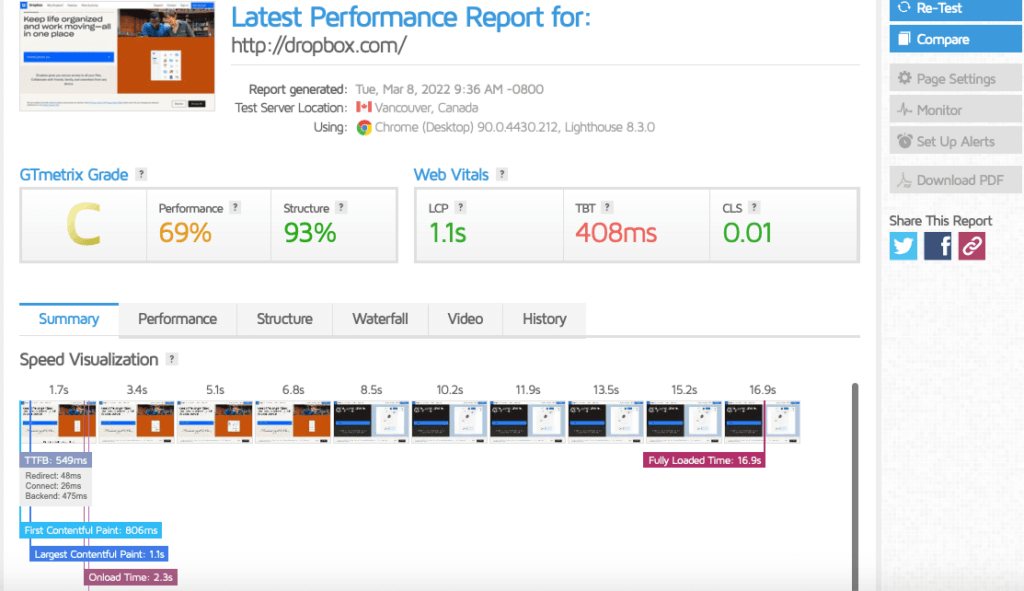
Just type in your URL and you’ll get a comprehensive page speed report from GTMetrix for free.
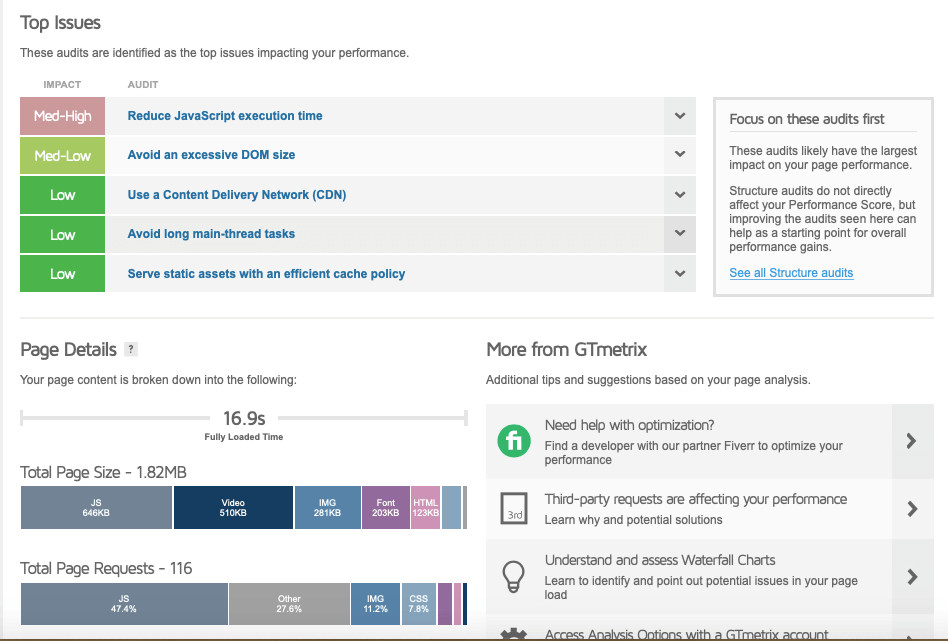
A GTMetrix performance report includes an audit of top issues and how to fix them.
Your page is responsive if it scales its content and all the elements on the page automatically across different devices.
Basically, you want your users to have a great experience — no matter their device, platform, or browser.
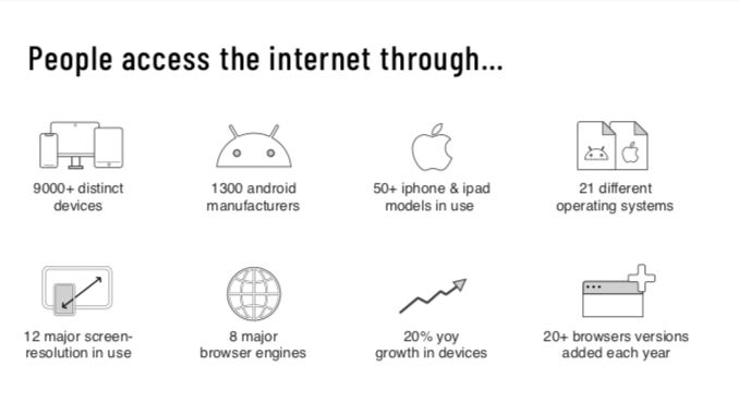
Of course it would be impossible to be 100% perfect in all 9,000+ devices and all browser engines.
But we want you to get why it’s important to ensure that your site’s usability and responsiveness is consistent across as many devices as possible.
Otherwise functionality and accessibility glitches like this could happen:
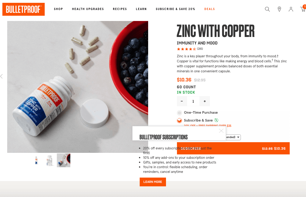
When users click on the “Learn more” link next to the Subscription option on the product page shown above, a pop up appears but it’s hard to read.
It’s no big deal but you want to spot issues right away, especially when it’s something like a problematic BUY button, for example.
You want to resolve anything that’s going to impact your
customer’s journey especially when they’re nearing the end of the funnel.
You can check your site’s responsiveness manually by borrowing different devices and then checking out your pages using various browsers.
Or you can ask different people to surf your pages, play around with them, do a few test tasks, and report back to you if they find any issues.
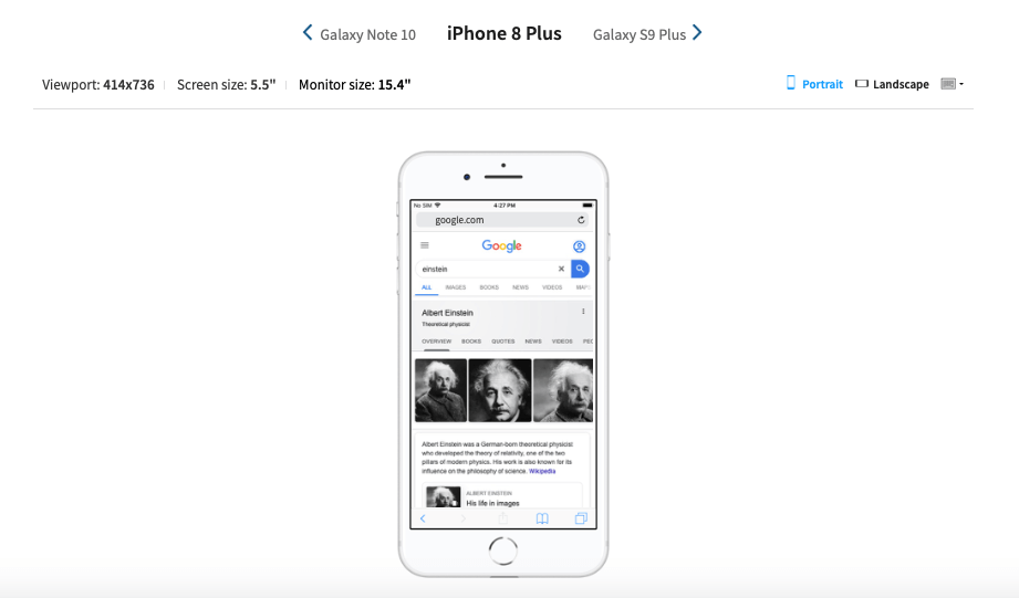
Alternatively you can test your page easily (and for free) on mobile devices online through BrowserStack.
Just enter the URL on their free Responsive Checker and you’ll see how it renders on popular mobile devices like the iPhone X, Galaxy S9 Plus, Pixel 3XL, various tablets, desktops and everything in between.
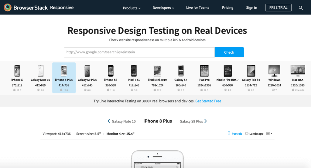
Just select a device and you can scroll and interact with the site as if you’re using the device in real life.
You can also use good ol’ Chrome for this. To see how responsive your pages are just go to the page you want to test, right click, select Inspect, then toggle between the device options.
Another Responsive Checker tool is Responsinator.
From Chrome to Safari to Opera, your site should look great and every element should work the way it’s supposed to.
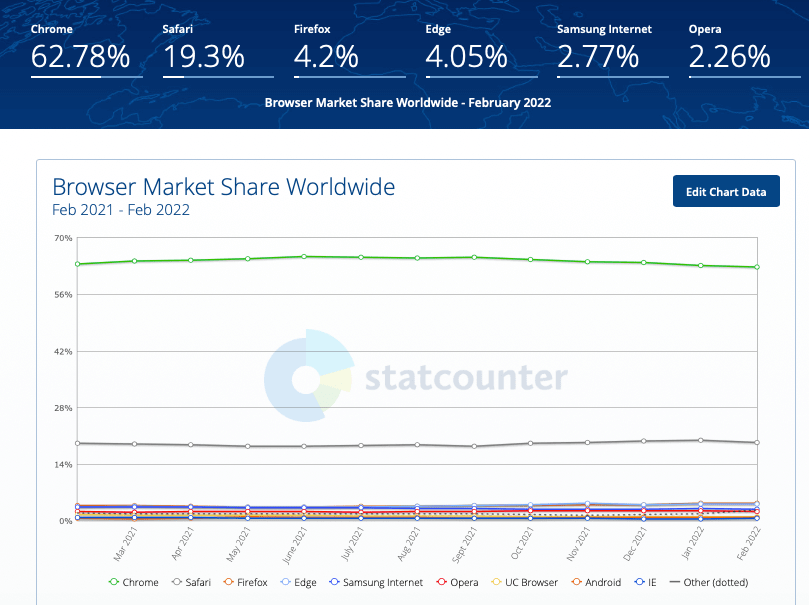
Chrome is the most used browser worldwide followed by Safari (Statcounter, Feb 2022).
A big part of making your pages cross browser compatible is using simple, easy-to-understand, easy-to-maintain, reusable code.
For example, instead of copying and pasting complex code in many files, just write one function or subroutine that you can then call when needed.
Doing it this way minimises issues, it’s easier to maintain, and it saves time because if ever there’s a problem, you’d only have one function to debug or adjust rather than countless different files!
It’s funny how preventable tech issues are so common.
But when it’s your campaign being launched, I doubt you’d be laughing.
This is why we recommend always taking the time to validate your HTML and CSS to prevent problems.
Use the W3C HTML Validator and CSS Validator to make sure your code is spot on and then fine tune it when needed.
Of course, testing every page on every different combination of device, platform and browser is almost impossible, not to mention costly.
Besides, not all pages are equal.
So prioritise your “mission-critical pages”. Depending on your funnel design, these could be your:
* Home Page
* Opt-in pages or those with important forms
* Registration and booking pages
* Product pages
* Sales pages
* Cart and Checkout pages
* Contact Us pages
* Any landing page you’re driving paid traffic to.
There are many other little things that make a huge difference.
For example, if you have forms you want users to complete, make sure they don’t ask for unnecessary information, and that the forms go through a validation and verification process.
But as you know, it’s so easy to miss some of them.
That’s why before you launch your page and start buying traffic, we recommend you take the time to review everything.
To make sure all the campaigns we handle are set up for success, our team uses our 159-point Conversion Design Checklist to help them dot the i’s and cross all t’s.
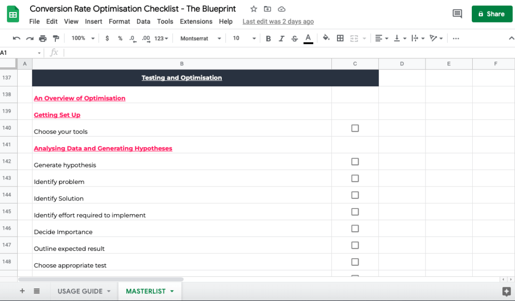
Our Checklist is comprehensive and covers ALL bases, including testing and optimisation:
We’re so excited for you because now you can start crafting persuasive pages!
We truly believe that Conversion Design is how you can build unlimited profit engines that will work for you in perpetuity.
If you implement it consistently in all your marketing efforts, you could soon enjoy:
* Lower cost per acquisition
* Higher AOV
* Double-digit conversion rates from day 1 — not day number who-knows-when
in the year twenty-never-ever.
* Make your ad spend work 2X or 3X harder
We’re confident that like many other businesses and entrepreneurs in our community, you’ll immediately be able to see a difference in how your visitors respond and you’ll start reaping unprecedented results in your conversion rates.
When you get your results data back, please don’t hesitate to reach out and let us know how you did! We’d love to hear your conversion story!
And if you have any questions or you fancy working with us, explore your options or schedule your free, no-strings-attached strategy call here.
3 more posts in CRO Fundamentals.