Welcome to another session of ConversionWise. In this post, I will talk about Mobile Hero Section: Key Elements for Conversion.
But before we move on, I would like to make an announcement. If you are reading this session as a blog post on our website, watch the video session of this blog on our channel on YouTube, “ConversionWise.”
You can also join our free Facebook group, where we teach about getting higher conversions for your business and offer free audit sessions.
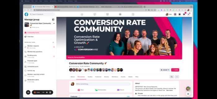
In this group, you will learn tips and tricks on how to build your business, increase sales, and improve the ROI of your online course or program.
Now that we’ve got that out of the way, let’s start with our lesson!
In today’s session, we r going to audit four landing pages for a pest control company to identify the key elements for mobile hero sections that can improve conversions.
Nothing sells more than a comforting feeling! And that’s exactly what the hero section on mobile devices can do. With a clear and persuasive message, it can help to boost your conversions on mobile devices.
Some key factors that make a mobile hero section effective are the headline, copy, images and video, CTA buttons, and social proof. A well-designed mobile hero section can help to improve conversion by improving trust and engagement.
However, not all landing pages are optimized for mobile devices. Often, marketers don’t pay enough attention to it or run into design and technical issues while converting desktop pages to mobile.
That’s why, at Conversion Wise, we conduct regular landing page audits to help our Facebook community, our email list, and our clients improve their conversion rates.
We randomly select landing pages that members from our Facebook group have submitted and evaluate them for mobile hero sections. By identifying the gaps in these pages, we help marketers and businesses improve their landing page strategies and increase conversions.
So, without further ado, let’s begin our analysis of the pest control company landing pages.
In this session, we analyze 4 landing pages and give feedback on what’s working well and what needs improvement.
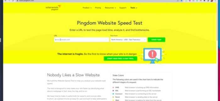
I’m going to use some tools to help me with my analysis. The first one is called “Tools.Pingdom”
With this tool, I can check the page speed and see if any issues need to be addressed.
The second tool I’m going to use is “Built With.” This tool will tell me what technology was used to build the landing page.
Now before I move on, I want to give you a quick overview of what we do at ConversionWise while conducting these audits.
We focus on conversion principles, and we also take a look at the technical aspects of the landing page.
The conversion principles we focus on are:
1) AIDA principles: Attention, Interest, Desire, Action
2) Page load time/speed
3) Trust Icon
4) Social Proof
5) Call to action
There might be more, but these are the main principles.
Let’s start with the first one.
1) 4ashoponline
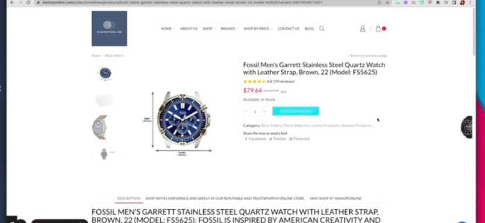
Let’s start with the speed of the page. As you can see, this landing page loads pretty slow, like 3.55 s which is not very good. This could be a major deterrent for conversions as users are impatient and do not want to wait around for a page to load fully.
After the speed, I look for key elements above the fold section. I see the imagery, the headline is also pretty good, and trust icons are also present. Call to action and social proof is also well-presented, which is good.
However, the size of the logo is very big, which creates a lot of white space, and I also see the headline is not emotive, which is another potential area of improvement.
When we come down, I see the products described in the text, but it’s too texty. This can be improved with emotive imagery to create a visual connection. I like you have a star rating with products which is a plus.
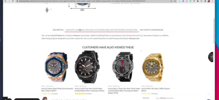
I would also like to see payment icons below the fold so that users can easily see all the areas where they can buy, and this could help reduce friction and increase conversions.
Lastly, adding FAQs or a customer support chat option would also be a good idea to improve engagement and trust.
Overall, with some tweaks in design and copy, this landing page could be an effective tool for increasing conversions on mobile devices. I would recommend that the pest control company work with a conversion optimization expert to help them identify and address these issues.
2) Space
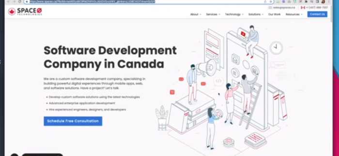
Let’s start with the speed of the page, which is pretty good at 1.65 s – much faster than 4ashoponline’s 3.55 s!
Now, let me at the page to find those 5 key elements: AIDA principles, page load time/speed, trust icons, and social proof.
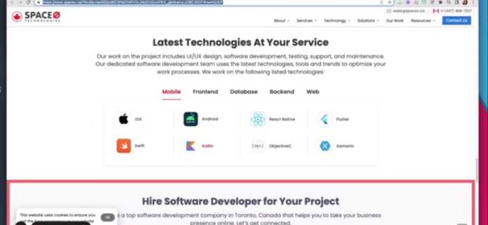
Since this is a software development company, I would like to see more CTA buttons and social proof in the form of testimonials or case studies.
I like your imagery; it’s really cool and attention-grabbing, and the call to action is also good. I would advise placing it more prominently on the page, as users may not see it due to its current location.
I would like to see a more emotive headline and some form of emotive imagery on the page to help connect better with users.
I see you have trust icons down there, but I would ask to get them in the hero section so that when the user scroll down, he still knows that the site is reliable.
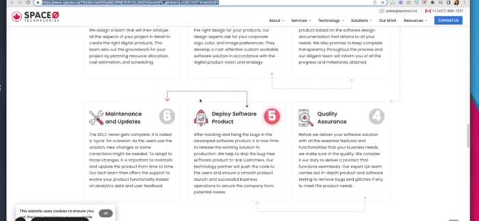
I also like your complete process for how you work, so I would advise adding some customer support chat options or an FAQ page where users can get answers to their most common questions.

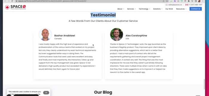
I like you have a testimonial section, but I would ask you to add at least three reviews so that it can be more persuasive. Overall, with some tweaks to the design and copy, this landing page could help increase conversions on mobile devices.
Lastly, I would suggest having an FAQ section so that customer support can help them with their most common questions.
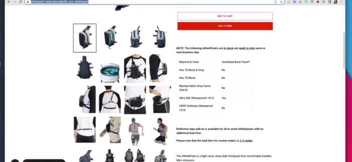
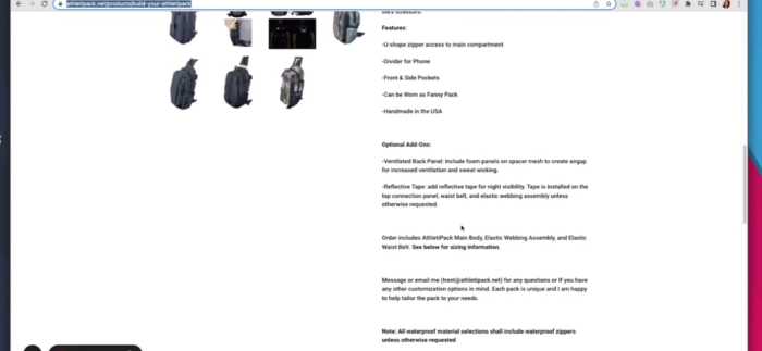
3) AthletiPack
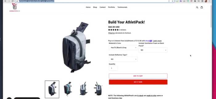
Let’s start with the speed of the page, which is not good. It’s 6.50 s, so it will take a bit longer for the page to load, which might be frustrating for users.
Now, let’s see if you get 5 elements that we always check on every landing page: AIDA principles, page load time/speed, trust icons, and social proof.
I got imagery, headlines here, social proof, CTA, and trust icons.
Trust icons aren’t as prominent as I would like, and I think their placement can be changed to increase the site’s conversion rates.
I don’t think we need this many images; most of them look similar and can also take up valuable space on the page. I would suggest removing a few of them to make more room for other elements.
I see you have added text, but the font is too small and makes it difficult to read. I would recommend making the font bigger or using a different typeface that is more readable.
After this text, I would like to see a repeated call to action button and some social proof, such as testimonials or customer reviews.
Again, I would stress adding an FAQ section or customer support chat option so users can get their answers to the most common questions. Overall, with some tweaks in design and copy, this landing page could be an effective tool for increasing conversions on mobile devices.
4) Shisha Quality
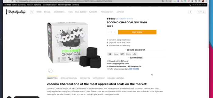
Let’s start with the speed of the page, which is pretty good at 6 ms – much faster than 4ashoponline’s 3.55 s!
Now, let me look at the page and see if you get five key elements:
I see all five elements here: AIDA principles, page load time/speed, trust icons, social proof, and a call to action.
It’s really good that you’ve managed to keep your page load speed so fast despite all the content on the page.
I like the trust icons – they add credibility to your page and help build trust with users.

I would suggest to add scarcity in the form of time-limited offers or promotions, which can help increase conversion rates even further.
I would change the color of the toolbar above, which doesn’t align with overall color scheme.
Lastly, I would suggest adding an FAQ section so users can get answers to their most common questions. All in all, with some tweaks in design and copy, you can significantly improve your landing page’s conversion rates on mobile devices.

Shisha Quality is a great site – it has all the elements you need to make your landing page great, including fast loading time and trust icons. However, there are still a few tweaks that could be made to increase conversions even further. I would suggest adding scarcity in the form of time-limited offers or promotions, which can help bring in more visitors and increase your conversion rates. I would also change the color of the toolbar above, as it doesn’t quite match the overall color scheme.
So, that’s it from the session! We audited 4 landing pages, suggested what could improve conversion rates, and made key recommendations for each. Thank you so much for joining me today – I hope these tips were valuable and helpful!
/