During this video we’re going to mainly be talking about E-Commerce Landing Pages , but don’t worry we will have a Lead Generation Landing Pages for Mobile video too coming soon to our YouTube channel.

Written by
Andy Haskins
Co-Founder & COO

During this video we’re going to mainly be talking about E-Commerce Landing Pages , but don’t worry we will have a Lead Generation Landing Pages for Mobile video too coming soon to our YouTube channel.
This is the video that EVERYONE has been waiting for!
During this video we’re going to mainly be talking about E-Commerce Landing Pages, but don’t worry we will have a Lead Generation Landing Pages for Mobile video too coming soon to our YouTube channel.
Click here to subscribe so you don’t miss it!
Time to get started!
In the video above we explain and show you how your landing pages for E-Commerce should look
on MOBILE devices to optimise for maximum conversion rates and conversions.
Make sure you watch the video as well as reading the blog to see some up close templates and examples!
Two of the most important things are:
Some great websites you can use to test these are:
Tools.Pingdom and Google Page Speed Insights

This is one of the main things that people lose sleep over and really worry about when creating
e-commerce pages for use on mobile devices, these are the elements that you NEED above the fold:
– Trust Seals (Payment Seals)
– Social Proof Testimonial
– Call to Action (CTA)
– Clear Product Image
So far we’ve learnt that page speed is crucial and then it’s the elements above the fold that come next!
See this great example of where elements should be placed above the fold:
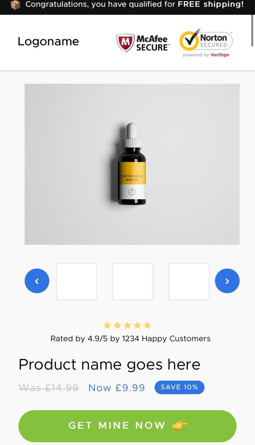
Can you spot the trust seals?
Yes! (McAfee/Norton)
How about the social proof?
Yes! (4.9/5 by 1234 happy customers with nice easy viewable stars)
Is the product image clear? Not pixelated?
Yes! (Tip: point of view images allow the user to visualise them using your product/service)
Is there a fixed call to action on the page?
Yes, (Get Mine Now ????)
Some tips for your pages include:
– Add a fixed scrolling CTA (Call to action) Button to header or footer of your page.
– Keep padding small on mobile comparing to desktop.
– Try and fit things on one line instead of two (if you have massive headlines that span across two lines then try and condense them for mobile.)
– Take out any elements that aren’t needed, you often need less on mobile pages.
Make sure you subscribe to our Youtube Channel to be the first to see these amazing videos!
Click here to subscribe
Want to have all our latest videos and tips emailed straight to you?
Click here to sign up to our monthly newsletter
3 more posts in CRO Fundamentals.