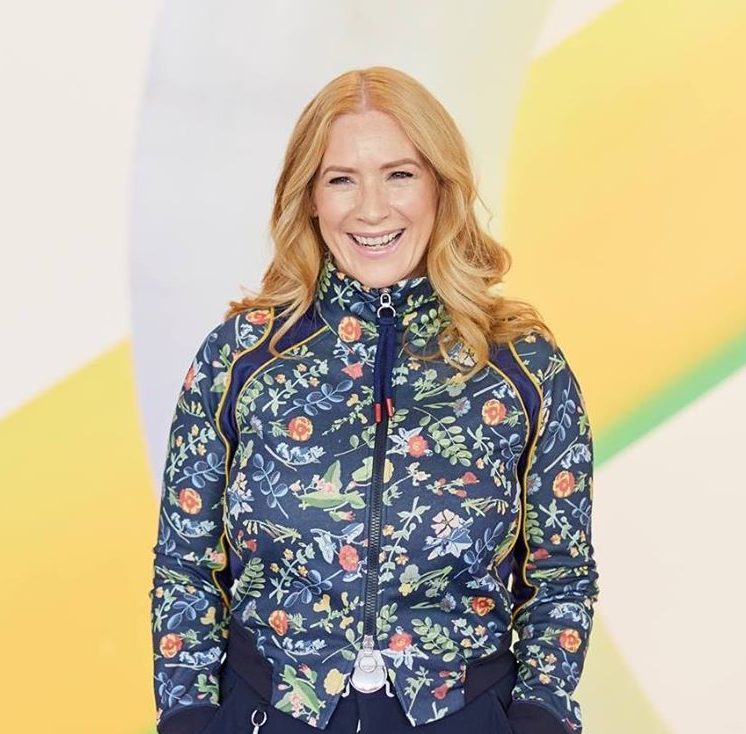
Meet Facebook Marketer Emma Van Heusen , as she talks with Oliver Kenyon , co-founder of Landing Page Guys.

Written by
Andy Haskins
Co-Founder & COO

Meet Facebook Marketer Emma Van Heusen , as she talks with Oliver Kenyon , co-founder of Landing Page Guys.
Meet Facebook Marketer Emma Van Heusen, as she talks with Oliver Kenyon, co-founder of Landing Page Guys.
Emma says she finds the process of creating Landing Pages
soul-destroying!
Do you agree? Personally we love creating Landing Pages.
Oliver and Emma talk us through the do’s and dont’s of a Landing Page on the video above, but we’ve also included a guide below for you! First of all, we will tell you a bit about who we are.
Landing Page Guys started in 2013, Oliver co-founded the business with Andy Haskins, we currently turnover between 25-75 landing page funnels/projects per month. We have an extensive team in the UK and we also have around 40 designers worldwide employed by us.
Because we focus on conversion rates. We focus on conversion rates and direct response, every click counts. When you’re doing paid media, email marketing or your sending traffic to a page for a specific reason (whether it’s a sale, a generation of a lead, an opt-in, a webinar etc).
Any design agency can make your website look pretty, but we focus on getting the principles behind the website that make it convert.
Landing Page Guys have worked with Emma since late 2019, Emma utilises a majority of click funnels, in the video call Oliver explains that click funnels are great, but they only get you so far. Click funnels are great for improving a concept, if you have something new you want to sell, click funnels are very easy to use and cheap and easy to run traffic tests on.
But what about when you’re ready for the next step… that’s when we come in at Landing Page Guys. When you’re ready to take the next step, after you know your product sells we can take your conversion rates from 1-2% on click funnels to 5-10% with our heavy directed response to conversion-focused funnels.
Emma tells us how she now wants to use those proven concepts from her click funnels to take her page to the next level. That’s where we come in.
Everyone is focused with scaling their traffic, building up their email list, building up their ads, sending more traffic to their pages but what they don’t understand is you can get the same results from optimising your landing page. You can almost double your ROI (Return on Investment) if you can double your conversion rate. However it’s often the thing that people forget about, they forget to do it because they have been given click-funnel templates that do work and do convert, but we can get them far better results.
The most important things when you’re driving people to your landing page is speed optimisation! This is another reason my click funnels aren’t the best option because click funnels are built on a software and it takes more time to load a landing page through click funnels. When you’re doing paid media there’s a statistic that says for every 1 second decrease in load time you’ll see a 5-10% increase in conversions.
What that means is for every one second your website is loading quicker you’ll see an increase in sales. So, speed is EVERYTHING.
https://tools.pingdom.com/
These are great websites because not only do they tell you how fast your web page loads, they also give you a breakdown of why they are loading in that time. What is slowing them down? What can you improve on? If you have a developer or a website manager on your team that can optimise or edit your pages then this can prompt them to make necessary changes to increase your page speed.
Down your landing page you should take your customer on a journey…. the journey of Attention, Interest, Desire and Action.
How do we do that though?
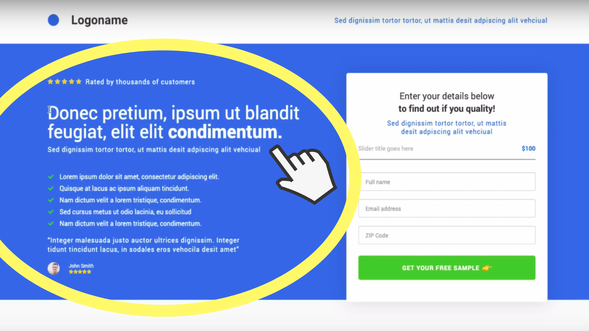
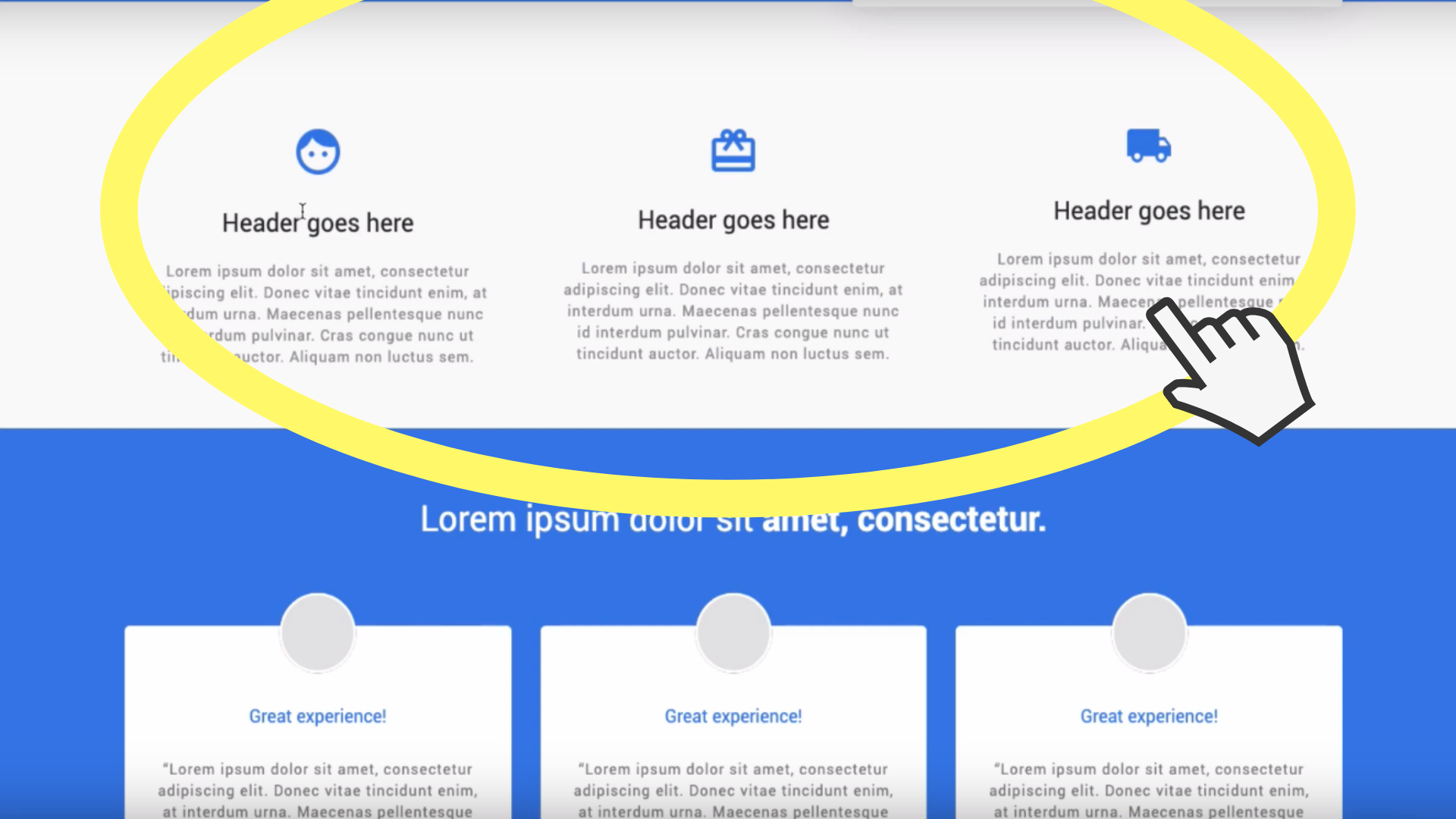
A great way to do this is using video. You need to outline in this section how EASY it is for your customer to get your product/service and what it will do for them/how it BENEFITS them. Another way to do this as well as using a video is doing a ’step 1, step 2, step 3’ (seen below)
It’s almost extremely important to have Social Proof and Trust Proof. We live in an age where if i’m a customer 9/10 I will go and do some research on your product. I’ll go on google and type ‘review’ and your company name.
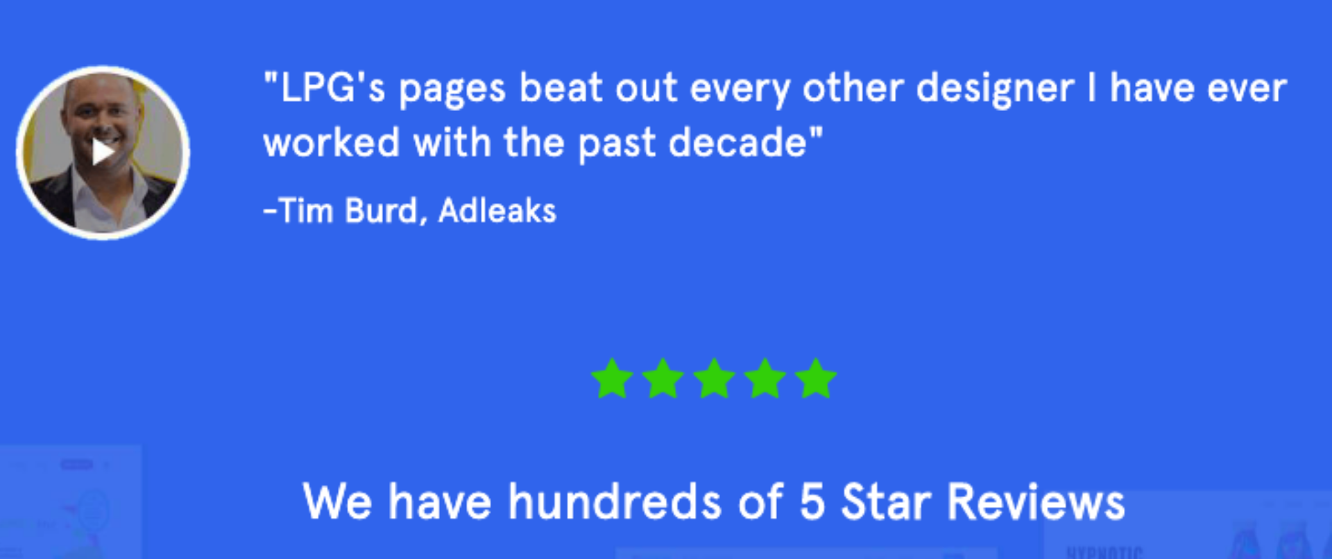
What we want to do when creating a Landing Page is NEVER GIVE THE CUSTOMER AN EXCUSE TO LEAVE YOUR PAGE. You should put the ’social proof’ on your page, readily available to them. A testimonial, a review, 5 stars etc…
Next up, trust proof. What is trust proof? It’s giving people a reason to trust you.
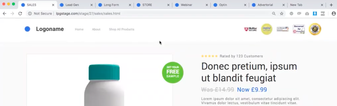
Here’s a great tip to get you started on that action – put an emoji on your CTA button, it may sound mad but putting an emoji on your call to action buttons it will up your conversions. Some great examples are:
Add to Cart (cart emoji)
Rush my order (clock emoji)
Buy Now (pointing right finger emoji)
As mentioned earlier it’s very important to talk about benefits of your product/service and not the features, it’s very easy to boast about your features but as a consumer, people don’t care as much about the features as they do about benefits. How does your product or service benefit them?
A case study has been done on an iPhone, to hear more about it watch the video above at the 27:11 mark.
We guarantee you if you currently haven’t got a testimonial above the fold and you add one that your conversion rate will automatically go up! It’s been proven.
We tend to advise clients that ask us for chatbots to not confuse their call-to-action. Meaning If their ideal path and goal is to get a phone call from the client then adding a chat bot will only get in the way of their ultimate goal. If their aim is to get them to fill out a form, then again the chat bot will hinder the overall goal. We preach K-I-S-S. No, don’t worry, we’re not asking you to pucker your lips our lovely blog readers, although I’m sure you’ll want to after all of our advice but K-I-S-S stands for:

We’re not insulting you all either, we promise. KISS is a design principle that benefits you and your customers. Keep It Simple Stupid.
Keep consistent with your branding as to not confuse the customer, your button does have to stand out however so do not be afraid to put your button in a different colour. Gold and green are the colours at the moment that seem to work really well on buttons!
Make sure you’re using the same font, the same style guide, just don’t get too obssessed with branding on your Landing Page.
We hope our masterclass to How To Build a High Converting Landing Page Masterclass helps you skyrocket your sales! If you want more tips and tricks then follow us on social media and YouTube.
If you’ve enjoyed reading this blog and you don’t want to miss out on any tips like this in the future join our newsletter: https://landingpageguys.com/newsletter
We don’t spam! We only send out one email every month with all the information you need to make your website/landing page successful.
3 more posts in CRO Fundamentals.